Water as a theme is rarely used on websites because it is quite generic. The color palette is limited and one of the only elements that could be used in conceptualizing design is the waves. However, water is one of the most abundant resources in the world, and expounding on its beauty helps create wonderful websites.
Numerous websites have created clever water-related themes. The most common websites that use water themes would be vacation destinations, water utility companies, and even non-profits that have advocacies related to water. There are multiple resources online where there are water-themed website templates. Some are available for free, while others come at a small price.
In this article, we would be exploring how different websites used elements and characteristics of water to develop creative websites. Here are a few examples of the coolest water-themed websites on the internet right now:
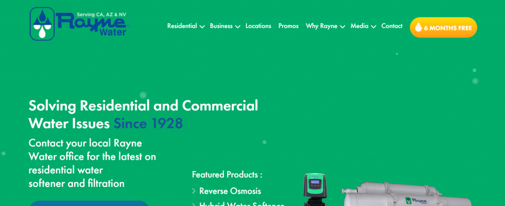
Rayne Water US

Are you looking for a water softener? This is a water utility company that sells that. The purpose of the website is to entice the readers to stay-on and read more about the product. The cute design of the website used different water themes like waves to separate different sections. The mixture of green, blue, and white is a good color palette for such a product. What makes the website even cute is the bubbles that float from the bottom. It adds a subtle detail but still equally enjoyable as other websites’ extravagant features.
Diamonds Maldives

All the other elements of the website are carefully placed so that it does not take attention away from the background. The clear water and clear skies can help users imagine that they are on an island destination. It features all the beauty the Maldives can offer to its tourists. All the fonts and texts used on the website are white which adds to its simplistic elegance.
The Manta Resort

Vacations near water are not always about beaches. Other bodies of water could be enjoyed on vacation as well. The website does not have a menu bar. Instead, the website has a button for bookings and another button for the menu. Everything else focuses on the brand. Highlighting the brand represented by the website is one of the most important goals all web designers have. The Manta Resort website does just that.
Reethi Beach

When selling something, it is sometimes best to be direct to the point. This is why the home page of the website immediately posts all their offers and the duration of these promotions. This way, the user can immediately decide if they want to book or not. Just like in other websites, a background showing clear skies and the beach never fails to entice people to want to be on a vacation.
Hellenic Holidays

This holiday destination website takes water to a whole new level. The image on the background shows the ocean view with a romantic sunset. It can make anyone yearn for a vacation. Then, it immediately shows the packages and offers that the resort has for its clients. This may ensure further interaction with website visitors – which is the goal of the website. The labels and fonts used for the menu bar do not have a background that does not distract the reader from the background as this is the main selling point of the website.
Fin Fun

The website is an online store for mermaid merchandise. This includes mermaid tales and costumes, and other diving gear for mermaid enthusiasts. As seen from the website, the design is the ocean shore which shows all the different hues of a typical beach. One of the good things about this website is that it connects to a mermaid blog which could be enjoyable for any enthusiast or hobbyist. There is also a button for coupons and discounts. They also have a subscription option for future products and newsletters. It ensures future interactions with readers and clients.
Water Utility Authority

Yes, the wave design in the bottom not only changes colors but moves as well just like how water is in real life. The menu bar of the website uses icons that make navigation easier. Then, the call-to-action buttons are very clear and could help in easily identifying what the reader wants from the website. The background is a subtle blue-green hue, but looking closer it is an image of ocean waves.
Water World

The water-theme could be seen in the name of the website and the color scheme it uses throughout. However, there are subtle imageries used within the website that uses wave designs. This is a good way to cooperate with the water theme without being too straight forward. The typeface used on the website also provides good contrast against the hues of blue used in the website elements.
Every Last Drop UK

This is not exactly a water-themed website, but it took a cool perspective of how important water is for people’s daily lives. The website is a parallax effect website that shows the day-to-day activities people have where the presence of water is essential. The character on the website is moving with every motion of the mouse scroll. It’s almost telling a story and could be enjoyed by readers of all ages. This is a good way to come across an important message about water. The strategy of the website is to grab the attention of the readers, and it is quite successful.
Sanitation and Water For All

How else can we get the message across than to use an image of a child with imaginary water? One of the main goals of a website is to immediately show readers the vision and purpose of the organization it represents. The Sanitation and Water for All organization is a group that supports the rights of all nations to clean drinkable water. Since it is a campaign that wants to support the access of the future generation to drinkable water, the image used in the banner is subtle but sends a very powerful message.
The post Beautiful Water-Themed Websites appeared first on SpyreStudios.


