How can we optimize fonts for faster loading times? We all know that web performance significantly affects the internet traffic of a website. But every web designer knows that small elements, like fonts, have a direct effect on site speed and performance. So this means, intelligently selecting and optimizing fonts is a web designer’s priority. But, how do we optimize fonts for faster loading times?
Here are some design tips on how to optimize fonts for better website performance:
Install a Font Preloader plugin
Preloading a font means that you are “forcing” a user’s browser to immediately download and cache a resource. A web designer can also opt to preload links, videos, images, and other files. But in this case, we shall focus on preloading fonts. As soon as the downloaded fonts are downloaded and cached, the browser can then start printing in the text.
Adding a preload to fonts can be done via a plugin or code. Via code, devs could use the preload tag <link rel=’preload’ href=’/font.woff2′ as=’font’ crossorigin>. There are tutorials available online for this.
Or, the easiest way to preload a text is to install a plugin. There are great, free plugins to try:
Perfmatters

Autoptimize

Use icon fonts
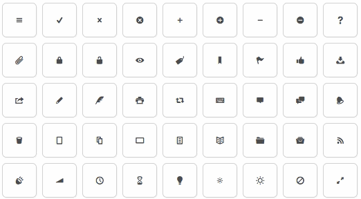
The main concept of using icon fonts is to convert pictograms or icons (normally implemented as a vector file or an image) into fonts. You can actually see this often, we use an icon to represent an option instead of a hyperlinked text. Take this free sample from Fontello:
On top of that, icon fonts are remarkably small-sized and a lot of resources, even free ones, are near pixel-perfect.
Choose System Fonts over unique fonts
Depending on your target devices, system fonts don’t need to be downloaded. Some of the good choices are Helvetica, Verdana, Franklin Gothic, and Cambria. These are good for the content’s body text as they are easy to read regardless of size, weight, and color.

Select the minimum number of typefaces
Maybe using two or three typefaces throughout a website is good enough to create a multitude of designs. Take this example from the Antro website. It is a minimalist website that uses a single font family in its design. The web designer creatively optimized the font by changing its size and weight.

Adjust instead in color, size, and weight of the font
Repetitively changing the typeface of font and choosing unique fonts throughout the text is tempting. However, every web designer knows that there are risks to this decision. Instead, designers can opt to adjust the color, size, and weight of the font. This is good for various parts of the website – menu bars, headers, titles, and body text. Using only a couple of fonts but changing up how they look through weight and color can drastically change the overall look and performance of a website.
Also read: 5 Uses of Outsized Typography in Web Design
The post How to Optimize Fonts for Faster Loading Times


