When discussing contrast-color in web design, it’s essential to understand its significance in enhancing text readability against various backgrounds. Contrast-color, a crucial aspect of CSS, addresses how foreground and background colors interact, thus affecting overall visual accessibility. The color contrast ratio is vital for ensuring good legibility, adhering to WCAG accessibility standards designed to support users with visual impairments. By applying CSS functions that quantify perceptual lightness, developers can evaluate whether to use a light or dark font for optimal visibility. This not only improves user experience but also aligns with the commitment to create accessible and inclusive web environments.
In the realm of web development, the term contrast-color often refers to algorithms that assess the interplay between text and background hues, thus influencing legibility. Understanding color contrast ratios and their compliance with WCAG guidelines is fundamental in crafting harmonious designs that cater to diverse audiences. The exploration of perceptual lightness through CSS functionalities allows designers to make informed decisions about font color selection, ensuring a streamlined visual experience. As digital accessibility remains a priority, grasping the nuances of contrast-color becomes ever more vital for creating user-friendly interfaces. In essence, improving color visibility through effective contrast techniques is key to enhancing online accessibility.

Understanding Contrast and Accessibility
When we talk about color contrast in design, we cannot overlook its vital role in improving accessibility. The need to ensure that text stands out against its background is paramount for delivering an inclusive user experience. Often, designers might find the task less onerous with expressive methods available; however, the intricacies of luminance calculations can become overwhelming. It’s essential to have a grasp of how certain color combinations can meet the Web Content Accessibility Guidelines (WCAG) standards.
The latest resources, including the `contrast-color()` function, aim to ease this burden; they allow us to merge modern CSS features with accessibility practices. This flexibility encourages us to explore innovative ways to calculate color contrast, ensuring not only compliance with the requisite guidelines but also improving user interaction. Creating high-contrast visuals is not just a matter of aesthetics; it directly affects how content is perceived and engaged with.
The Evolution of Color Contrast Calculations
Historically, contrast calculation methods leaned heavily on formulas established by WCAG, which, while effective, often resulted in complex and sometimes convoluted code. As mentioned, the lush mathematical dependencies can make understanding and troubleshooting a challenge. Simpler models can mediate this by employing perceptual lightness rather than traditional luminance; thus, we steer towards more intuitive approaches using color spaces like CIELAB.
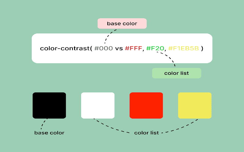
By utilizing color spaces, designers can better predict how different colors will visually interact on screens, which is pivotal when determining whether black or white text will provide better contrast against various backgrounds. The refined formulas derived from this research, such as the ones proposed using `oklch()` measurements, signify a noteworthy step toward clearer, more maintainable code that aligns with our technical and accessibility requirements.
Implementing the New Methodology
The shift toward utilizing `oklch` represents a crucial advancement in our toolkit. Given its foundation in human perception, its lightness attribute serves as a more reliable indicator for contrast calculations compared to traditional metrics. This means developing standards that are easier to implement, greatly benefiting developers who prefer streamlined solutions over convoluted rendering paths. With this refined methodology, we can ascertain the effective lightness threshold where color contrast balances between black and white.
The personal touch of adjusting parameters based on specific requirements opens doors for user experimentation, thus refining the design process. Whether incorporating a simple application or experimenting with various color schemes, the ease of adaptability here cannot be understated. By suggesting lightness thresholds between 0.65 and 0.72, we empower designers to feel more confident in how their choices will resonate across diverse viewing environments.
Color Mixing Techniques for Enhanced Flexibility
Further innovation arrives with the introduction of color mixing techniques, allowing designers to diversify beyond the conventional black and white dichotomy. Through the application of `color-mix()`, one can explore a gradient of blended colors that maintains sufficient contrast while moving away from a binary system. This is especially useful when creating UI elements that need to integrate more creatively with the overall aesthetic of a design.
Focusing on personalized color decisions while still adhering to accessibility principles creates a more vibrant design culture. Coupled with CSS Custom Functions, the application of mixed colors can yield customized results that adjust to user preferences dynamically, paving the way for a more immersive visual experience. Experimentation here represents a progressive leap that, while necessitating browser compatibility considerations, vastly enhances design capability.
Conclusions and Future Directions
As we distill these ideas into actionable insights, the fundamental takeaway remains focused on adaptability and understanding. The advancements in color contrast calculations herald a new era where adhering to established guidelines can also be enjoyable and creatively fulfilling. Moving beyond mere compliance, the introduction of cognitive approaches and perceivable metrics emphasizes the importance of the end-user experience.
Ultimately, the task isn’t just about meeting standards; it’s about making design choices that resonate with users at varying accessibility needs, leading to an inclusive digital landscape. As development in CSS continues to evolve, staying attuned to changes and harnessing new features will be critical in crafting functional, beautiful, and accessible user experiences.
In conclusion, the exploration of efficient ways to approximate the `contrast-color()` in CSS has unveiled a simpler and more adaptable solution by leveraging perceptual lightness values in the OKLCH color space, rather than relying solely on luminance. This innovative approach not only facilitates easier readability in code, but also keeps accessibility in mind, ensuring better contrast ratios in various scenarios. Here are some key takeaways about this technique:
– **Accessibility Mindfulness**: The simplified formula aims to enhance accessibility by providing clearer contrast distinctions based on perceptual lightness values.
– **Flexibility and Adaptation**: Users can readily adjust the lightness threshold as needed, allowing for a more customized application that best fits their design requirements.
– **Improved Visual Outcomes**: The use of OKLCH over the traditional LCH demonstrates superior performance in matching APCA standards, ensuring that visual content remains clear and legible.
Ultimately, while the new method offers a compelling alternative to existing WCAG-compliant solutions, it’s crucial for developers to remain vigilant regarding compliance standards in their specific contexts. As always, testing across various devices and visual impairments will ensure optimal accessibility outcomes. Here are some considerations to keep in mind:
– **Compatibility**: The new solution is compatible with modern browsers, but attention should be paid to legacy systems, particularly with Safari compatibility being noted.
– **Testing Required**: Continuous testing is essential to guarantee both visual clarity and adherence to WCAG standards, especially if legal compliance is a concern.
– **Future Adaptability**: As CSS evolves, the implementation strategies discussed should remain adaptable to integrate new features, enhancing the overall user experience and accessibility.