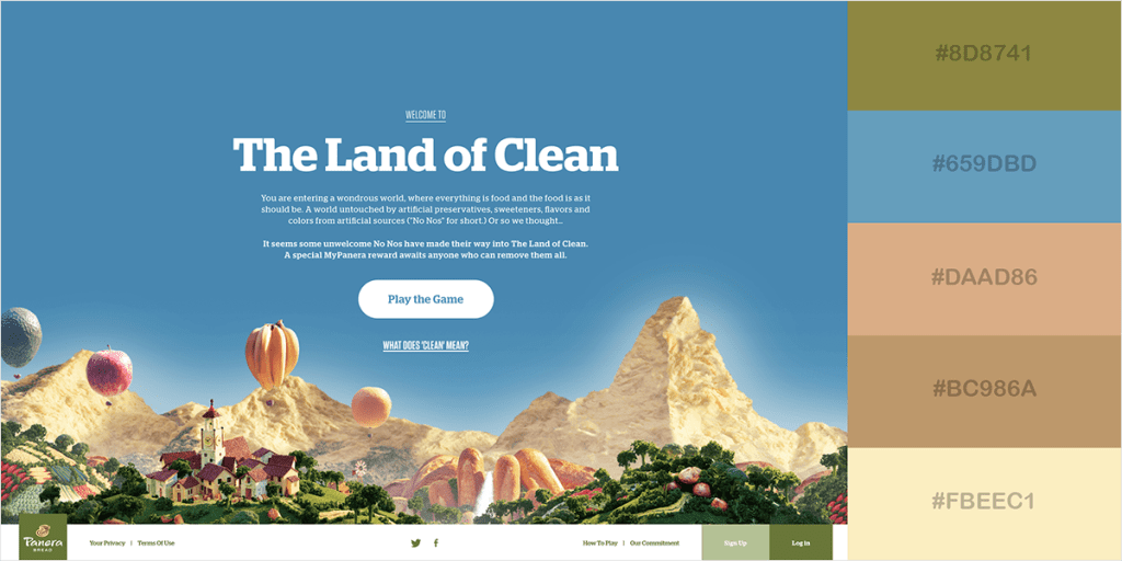
Color scheme in web design is a pivotal aspect that transcends mere aesthetics, influencing not just a website’s visual appeal but also user emotions and interactions. The right colors can evoke trust, excitement, or tranquility, effectively shaping brand identity and user engagement design. Through the lens of color psychology, the carefully curated palette becomes a strategic tool, guiding visitors’ perceptions and actions within a digital landscape. From the calming blues of major banking institutions to the urgent reds seen in promotional campaigns, the interplay of web design colors can determine conversion rates and viewer retention. Thus, embracing an intentional color scheme is key to creating accessible design that resonates with diverse audiences, ensuring a seamless user experience across platforms.
In the realm of digital aesthetics, the selection of hues within a website’s layout holds transformative power, functioning as both a beacon of brand identity and a catalyst for user interaction. Regardless of whether we refer to it as chromatic strategy, palette cohesion, or the emotional undertones of web design, the underlying principle remains—colors are not arbitrary choices but calculated decisions that can significantly impact viewer perception. Diverse color schemes weave the narrative of a brand, engaging visitors at a subconscious level akin to poetry in motion. Each hue narrates a different story, from the serene greens of health and wellness to the vibrant yellows that inspire joy and innovation. When designers harness the synergy of color appropriately, they open doors to inclusive and captivating online experiences for all users.
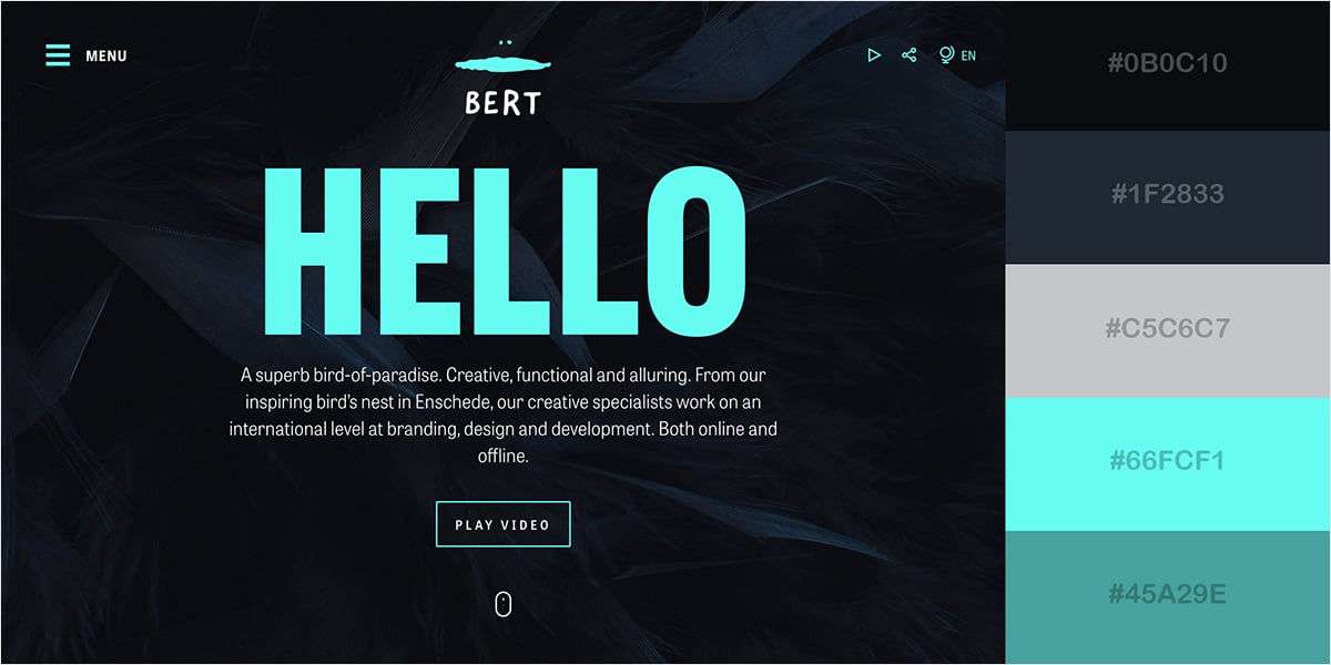
The Role of Color in User Experience
Color is not merely a visual delight; it embodies the essence of our interactions with digital interfaces. The hues that adorn a website do more than decorate; they evoke emotion, convey meaning, and guide users in a dance of interaction. In a marketplace flooded with information, the right color can cut through the noise, instantly connecting with viewers and subtly shaping their journey through a site.
Imagine visiting a website draped in soothing pastels or vibrant patterns that scream energy and life. Each shade grabs attention, sets the mood, and can even turn the ordinary into the extraordinary. Thus, a deep understanding of color’s psychological power equips designers to create spaces that are not only visually appealing but also profoundly engaging.
Cohesive Color and Brand Recognition
A brand is often like a story wrapped in colors. The shades selected speak volumes about the identity and values of a company, allowing it to resonate with its audience on a deeper level. Take Coca-Cola’s signature red or Facebook’s calming blue—these colors transcend mere preference; they are foundational to the brands themselves. A consistent color scheme across all platforms transforms a mere name into a memorable icon.
Studies show that when users encounter a unified color palette, they remember the brand significantly better—up to 80% more, as noted in numerous marketing analyses. This fosters a sense of familiarity and trust. Each time consumers engage with a brand, the colors become a familiar entity, etching themselves into memory and influencing purchasing decisions.
Embracing Accessibility Through Color Design
In the realm of web design, accessibility often takes a back seat, yet it is an essential element that should be imbued in every color decision. Designers have a vital responsibility to ensure that their choices do not alienate users—especially those with visual impairments. The color contrast must not only be visually appealing but should also adhere to established guidelines to ensure that web content remains approachable for everyone.
Implementing effective contrast creates a more inclusive environment. Consider engaging colors that meet WCAG standards; this practice invites a broader audience to experience the content. By adopting a mindset that prioritizes accessibility in color schemes, designers foster a digital landscape where creativity and inclusivity coalesce, enhancing the experience for all users, and nurturing a sense of belonging.
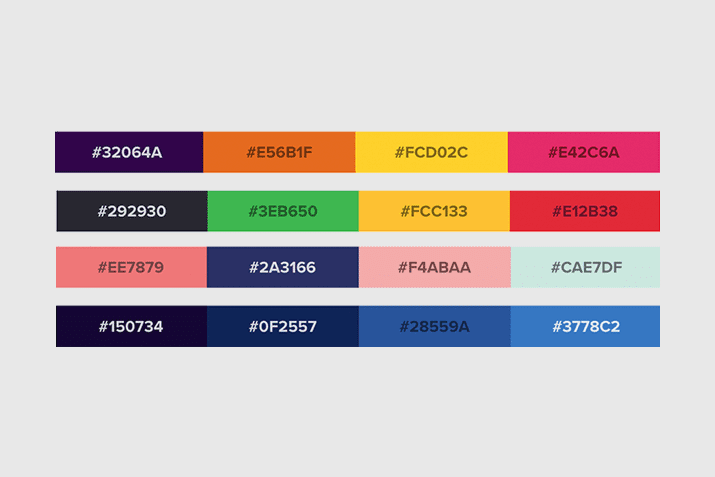
The Power of Color in Design
In wrapping up our exploration of color schemes in web design, it becomes evident that these palettes transcend mere aesthetic appeal; they herald experiences, evoke emotions, and mold interactions. The essence of compelling visual communication lies in an understanding of color’s innate power—and its ability to influence subconscious decision-making. Key takeaways include:
– **Emotional Resonance**: Colors cultivate feelings, with blue invoking trust and urgency ignited by red.
– **Brand Identity**: A cohesive color palette fortifies brand recognition, bolstering organizations like Coca-Cola and Facebook to the forefront of consumer minds.
Moreover, beyond just creating visual allure, color schemes directly affect user behavior and accessibility. The considerations of design go beyond trends, embedding a commitment to inclusivity, ensuring all users—regardless of their visual capabilities—can traverse the digital landscape without hindrance.
– **Engagement Impact**: An enticing color scheme can elevate user engagement by as much as 20%.
– **Accessibility Matters**: Adhering to standards sets the stage for a truly inclusive experience; contrasting colors become lifelines for those navigating your site.
Embracing Color Trends
As we look forward to the continuous evolution of web design, it’s essential to embrace emerging trends while honoring timeless principles. Positively, the infusion of bold hues against minimalist backgrounds highlights significant elements, guiding users through their experiences as they float seamlessly across digital spaces.
– **Trend Adaptation**: Staying ahead of the curve and adapting to new styles ensures sustainable relevance.
– **Resource Collaboration**: Leveraging innovative tools such as Adobe Color helps designers refine their work and share inspiration with their peers.
Ultimately, the call to action is clear: let us not merely adorn our websites with colors but infuse them with intention and meaning. The ability to harness color effectively can unlock the door to increased engagement, brand loyalty, and a unique identity in an overcrowded marketplace. By embracing the captivating power of color, web designers can create enriching experiences that linger in the memories of users long after their visit. The journey to design excellence is paved with hues—let us choose them wisely.

