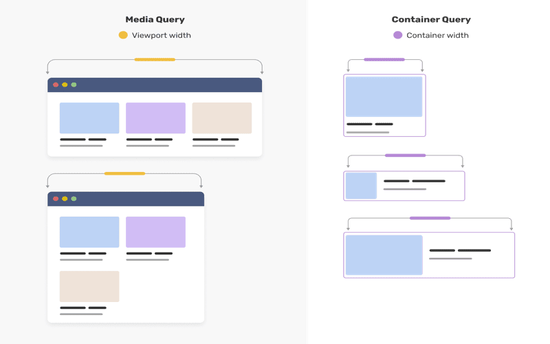
Container Queries are revolutionizing the way we approach responsive design in web development. By allowing styles to adapt based on the size of a container, rather than just the viewport, CSS container queries provide a powerful tool for developers looking to create flexible and adaptive layouts. Unlike traditional CSS media queries, container queries can respond to the dimensions of their parent elements, enabling a more modular approach to styling components. This innovation not only enhances user experience but also allows for more intuitive usage of container query units, facilitating styled container queries that can respond precisely to their environment. As web design increasingly embraces these advanced CSS layout techniques, understanding container queries becomes essential for developers aiming to stay ahead in the evolving landscape of responsive design.
In the realm of modern web design, container-based style adjustments are becoming increasingly relevant. Often referred to as ‘element size queries,’ these innovative techniques empower developers to craft responsive interfaces that adapt fluidly to their surrounding elements. By leveraging styled container queries, designers can achieve a level of flexibility that traditional media queries simply cannot match. Features such as container query units add another layer of sophistication, allowing for precise control over the elements based on their context. As a result, embracing these CSS layout innovations opens a new chapter in the design of user-friendly, adaptable websites.

The Introduction to Container Queries
When container queries were introduced in 2022, I confess they didn’t pique my interest. At first glance, they seemed to replicate capabilities we already had through media queries, leading me to think that their functionalities were peripheral rather than essential. What was the rationale behind using container size queries when media queries were already ingrained in our workflow?
However, this perception began to shift as I delved deeper into their potential. As the web continues to evolve, these container queries offer a dynamic approach—one that accommodates changing container sizes seamlessly. The inception of this query type was met with skepticism, but the explosive growth in their applications proves their worth in modern design practices.
The Novel Container Scroll-State Queries
Container scroll-state queries unveiled a new realm of possibilities. These innovative queries allow developers to determine whether a container is scrollable or check if it’s positioned at a specific snap-target. For instance, the emerging support in Chrome for detecting the scroll state offers a glimpse into how we can rethink interactivity on web pages.
Imagine a webpage that adapts its design elements based on the user’s scrolling behavior. This enables a level of engagement that was previously unattainable. With container scroll-state queries, the ability to define how and when elements respond to scrolling creates a smoother, more tailored user experience. This capability is crucial as we navigate various screen sizes and orientations.
Understanding Anchored Container Queries
With the advent of anchored container queries, developers can now ensure that user interfaces remain functional regardless of space constraints. An example would be a tooltip that intelligently flips its position depending on available screen real estate. This smart handling of elements can make a significant difference in overall user experience.
Visual adjustments like these are essential in today’s design, where real-time adaptability is expected. Anchored container queries effectively bridge the gap between design intent and practical execution, allowing for responsive components that maintain usability.
Exploring the Limitations and Potential of Container Queries
Despite the exciting advancements, there’s still a lingering question: how far can we push container queries? While they initially seemed to serve niche purposes, their profound implications could reshape the fabric of how styles are applied across container elements. It begs consideration—what if we had a broader suite of container queries at our disposal?
With the integration of features like compute() syntax, developers are empowered to extract and utilize values across various CSS properties. Such flexibility indicates that the future of container queries could ultimately redefine web design and interface development, enhancing our ability to create adaptive experiences.
Future Prospects of CSS Properties with Container Queries
Looking ahead, the idea of querying any CSS property opens up a plethora of new opportunities. It’s been suggested that container style queries will evolve beyond just custom properties, allowing for a nuanced manipulation of styles drawn directly from computed values. This could revolutionize how we interact with CSS, providing a more intuitive and powerful design language.
Think about it—what if the radial gradient in your background could be manipulated based on the width of a neighboring element? The prospect of having fine-tuned control over every aspect of design through container queries is tantalizing and will likely lead to greater innovation in web standards.
The Insights from Industry Experts
Industry experts like Adam Argyle have long championed the idea of enhancing container queries. Insights such as the ability to check for on-screen elements or count child nodes demonstrate that there’s a broader conceptual framework waiting to be explored. These proposals could fundamentally enhance our design toolkit, making fluid layouts much easier to execute.
Moreover, there’s a compelling argument for integrating container queries into pseudo-classes, thus expanding their reach and usability. This integration would streamline the way developers think about styling and responsiveness, fostering a more organic interaction between elements on a page.
Conclusion: Dreaming of Future Container Query Capabilities
As we stand on the brink of what seems to be an evolution in web design, the possibilities for container queries remain vast. The potential expansion to encompass a wider array of properties and interactivity means that 2026 could be a turning point for responsive web design. I’m eager to witness how these developments unfold and what new features industries will embrace.
What excites me most is the collaborative spirit within the developer community, where ideas flourish and innovations take shape. Together, as we push for greater functionalities with container queries, we may discover new hacks, shortcuts, and methodologies that redefine our relationship with CSS and web design.
Further Reading and Resources
If you’re looking to deepen your understanding of container queries, there are numerous resources available. For beginners, interactive examples by Ahmad Shadeed offer a fantastic starting point to grasp the concepts and practical applications. Additionally, following the latest developments from sources like Chrome 143 brings valuable insights on using anchored container queries effectively.
Staying updated with these resources not only enriches your skill set but also positions you at the forefront of web design innovation. As implementations continue to evolve, engaging with these materials will ensure you’re not just keeping up, but you’re also ready to leverage the full power of container queries.

In summary, the future of container queries holds immense potential, opening new avenues for responsive design and functionality. As we’ve explored, the introduction of features like container scroll-state queries and anchored container queries showcases the versatility of this tool. Further expanding the capabilities of container queries could revolutionize web development in several ways. Some possibilities include:
– **Greater flexibility in styling:** Allowing queries for any CSS property would empower developers to create dynamic designs that can respond to various states and conditions.
– **Enhanced responsiveness:** By enabling queries for child elements and their properties, developers could create smarter UI elements that adjust seamlessly to different screen sizes and contexts.
– **Improved usability:** Potential enhancements like counting child nodes or detecting whether a flex container is wrapped could lead to better accessibility and user experiences.
As such, the community is eager to see how these ideas will unfold in practice as container queries evolve.
Looking ahead, it’s clear that container queries have just begun to scratch the surface of what is possible in terms of creating dynamic and responsive web interfaces. As more features are developed and existing ideas are refined, we can anticipate a significant impact on how we approach CSS and layout strategies. The exploration of container queries can lead us to exciting developments, such as:
– **New syntactic innovations:** Proposals like compute() and inherit() could greatly simplify the way we manage and reference CSS properties, making styling more intuitive.
– **Expanded functionality:** The potential introduction of pseudo-classes for container queries could make for even more dynamic styling based on container properties and states.
– **Community-driven enhancements:** Continued proposals from developers suggest a vibrant ecosystem eager to push the boundaries of what container queries can achieve.
Embracing these innovations will not only enhance our design toolkit but also encourage a more collaborative approach within the web development community.


