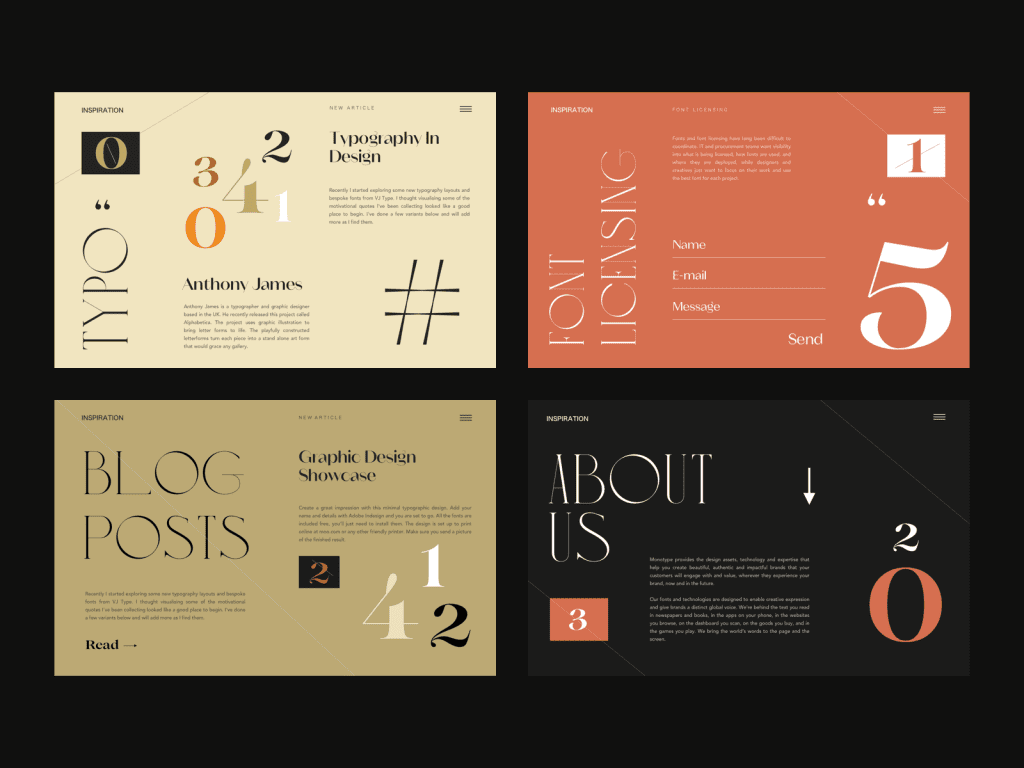
Typography in web design is more than just an artistic choice; it is a critical component that determines how users interact with content online. Understanding typography basics lays the foundation for creating visually appealing and effective websites that communicate clearly. By following web typography best practices, designers can enhance legibility and readability, ensuring that users engage with their content fully. Moreover, mastering responsive typography will enable your text to adapt seamlessly across various devices, allowing for a better user experience. In this guide, we will explore essential principles of typography that every beginner needs to know to create captivating digital landscapes.
The art of text presentation on the web, often referred to as typographic design, plays a pivotal role in shaping user engagement and content interaction. As you embark on your journey into this world of letters and layout, you’ll discover that a solid grasp of typography forms the bedrock of effective web development. Exploring the nuances of written communication—whether it’s understanding typographic hierarchy or the importance of font choice—will empower you to craft experiences that resonate with your audience. With a focus on inclusivity and accessibility, the choices made in typographic styles can bring clarity and impact, guiding users through their exploration of digital content. Join us as we unravel the essentials of typography, equipping you with the tools to transform text into a dynamic element of your web design practice.
The Essence of Typography in Digital Realms
At the heart of every engaging website lies the subtle art of typography, a craft that balances form and function. Typography serves as more than mere letters strewn across a page; it is the voice of your content, setting the tone and inviting audiences on a journey. When beginners embark on the path of web design, grasping the essence of typography becomes a pivotal stepping stone toward creating seamless user experiences.
Imagine, if you will, a beautifully crafted website. The words dance across the screen, effortlessly guiding visitors like a gentle breeze rustling through pages of a well-loved book. Eliminating unnecessary clutter and embracing clear, concise fonts not only enhances readability but creates a sanctuary for the eyes. This harmony between text and layout nurtures a bond between the creator and the audience, enriching the digital dialogue.
Typography: A Symphony of Readability and Appeal
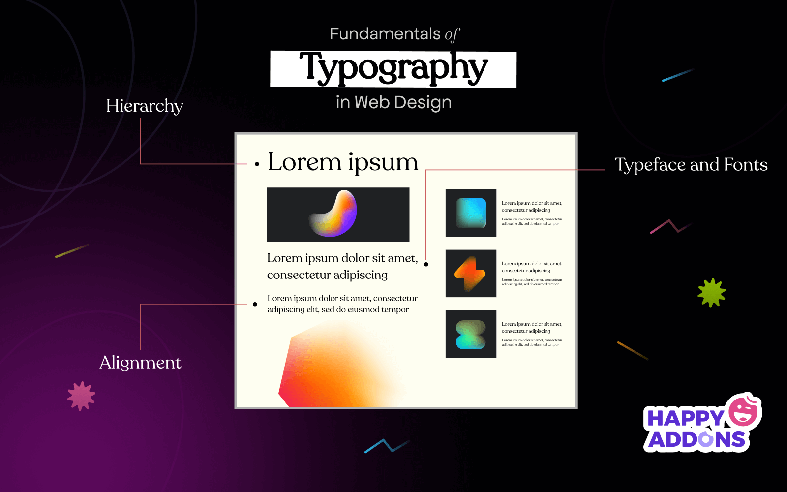
As we plunge deeper into the world of typography, we find that readability is its cornerstone, a symphony that resonates with every viewer. Consider this: sans-serif fonts might often grace the headlines, with their crisp lines commanding attention, while their serif counterparts provide comfort in the depths of longer narratives. Each choice of type warrants the utmost consideration, shaping user interaction and satisfaction.
Moreover, think about how hierarchy acts as a conductor in this grand symphony. By orchestrating varying sizes, weights, and colors, designers can draw the audience’s gaze, directing them to significant points while allowing softer notes to linger in the background. Typography thus becomes a powerful tool for communication, guiding readers through the content as if flipping through the chapters of a captivating novel.
Navigating the Landscape of Modern Typography
Today’s web is a vibrant tapestry woven with both web fonts and system fonts, each presenting unique advantages and challenges. Web fonts, brimming with personality, open up vast creative avenues, offering designs that stand out and breathe life into a digital canvas. However, one must tread cautiously, as the delicate balance between aesthetics and performance must be maintained, with loading times looming like a shadow over a designer’s masterpiece.
Conversely, system fonts, the silent workhorses of web design, boast speed and reliability. Already present on users’ devices, they load swiftly, ensuring that the user experience remains smooth and unblemished. The choice between these options calls for introspection, as understanding the audience’s needs leads to better decision-making in the typography journey.
Embracing Typography’s Impact
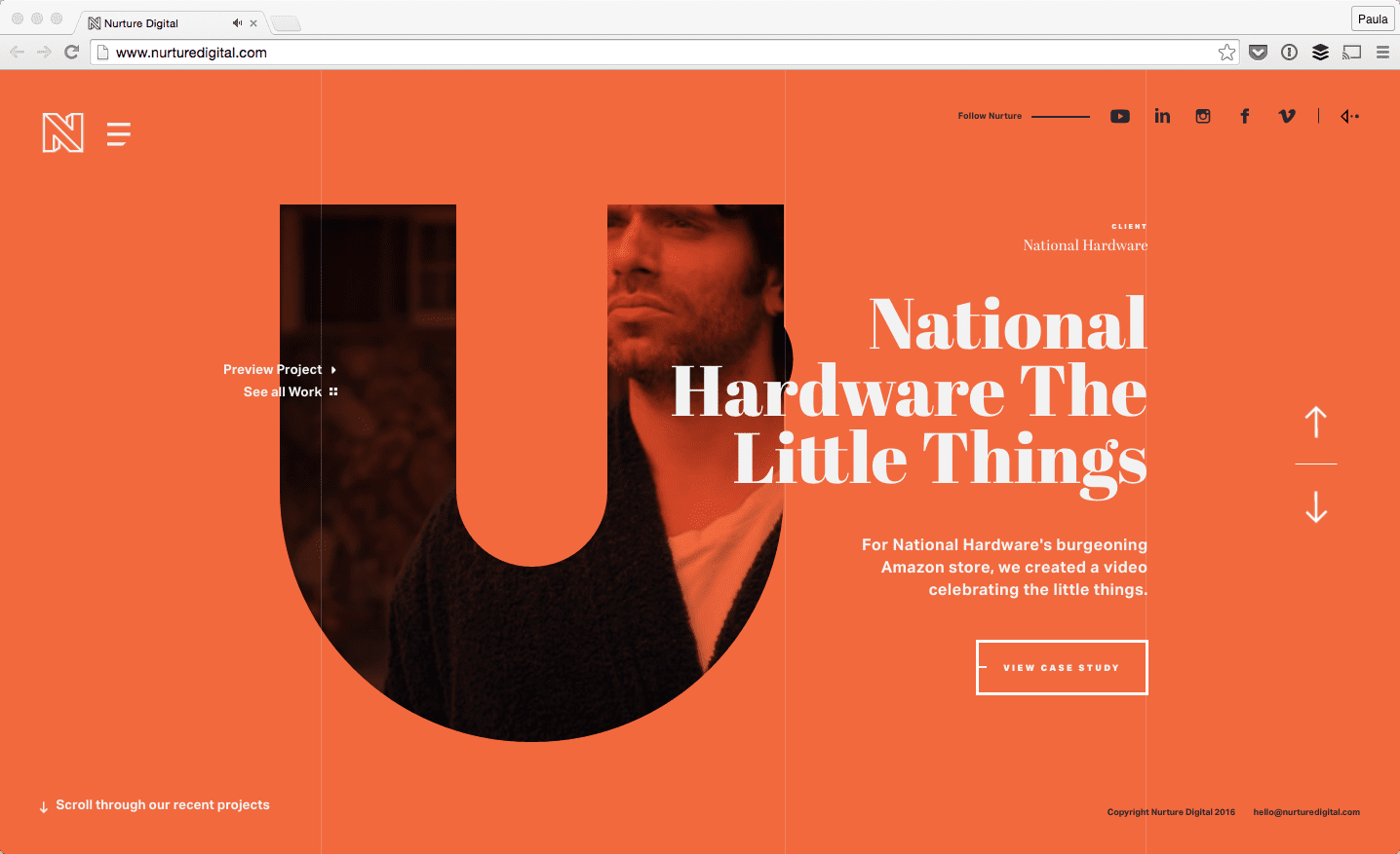
In the world of web design, typography emerges as a silent yet powerful architect, shaping not just the visual framework but also guiding user experience through a harmonious blend of aesthetics and function. Think of typography as the voice of your website; it sets the tone for communication, entices visitors to stay longer, and aids in deciphering your message. Embracing effective typography is akin to weaving a narrative that captivates the eyes and minds of onlookers. When wielded wisely, typography enhances readability, builds structure, and establishes a hierarchy that leads users effortlessly from one section to another, cementing their journey through your site.
To summarize the essence of typography in web design, consider the following points:
– **Readability and Accessibility**: Opt for fonts that promote clarity, ensuring every visitor finds comfort in consuming your content.
– **Responsive Design**: Adapt your typography dynamically, allowing it to gracefully reshape across devices, from intricate monitors to pocket-sized screens.
– **Visual Hierarchy**: Utilize size, weight, and color to craft a path through your content, beckoning users to explore further and deeper.
The Future of Typography in Web Design
As we gaze into the horizon of web design, the role of typography will only continue to evolve, adapting to the diverse landscape of digital engagement. The rise of AI-driven typography tools promises to provide even more creative options, enabling designers to personalize experiences like never before. Typography will remain a bridge, not just connecting words but also experiences, feelings, and actions across the digital realm. In a world where attention spans are fleeting, effective typography stands as a guardian of communication, embellishing words with clarity and bringing them to life with color and form.
Looking ahead, keep in mind these critical aspects that will shape the future of typography:
– **Innovative Digital Tools**: Embrace cutting-edge platforms that enhance typographic creativity and simplify the design process.
– **Holistic User Experience**: Prioritize the emotional journey of users, ensuring that typography not only captures attention but also resonates on a deeper level.
– **Sustainability in Design**: Adopt eco-friendly web practices, considering not only performance but also the ecological footprint of the digital choices you make.

