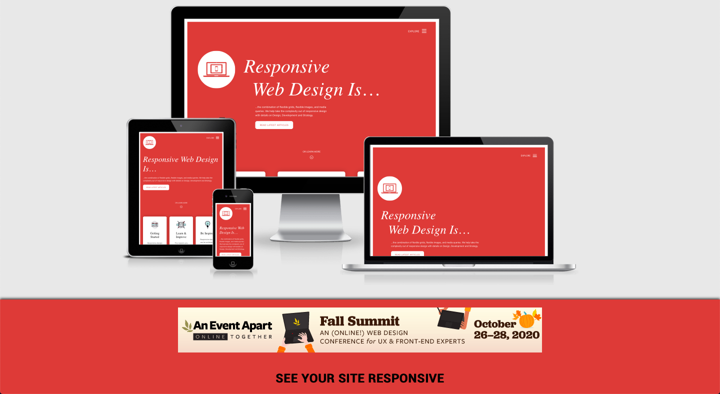
Anyone who builds websites knows that responsive design is important. In fact, any modern website should be built with responsive techniques in mind.
While there are plenty of tools for creating responsivity, it’s tougher to find debugging & testing tools. And what good is an untested layout? About as good as an uninspected car, although less threatening to your corporeality.

The following tools are built for responsive testing on any medium. Here are some of the best ones worth checking out.
1. Designmodo Responsive Test
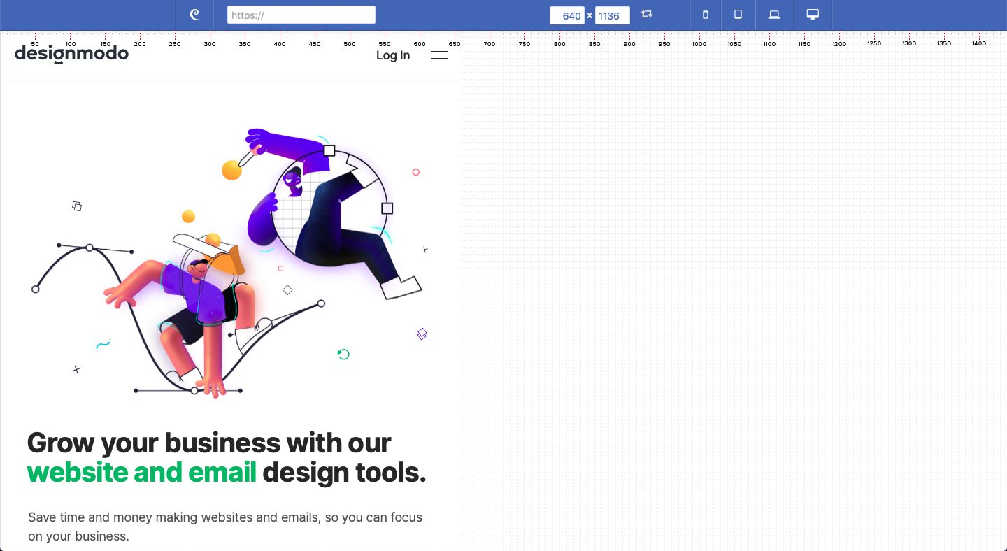
Perhaps the greatest free online web app is Responsive Test by Designmodo. This was built specifically for users who need to test their responsive layouts.
The interface is completely draggable and resizable without changing the browser window. You’ll find a ruler fixed along the top of the page and manual inputs for resizing. Plus, there are custom dropdown menus that include pre-determined sizes for smartphones, tablets, and e-readers.
All in all, this is the responsive tool you’d want to try out. It has everything you could possibly need in one place. The interface is really intuitive and it just feels like home.
2. BrowserStack
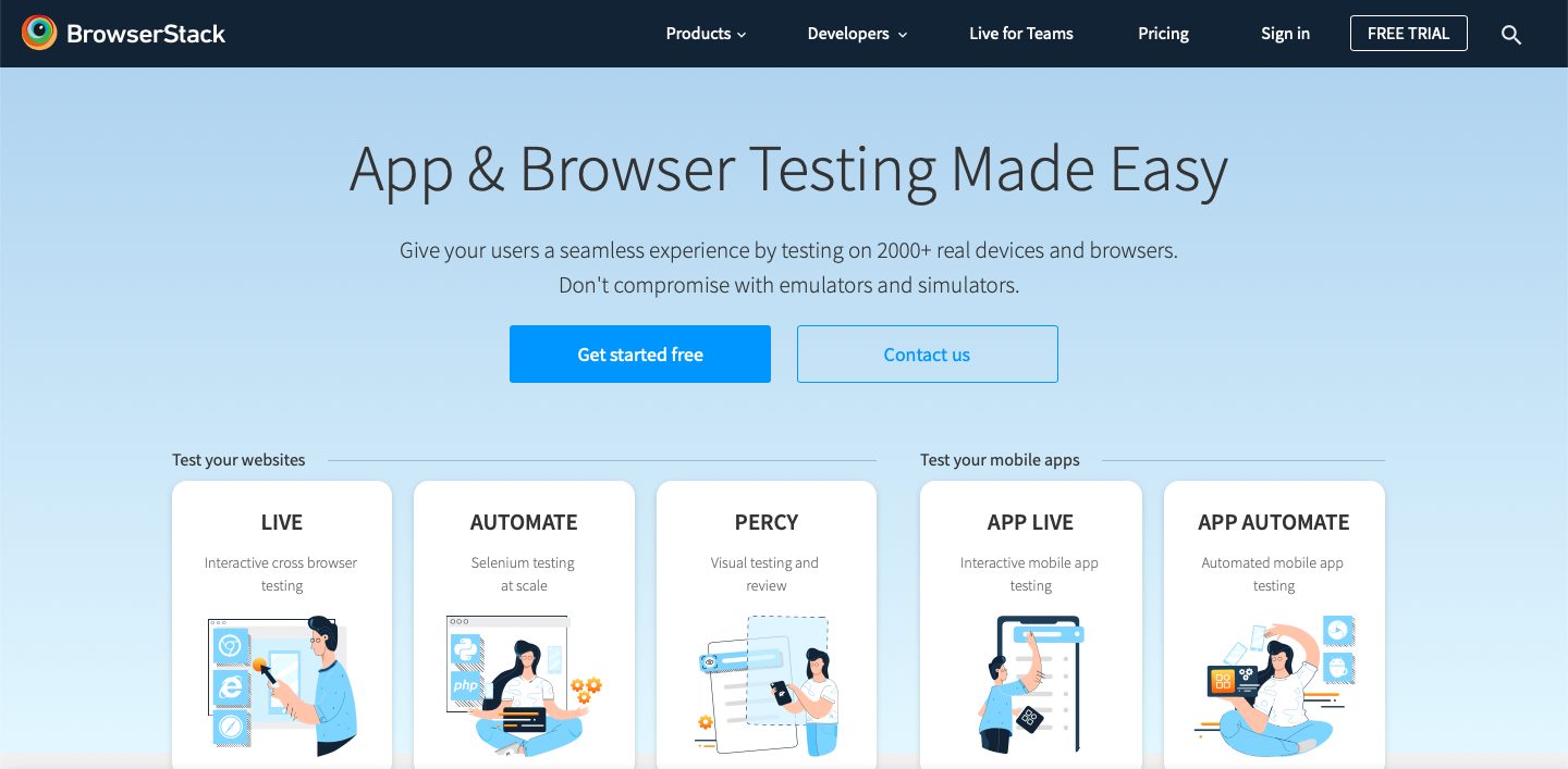
Used by over 36,000 clients, BrowserStack is another popular responsive testing tool that you can use for your layouts. Even big companies like Microsoft and Twitter use this tool for their needs. You can test your site on over 2,000 browsers with this tool
3. Responsinator
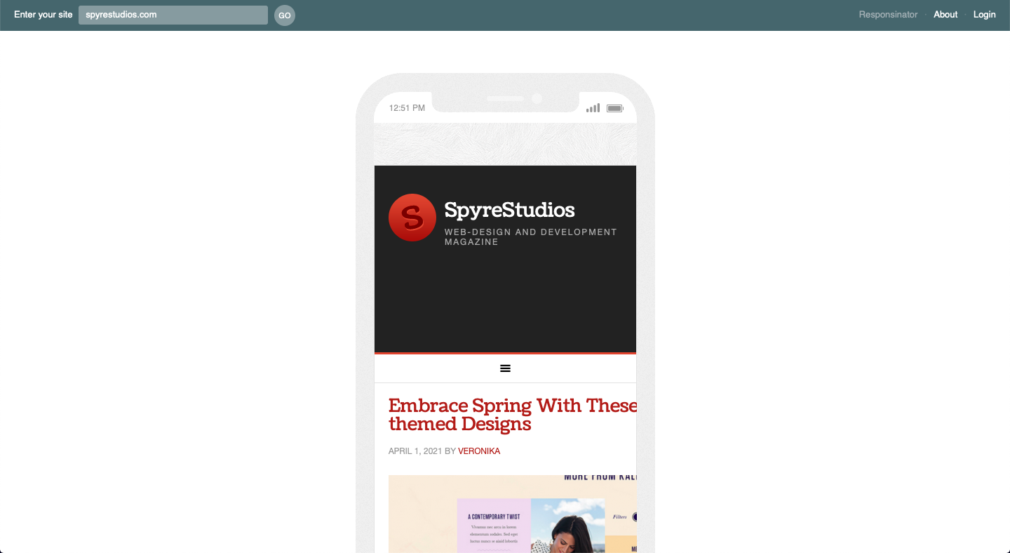
If you’re looking for something easy to use, the Responsinator is the one for you. This tool allows users to see how their sites would look on different types of devices. Just enter the URL of your website and it’ll load that page for you.
4. Screenfly
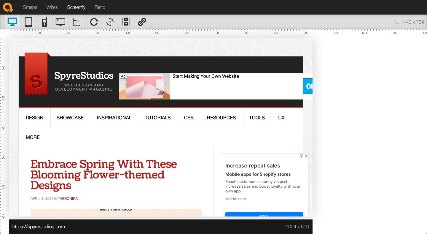
Another tool where you can check how your site looks on different screen sizes is Screenfly. It’s available not just on computers but also on phones and even tablets. Input your website URL and you’ll the difference.
5. Cross Browser Testing
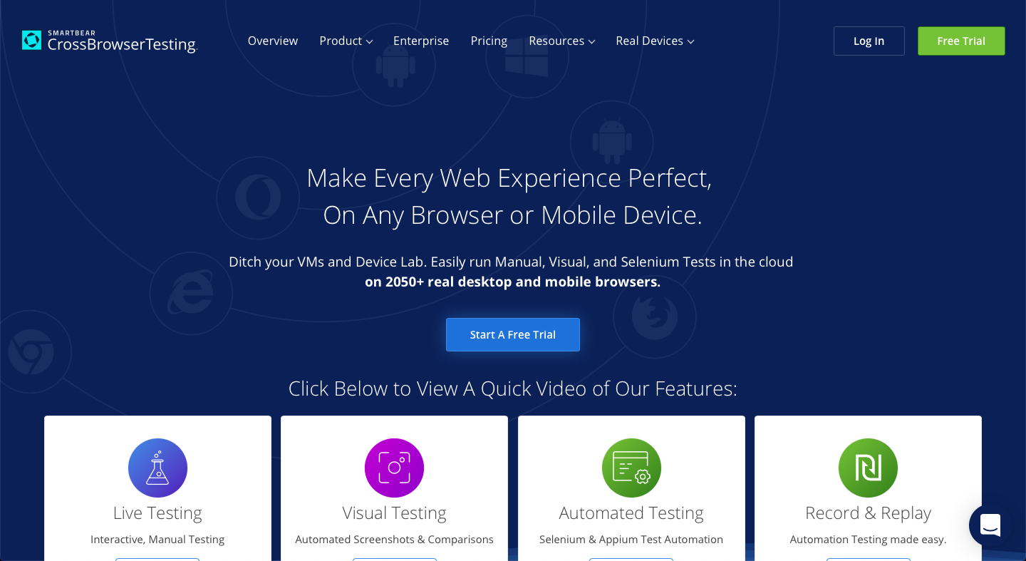
If you want a tool that’s multi-functional, you might want to check out Cross Browser Testing. It’s a convenient way of checking your site’s responsiveness. You can test it out for several screen sizes and devices all at the same time. Isn’t that just efficient? You can take screenshots and compare them one by one.
6. Viewport Resizer

You can also just getting an extension for your browser. The ViewPort Resizer can be added to your Google Chrome browser and it’ll help you see how your site looks in different formats. It even offers 47 options for screen sizes.
7. Responsive Design Checker
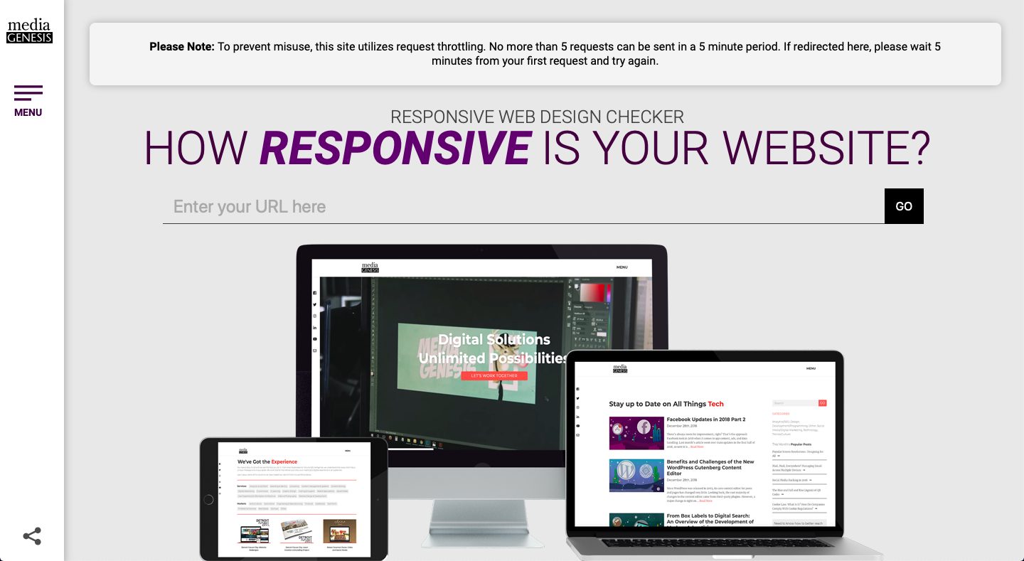
Another tool that tests responsiveness for websites and offers various screen sizes is Responsive Design Checker. It can check large screen sizes up to 24 wide. Plus, it features screenshots that you might find useful for mockups.
8. Lambda Test
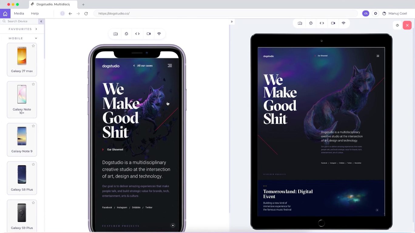
Aside from large screen, you also have to consider how your website will look like on mobile devices. Lambda Test helps users see their websites in mobile mode, whether you’re using an android or an iPhone. In addition, you can also make your own custom device view port.
9. Responsive Test Tool
Just like other responsive testing sites, Responsive Test Tool is easy to use and navigate. Just enter the URL of your website into the search bar and it’ll load your page for you. You can select any of its preset device sizes or customize your own. If you change up your website, you can simply click the Check button to reload it on this webpage.
10. Am I Responsive
Similar to Responsinator, Am I Responsive has a set number of devices or screen sizes that you can test your website for. Nonetheless, it’s quite useful and easy to use to check how your website looks on different devices. Plus, you can take screenshots of this in case you need samples for your portfolio.
These 10 tools should give you more than enough to work with. Anyone who does responsive design knows that it can be tough. But with the right tools & resources at your disposal, the process gets a little easier.
Responsive web designers will love these other posts:
34 Inspiring & Responsive Web Design Portfolio Layouts
Popular Responsive Grids for Designing Website Layouts
The post 10 Best Tools for Testing Responsive Websites


