The evolution of the Firefox logo is a signal of an evolving brand. Mozilla Firefox was one of the best browsers in the early 2000s. It was fast, it was new, it was efficient, it could open multiple tabs (something that many browsers couldn’t do at the time). It was a great break from Internet Explorer, a browser that we don’t understand why we hate so much. However, more than just a browser, Mozilla Firefox was a brand.
What better way to represent a brand, than a good logo right? This is what we should always consider as designers. We must understand the visions of the company, the people who created the company, to be able to create a logo that will represent who and what they are. Let’s be honest, to think about this as designers, creating the logo is such a daunting task.
So for inspiration, as you create a new logo for your new client, this article takes a quick look at the different logos of Mozilla Firefox, what they represent, and what they mean to the company:
The Pheonix: 2002
There is not much explanation on why and how the first logo of Mozilla looks like a Phoenix. But, the phoenix on the logo seems like it is being reborn from the flames. Mozilla has a very long history, being its age now in 2021. We know that the browser was just a small project back in 1998 and was only intended for programmers. But it was supported by so many people within the industry and has expanded into this big community by surprise. Maybe what the logo is trying to say that everything changes and gets renewed to have a new life. Pretty cool, huh?
The Firefox: 2004
The new logo was designed by Jon Hicks of Hicksdesign. It was rendered from a concept created by both Daniel Burka and Stephen Desroches – both of whom are big names in product design and management.

Image Source: 1000 Logos
The meaning behind the logo is actually pretty straightforward, but heartwarming at the same time. As we can see, the orange ‘firefox’ is embracing the blue globe. For the Mozilla team, this represents the coverage of the browser. It means that it could take you around the globe with its incredible speed. And, the browser (since it is open-source at the time) is accessible to EVERYONE allover the world.
INTERESTING FACT: The orange animal we have always thought was a “firefox” is actually a red panda. The red panda is a protected species in China. It somewhat looks like a cross between a bear and a fox, but in reality, it is scientifically more of a raccoon.

Image Source: Flickr
The Minimalist: 2021
Over time, the Mozilla logo has been updated and overhauled but not in a major way to change the way it looks. But the latest logo is not such a big surprise for everyone. Since 2018, the company has been showing off different versions of their logo, to test the waters on the users’ reaction.
In this new logo, the red panda and the earth have obviously disappeared. It is a minimalistic take of the old logo but the concept remains the same. What this new logo represents is that all companies, especially in tech, should adapt to changes so that it survives.
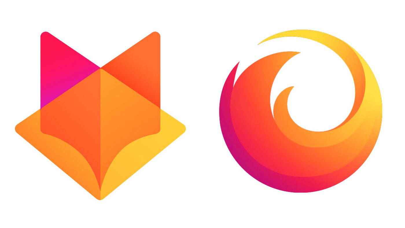
Image Source: Mozilla
Also read: Best Portable Tripods for Taking Your Own Photos
The post The Evolution of the Firefox Logo


