There are multiple laws of UX that designers must know by heart to make sure that their work meets user expectations. However, there are so many UX laws, sometimes, it is difficult to remember and apply all of them. There are a few basic UX laws that designers must know by heart, and are already considered as “norms” in the design world. These are the kinds of laws we learn about and help us understand why apps and websites are designed the way they are. All these laws must be in conjunction with UX design principles to make sure that your design work matches user requirements.
Here are some of the most important UX Laws we must know as designers:
Aesthetic-Usability Effect
In users’ minds, designs pleasing to the eyes appear more usable.
Researches show that interfaces that are more aesthetically pleasing are not only more preferred by users but are also perceived to be more user friendly.
The best example of this would be a Macbook Pro. We are all used to finding the menu bar on the left side of the panel instead of the bottom. It is also second nature for us to think that the exit button is the left-most choice, instead of the rightmost. Non-Apple products also have less bloatware on their desktop making their interface cleaner. This is how Apple products have maximized aesthetics.

Jacob’s Law
Users prefer that your product (app, or website) work as others that they are familiar with.
This is where standards usually come in. It could be in a website layout, ad placement, gestures, and the like. How we design our website or app should follow the same “standards” as other more popular apps or websites.
For instance, the use of gestures on an app should be similar to how gestures work in other apps. This is why a pinching motion is always used to zoom a photo in or out in whatever app is in question.
Another more practical example of this would be how e-commerce sites structure their pages similarly with, say, Amazon. The product is don’t the left side, the “add to cart” button is on the right. The prices are usually styled in a bold red font.

Law of Proximity
Anything close together is understood to belong to the same group.
This is why spacing between categories on a website, or spacing between posts is important. Even if you have clear indicators between two different topic categories, putting that space in between still makes a big difference.
Take this BBC website screenshot as an example. The relative spacing between each “feature” shows that they are of the same group. But the spacing between the news and sports categories tell readers that these posts are from different categories:

Zeigarnik Effect
People remember interrupted tasks better than completed ones.
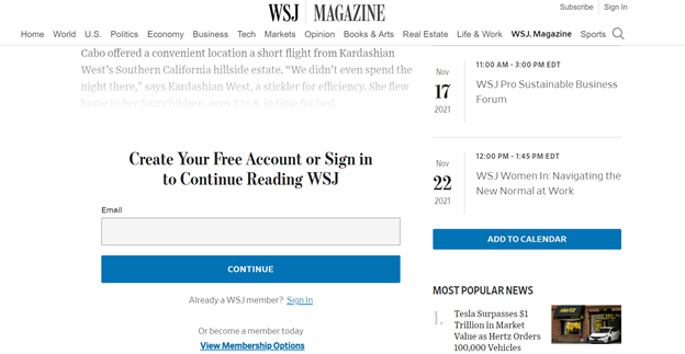
This is where careful ad placement can be seen in between tasks or videos. It is also why websites that require registration or payment will let you read part of the posts first. And, if you want to continue you must do a certain action (like register, signup, or pay a premium).
Pragnanz Law
Users interpret complex images in their simplest form because it requires the least mental effort.
This law is also known as the law of simplicity. Most of the time, users appreciate designs that require less mental effort. The law of simplicity explains why call-to-action buttons are shaped either as a rectangle or an oblong, than anything else. Also, even if we turn these buttons into their 3D form, we retain the original flat shape (square to a cube).

Also read: 16 CSS Social Media Icons
The post 5 Laws of UX Every Designer Must Know


