

Overview
This is part two of a two-part series about React-Bootstrap-Table. In part one we created a simple React application using react-create-app, added React-Bootstrap-Table, populated a table with data, worked with columns, styled the table, and selected rows.
In this part we’ll continue the journey by expanding rows, adding rows, deleting rows, and covering pagination, cell editing, and advanced customization.
Expanding Rows
This is one of the coolest features of React-bootstrap-table. When displaying tabular data, there is often additional data you may want to see on one or two rows, but you can’t display all the data for all the rows.
One option to address that is to show tooltips, but tooltips require that you hover with the mouse over the target area, and you can only see one tooltip at a time. Expanding rows let you display additional data for each row in a kind of drawer that stays expanded as long as you want, and you can collapse it back when you’re done. You can expand as many rows as you want at the same time. Here is how it’s done with React-bootstrap-table.
The love map contains relationships between some Arrested Development characters: Gob loves Marta and Buster loves Lucile 2. The isExpandable() function controls which rows are expandable. In this case, it returns true for rows whose character name is in the love map. The expandRow() function returns a component when a row is expanded.
The returned component is displayed below the row until the row is collapsed. Configuring row expansion is a little tricky. Some options are just props on the BootstrapTable component.
The expand column options are one object prop, and then there is a prop called options that contains additional row expansion options like expandRowBgColor and expanding. It would be much simpler if there was just one prop called expandRowProp that contained all the options (like the selectRowProp).
import React, {Component} from 'react'
import {BootstrapTable, TableHeaderColumn}
       from 'react-bootstrap-table'
import '../css/Table.css'
import '../dist/react-bootstrap-table-all.min.css'


const loveMap = {
  Gob: 'Martha',
  Buster: 'Lucile 2',
}


function isExpandableRow(row) {
  return row['name'] in loveMap;
}

function expandRow(row) {
  return (
    {row['name']} loves {loveMap[row['name']]}.
  );
}


class Table5 extends Component {
  render() {
    const options = {
      expandRowBgColor: 'pink',
      expanding: [1] // initially expanded
    }
    return (


            ID


            Name


            Value


    )
  }
}

export default Table5

Pagination
So far we displayed just three rows of data. Tables are designed to display a lot of data that doesn’t necessarily fit on the screen at the same time. That’s where pagination comes in. React-bootstrap-table supports many pagination options.
Let’s populate our table with 100 items, which will be ten pages of ten items each. We will use a getData() function that returns an array of 100 objects with ids, names, and values based on their index.
Let’s also specify which page to display initially (4), customize the text for prev, next, first and last page (using Unicode arrows for extra coolness) and finally provide a custom function called showTotal() to display the total number of items. Note that the attribute for controlling the previous page button is called “prePage” and not “prevPage” (it got me). All the pagination options go into the general “options” attribute of the table.
import React, {Component} from 'react'
import {BootstrapTable, TableHeaderColumn}
        from 'react-bootstrap-table'
import '../css/Table.css'
import '../dist/react-bootstrap-table-all.min.css'


function getData() {
  var data = []
  for (var i = 0; i < 100; ++i) {
    data[i] = {id: i, name: 'item_' + i, value: i}
  }

  return data
}


function showTotal() {
  return There are 100 items total
}


class Table6 extends Component {
  render() {
    const options = {
      page: 4,
      prePage:  '⟵',
      nextPage: '⟶',
      firstPage: '⟸',
      lastPage: '⟹',
      paginationShowsTotal: showTotal
    }
    return (


            ID


            Name


            Value


    )
  }
}

export default Table6

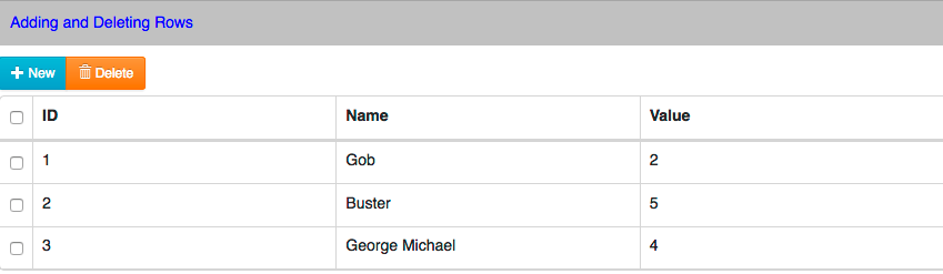
Adding and Deleting Rows
So far we used the table to display information in a variety of ways. But tables can be used as a user interface for manipulating data. Let’s see how to add and remove rows from a table.
The key attributes are insertRow and deleteRow. When you specify them, “New” and “Delete” buttons are added. If you click the “New” button, a modal dialog opens up and lets you add new rows. If you click the “Delete” button, all selected rows are deleted. To delete rows, you must enable row selection, of course. You can also attach hook functions that are called after adding or deleting rows.
import React, {Component} from 'react'
import {BootstrapTable, TableHeaderColumn}
        from 'react-bootstrap-table'
import '../css/Table.css'
import '../dist/react-bootstrap-table-all.min.css'


function onInsertRow(row) {
  let newRowStr = ''

  for (const prop in row) {
    newRowStr += prop + ': ' + row[prop] + ' n'
  }
  alert('You inserted:n ' + newRowStr)
}


function onDeleteRow(rowKeys) {
  alert('You deleted: ' + rowKeys)
}

class Table7 extends Component {
  render() {
    const options = {
      afterInsertRow: onInsertRow,
      afterDeleteRow: onDeleteRow
    }

    // To delete rows you be able to select rows
    const selectRowProp = {
      mode: 'checkbox'
    }

    return (


            ID


            Name


            Value


    )
  }
}

export default Table7
Cell Editing
Another form of data manipulation is in-place editing (a.k.a. cell editing). Cell editing can be triggered by a click or double-click. Cell editing is controlled by the “cellEdit” attribute. In addition to the mode, you can specify non-editable rows and hook functions.
In the following code, the nonEditableRows function simply returns the row key 3, but could use a more sophisticated logic.
import React, {Component} from 'react'
import {BootstrapTable, TableHeaderColumn}
        from 'react-bootstrap-table'
import '../css/Table.css'
import '../dist/react-bootstrap-table-all.min.css'


class Table8 extends Component {
  render() {
    const cellEditProp = {
      mode: 'click', // 'dbclick' for trigger by double-click
      nonEditableRows: function() {
        return [3];
      }
    }
    return (


            ID


            Name


            Value


    )
  }
}

export default Table8

Exporting Your Data
Sometimes, viewing your data and playing with it in a web UI is not enough, and you need to take your data and feed it to other tools. The way to do it with React-bootstrap-table is very simple. You just add the exportCSV attribute (and optionally a filename) and an export button is added. When you click the button, it allows you to save your data to a CSV file.
import React, {Component} from 'react'
import {BootstrapTable, TableHeaderColumn}
        from 'react-bootstrap-table'
import '../css/Table.css'
import '../dist/react-bootstrap-table-all.min.css'


class Table9 extends Component {
  render() {
    return (


            ID


            Name


            Value


    )
  }
}

export default Table9

Here is the exported data from our little table:
"id","name","value"
"1","Gob","2"
"2","Buster","5"
"3","George Michael","4"
Customizing All the Things
We covered a lot of material, but React-bootstrap-table has a lot more in store. Practically, every aspect can be customized. Read the full documentation on how to customize a table.
Here is a list of the customizable parts:
- Cell
- Toolbar
- Insert Modal
- Pagination
- Column Filter
- Cell Editing
- Row Selection Column
Conclusion
React-bootstrap-table packs a powerful punch. It provides out of the box a pleasant user interface for displaying, searching and manipulating tabular data. The API is very consistent—major features can be enabled by specifying a simple attribute and optionally customized with additional attributes that often can be dynamic functions.
While the default behavior and the basic configuration should satisfy most users, if you need more advanced features and customization, there is ample documentation and examples how to go about it.
Over the last couple of years, React has grown in popularity. In fact, we have a number of items in the marketplace that are available for purchase, review, implementation, and so on. If you’re looking for additional resources around React, don’t hesitate to check them out.
Powered by WPeMatico


