How can you tell if your brand is working for you? And what does “successful branding” even entail?
Branding is tricky in that it’s generally difficult to assess ROI. Done well, and it can breathe life into a struggling company. Done wrong, and it can ruin the perception of even the most well-established brands. While there are many aspects of successful branding, perception often starts with the logo. It’s the face of your brand, appearing everywhere from billboards, business cards, packaging and even the product itself. This is why companies spend a great deal of time and money into creating and often times re-creating the perfect logo.
So what is it about branding that burns itself into a collective memory? In an effort to better understand the most important parts of a logo, this design study of over 8,000 people in the United States gave participants a multiple choice test to see if they could identify the real logo of eight iconic food brands when it was placed in a line-up with imposters. It explores elements like color, font and tagline to see what was remembered most by consumers.
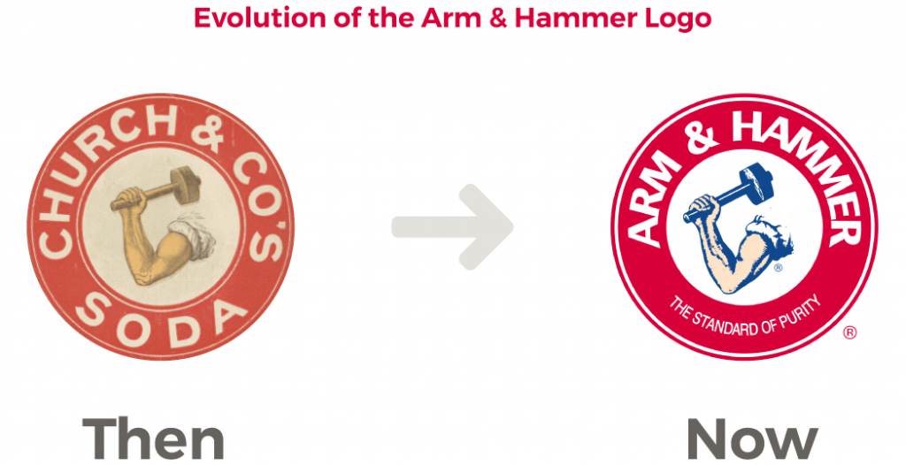
The idea was to gauge which parts of a logo left an impression on individuals and which were fungible. Looking at the survey results, you can see what individuals recognized most about the logos of iconic food brands like Arm & Hammer, Chicken of the Sea and French’s. See how the rebranding efforts and food logo redesign of these major companies have impacted their brand image among consumers.
Arm & Hammer


Chicken of the Sea


Check out more iconic food logo redesign stats here.
The post What We Can Learn From Redesigns of Iconic Food Logos appeared first on SpyreStudios.
Powered by WPeMatico


