Whether you are a beginner or a seasoned pro in the art of web design, you still can’t avoid making mistakes. After all, it is from mistakes that we learn. However, it also does not hurt to know what mistakes can be prevented. In the spirit of the Halloween month, here’s our list of scary web design mistakes you should avoid.
Inconsistent Fonts
We always talk about having consistent branding in our web design. This means we use the same motifs, same color palettes, and more. This also includes using the same fonts in our web design. Not only does it look messy from a viewer’s perspective, it looks bad overall. So when something looks bad for the viewer, they tend to go and never come back. And we don’t want that.
However, using consistent fonts is not enough. You also have to find a font that suits your design or your branding best. Obviously, using comic sans is a big no-no for designers. You can choose from handwritten fonts, script fonts, serif fonts, and more. Take a look at typography websites and see their brilliant use of fonts and how it aligns with their brand.
Cluttered Pages
Cluttered pages are also a no-no in web design. Using space in design is very important – this also applies in web design. Space makes your design breathe, and it’ll be easier on the eyes. Moreover, when a design is too cluttered, the things you want to be highlighted or emphasized won’t be noticed. This is because a lot of things are going on in the design that the viewer won’t know where to look.
Unclear Purpose
First impressions are very important, especially in web design. At a glance, you should be able to tell the visitor what the brand does, what it can do for the visitor, and that you can be trusted. However, when the visitor gets confused with your website, or it is unclear what kind of company you are – there is a chance that you will lose a potential customer.
Make sure to be straightforward in your design and let the user immediately know what the company does. You can add a snippet of the services, testimonials, or even awards the business has received.
Not Mobile-Friendly
A website being mobile-friendly is such an important thing to take note of. Majority of people can now access the internet through their smartphones or tablets. It is also much smaller than a laptop or computer, and the web can be accessed via mobile data. This is why a lot of people just check websites through their phones, which means it’s important for designers to make websites mobile-friendly.
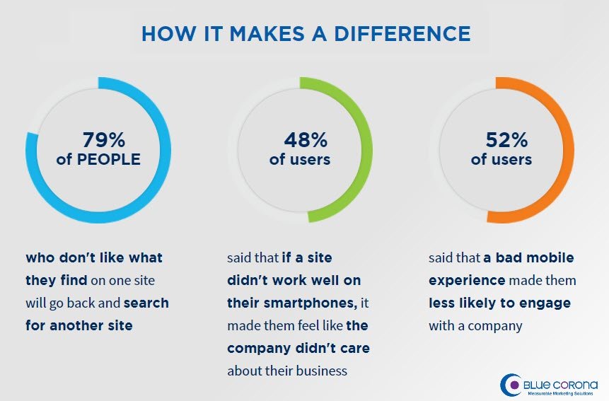
 Image Credit: Blue Corona
When a website is not mobile-friendly, the desktop version would appear much smaller in our phones. Moreover, the layout of the website will also change – trying to accommodate itself through the medium it was accessed into. You have to make your web design responsive to different mediums because it reflects badly on your part. In fact, 48% say that if a website isn’t mobile-friendly, it feels like that the company doesn’t care. Furthermore, 52% say that a bad mobile UX makes them less likely to interact with the company.
Slow-Loading Websites
 Image Credit: ThinkWithGoogle
In these times where fast internet is already possible, websites that loads slowly is a big mistake. People are impatient, and they can easily go search for another website with the same services but have faster loading time.
As you see from the infographic above, the loading time should not even take 10 seconds, nor 5 seconds. As much as possible, the website should load under 2-3 seconds. And you should take into consideration that people are much more impatient when they’re loading websites via mobile phones.
No Calls to Action
Calls to action are very important as it encourages your (potential) customers to do business with you. Whether this is to sign up for a mailing subscription or to buy a product. When you have no calls to action in your website, half of your website’s purpose is already gone.
However, having too many calls to action in one page is also bad practice. This just confuses potential clients on what you want them to do, or what they can do. It is much better to assign one call to action in each page. For instance, you can put “Sign up!” in one page, while in another page you can put, “Contact Us”.
As mentioned before, your website should mention a clear purpose on what your website is. This does not only apply in making first impressions to visitors, but also applies to calls to action in order to encourage transactions with your business.
You might also enjoy:
6 Common SEO Mistakes Most Web Designers Make (And How To Avoid Them)
Modular Web Design Advantages and Disadvantages
The post Scary Web Design Mistakes You Should Avoid appeared first on SpyreStudios.


