
The navigation bar: a simple and seemingly obvious element of any web page, you’d think.
But it’s important to put thought into your navigation bar so that it works well for your users, eases navigation, and is accessible.
In this article, I’ll show you how to ensure that your navigation bar works as well as it possibly can and is an enhancement to your site rather than an add-on.
Features of a Great Navigation Bar
A great navigation bar will improve User Experience (UX) and be easy for all of your site visitors to use. It will:
- Be clear, with labels that make sense and are relevant to the pages they link to.
- Be in a place that visitors expect it to be—this could be at the very top of the page or underneath a banner.
- Work well on both desktop and mobile (and everything in between), using a burger menu for mobile perhaps.
- Be accessible, which isn’t just about the code but also about the design—are colours sufficiently contrasting and does the menu stay in one place?
- Enhance your site’s design and be consistent in colours and fonts.
- Be permanently available on each page of your site.
That’s quite a lot for a navigation menu to do! WordPress automatically deals with some of the challenges, but let’s look at some of the key elements of an effective navigation menu to identify specific best practices.
User Experience
The most important task for a navigation menu is to make it easy for people to navigate the main areas of your site. Depending on the nature of your site, your menu might include links to any of a number of pages.
- for a news site: links to the sections, using category archives
- for a store: links to the departments, using product categories
- for a small business site: links to static pages with information on the business and its services
- for a blog: links to the most popular categories
Every navigation menu should also include a link to the home page—even if this is linked to via the logo or site name in the header, it should always be in the menu too. You’ll also be likely to include links to other static pages such as an ‘about’ page and a ‘contact’ page.
Links should have clear, short but obvious names, which relate to the content being linked to but aren’t necessarily the same as the title of the page where they link. For example a site with a page called Our Consulting Services might have a link to it in the menu called Consulting.
The Envato Elements site’s main navigation is very simple, with just a few links in a bar at the top of the page. The bar is clearly a navigation bar and stands out on the page:

It’s good practice to ensure that the part of the menu that’s always visible (i.e. the top level navigation) is contained within one line on a desktop browser. This avoids clutter and is neater. If your menu spans two or more lines, consider adding some of the links at a second level, with dropdown menus.
If your menu needs to have more links, there are two ways to address this: by using drop-down lists under the main navigation items, or by adding a mega menu.
Dropdown lists can be created in the WordPress menu screens by adding menu items at multiple levels. A well-coded theme will then translate this into a dropdown menu on the screen. Here’s an example of a page-based site with multiple levels in its menu:

A mega menu is for sites with lots of links that aren’t so easy to break down into subitems, or for sites that want a lot of items to have equal prominence. They’re used a lot by online stores.
To get a mega menu, you could either use a theme with a mega menu included, or install a mega menu plugin. This will let you add and customize your own mega menu.
 WordPressUberMenu and 7 Other Best Mega Menu Plugins
Another element of UX for navigation is the positioning of your navigation menu. Users will always expect this to be at the top of the screen, whether in a bar above the banner, or below the banner. Menus at the very top are sometimes floated to the right of other content such as the site name and logo.
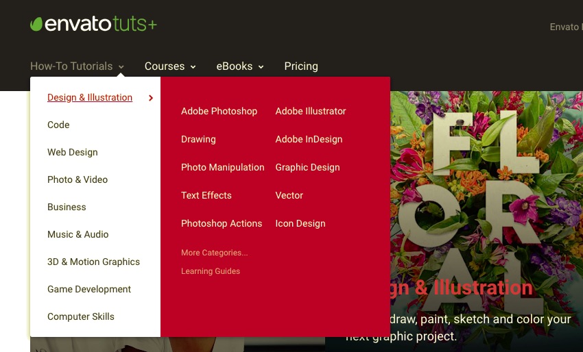
The Tuts+ menu uses a combination of a dropdown and a small mega menu next to one of those dropdowns:

This is in addition to a search bar and links to other parts of the site on the top right of the page.
Another aspect of UX is whether your navigation menu moves with the user as they scroll down the page, staying at the top of the browser window. One experiment found that a fixed or ‘sticky’ navigation menu can be over 20% easier to navigate.
This only works well with a narrow navigation bar; a wide one will get in the way of content. Some themes will include this—a search for ‘fixed menu’ on Envato Elements finds 16 themes. Alternatively you can add this to your own theme using CSS: position: fixed and top: 0.
Sites with fixed menus are relatively rare still but the big social media sites tend to use them, such as Google+:

Visual Design
The visual design of your navigation menu should enhance UX and reflect your brand.
The colors and fonts used in the menu will normally reflect the colors used elsewhere in the site, taking them from a site-wide palette that contrast with the color of other elements around the menu. The Envato sites with their contrasting banner and green on-brand text are a good example of this.
The WordPress.com site doesn’t have a contrasting navigation menu but because the site design is so simple, it’s clear that this is navigation:

The BBC website has a simple navigation men at the very top of the screen. Again this is low-contrast, but it’s obvious that its a menu from the positioning:

If you place your navigation menu below the header (a practice that’s becoming less common as menus at the very top become more popular), then your visual design will need to ensure that it’s clearly a navigation menu and not part of the page.
The Gap website has two navigation menus: one at the top to the company’s other brands, and one under the banner to the store’s departments. It’s clear that this is navigation because of all the white space:

Mobile Navigation
Navigation on desktop and mobile will be different for two reasons:
- People are using fingers or thumbs instead of a mouse.
- There’s less screen space.
This means that if you’ve used a mega menu or a multi-level drop-down menu, you’ll need to find a creative way of adapting this for the smaller screen.
The most common way of adapting navigation for mobile is by adding a burger menu, given that name because it’s often represented by three horizontal lines that look a bit like a burger.
In the case of the Envato Elements site, the menu is represented by a sideways ellipsis (or three dots one above the other):

When you tap on the symbol, you’ll see the menu items, which can be expanded as shown in the two screenshots below:

This is a good example of how to incorporate a large navigation menu on mobile without losing any of the items in the menu or overwhelming the user.
You can add a burger menu to the code of your theme yourself, or you can use a theme with one built-in or add one via a plugin.
Some sites choose to use an alternative menu when being viewed on mobile devices, with fewer links. This may reduce clutter but it’s bad for UX, so I’d advise against it. Instead, use a solution like the one above that retains all the links but adapts it to the small screen.
On mobile, you’ll also need to consider the size of the links in your navigation menu. This is because people will be tapping on them instead of clicking. Make sure your links are sufficiently well spaced out and that it’s difficult for someone to accidentally tap the wrong one.
Accessibility
Its important not to forget accessibility when considering UX, visual design or mobile design. If your navigation menu isn’t accessible, you’re limiting the audience that can use your site—and you may be breaking the law.
Consider the colors in your navigation. If these are low-contrast or the text is small or ornate, then users with visual impairments may struggle to read them. This also applies to people who are short-sighted, and there are millions of us! The web accessibility intitiative has useful guidelines on colors and contrast.
The way the menu is coded is also important. Markup should be structured correctly, with link titles included and lists coded correctly.
Make sure your theme’s code includes an instruction to skip the navigation menu unless it is specifically requested. Otherwise, people accessing your site using a screen reader will have to listen to it reading out the main menu every time they switch to a new page. If you’re using a mega menu this could take some time, and is likely to lead to the user leaving your site.
Consider any visual effects you may be using for your menu. This will include mega menus, dropdown menus, fixed menus and menus that move in any way.
A menu that changes position on the screen or changes colour as the user scrolls is distracting and can cause problems for people with some conditions. My advice would be to keep the design of your menu as clear and simple as possible, and to avoid adding fancy visual effects for the sake of it.
The W3C has a useful tutorial on accessibility and navigation: check it against your site and run your site through a validator before going live.
A Well-Designed Navigation Bar Will Enhance Your Site
The navigation menu is such an obvious part of any website that it’s easy to just throw it in and not take the time to consider its design.
If you follow the tips above, you’ll have navigation that makes it easier for your users to navigate your site, meaning they’ll stick around for longer. Its design will reflect well on your brand and ensure that you’re not excluding users because of the technology they’re using or any disabilities they may have.


