

Since Android 1.5, application widgets have enabled users to get information, control apps, and perform crucial tasks, all from the comfort of their homescreens.
In this two-part series, I’ll be showing you how to provide a better user experience by adding an application widget to your Android projects.
By the end of the series, you’ll have created a widget that:
- Displays multiple sets of data.
- Performs a unique action when the user interacts with a specific
Viewwithin that widget’s layout. - Updates automatically whenever a set period of time has elapsed.
- Updates with new data in response to user interaction.
In this first post, we’ll be using Android Studio’s built-in tools to quickly and easily generate all the files required to deliver any Android application widget. We’ll then expand on this foundation to create a widget that retrieves and displays data and responds to onClick events.
What Are Application Widgets?
An application widget is a lightweight, miniature app that typically falls into one of the following categories:
- Information widget. A non-scrollable widget that displays important information, such as a weather or clock widget.
-
Collection widgets. A scrollable widget that displays a series of related elements, such as a gallery of photos or articles from the same publication. Collection widgets are typically backed by a data source, such as an
Arrayor database. A collection widget must include either aListView,GridView,StackView, or anAdapterViewFlipper. - Control widgets. A widget that acts as a remote control for your application, allowing the user to trigger frequently used functions without necessarily having to launch your application. Applications that play music often provide a widget that lets the user play, pause, and skip tracks directly from their homescreen.
- Hybrid widgets. Why restrict yourself to one category, when you can cherry-pick elements from multiple categories? Just be aware that mixing and matching can lead to a confusing user experience, so for the best results you should design your widget with a single category in mind and then add elements from other categories as required. For example, if you wanted to create a widget that displays today’s weather forecast but also allows users to view the forecast for different days and locations, then you should create an information widget and then add the necessary control elements afterwards.
In addition to the above functionality, most widgets respond to onClick events by launching their associated application, similar to an application shortcut, but they can also provide direct access to specific content within that application.
Application widgets must be placed inside an App Widget Host, most commonly the stock Android homescreen, although there are some third-party App Widget Hosts, such as the popular Nova Launcher and Apex Launcher.
Throughout this series, I’ll be talking about widgets as something you place on the homescreen, but if you have a vague recollection of being able to place widgets on the lockscreen, then this wasn’t just some kind of wonderful dream! Between API levels 17 and 20, it was possible to place widgets on the homescreen or the lockscreen.
Since lockscreen widgets were deprecated in API level 21, in this series we’ll be creating a widget for the homescreen only.
Why Should I Create an Application Widget?
There are several reasons why you should consider adding an application widget to your latest Android project.
Easy Access to Important Information and Features
Widgets allow the user to view your app’s most important information, directly from their homescreen. For example, if you’ve developed a calendar app then you might create a widget that displays details about the user’s next appointment. This is far more convenient than forcing the user to launch your app and potentially navigate multiple screens, just to retrieve the same information.
If you develop a control widget (or a hybrid widget with control elements) then the user can also complete tasks directly from their homescreen. Continuing with our calendar example, your widget might allow the user to create, edit and cancel appointments, potentially without even having to launch your app. This has the potential to remove multiple navigation steps from some of your app’s most important tasks, which can only have a positive impact on the user experience!
Direct Access to All of Your App’s Most Important Screens
Tapping a widget typically takes the user to the top level of the associated application, similar to an application shortcut. However, unlike app shortcuts, widgets can link to specific areas within the associated application. For example, tapping a widget’s New email received notification might launch the application with the new message already selected, while tapping Create new email might take them directly to your app’s ComposeEmail Activity.
By embedding multiple links in your widget’s layout, you can provide convenient, one-tap access to all of your app’s most important Activities.
Create a Loyal, Engaged User Base
As the whole Pokemon Go explosion and subsequent drop-off proved, getting a ton of people to download your app doesn’t automatically guarantee a loyal user base who will still be using your app days, weeks, or even months down the line.
Mobile users are a pretty fickle bunch, and with the memory available on your typical Android smartphone or tablet increasing all the time, it’s easy to lose track of the apps you’ve installed on your device. Chances are, if you pick up your Android smartphone or tablet now and swipe through the app drawer then you’ll discover at least one application that you’ve completely forgotten about.
By creating a widget that showcases all of your app’s most valuable information and features, you ensure that each time the user glances at their homescreen they’re reminded not only that your app exists, but also that it has some great content.
Adding an App Widget to Your Project
Even the most basic widget requires multiple classes and resources, but when you create a widget using Android Studio’s built-in tools, all of these files are generated for you. Since there’s no point in making Android development any harder than it needs to be, we’ll be using these tools to get a head-start on building our widget.
An application widget must always be tied to an underlying app, so create a new Android project with the settings of your choice.
Once Android Studio has built your project, select File > New > Widget > AppWidget from the Android Studio toolbar. This launches a Configure Component menu where you can define some of your widget’s initial settings.

Most of these options are pretty self-explanatory, but there are a few that are worth exploring in more detail.
Resizable (API 12+)
If a widget is resizable, then the user can increase or decrease the number of “cells” it occupies on their homescreen, by long-pressing the widget and then dragging the blue handles that appear around its outline.
Wherever possible, you should give your widget the ability to resize horizontally and vertically, as this will help your widget adapt to a range of screen configurations and homescreen setups. If a user has a seriously cluttered homescreen, then it may be impossible for your widget to even fit onto that homescreen, unless your widget is resizable.
If you do want to create a non-resizable widget, then open the Resizable dropdown menu and select either Only horizontally, Only vertically, or Not resizable.
Minimum Width and Height
The minimum width and height specifies the number of cells your widget will initially occupy when it’s placed on the homescreen.
For resizable widgets, this is the smallest the user can size your widget, so you can use these values to prevent users from shrinking your widget to the point where it becomes unusable.
If your widget isn’t resizable, then the minimum width and height values are your widget’s permanent width and height.
To increase a widget’s chances of fitting comfortably across a range of homescreens, it’s recommended that you never use anything larger than 4 by 4 for the minimum width and height values.
While the exact width and height of a homescreen “cell” vary between devices, you can get a rough estimate of how many DPIs (dots per inch) your widget will occupy using the following formula:
70 × number of cells -30
For example, if your widget is 2 x 3 cells:
70 x 2 - 30 = 110
70 x 3 - 30 = 180
This widget will occupy around 110 x 180 DPIs on the user’s homescreen. If these values don’t align with the dimensions of a particular device’s cells, then Android will automatically round your widget to the nearest cell size.
Review all the options in this menu and make any desired changes (I’m sticking with the defaults) and then click Finish.
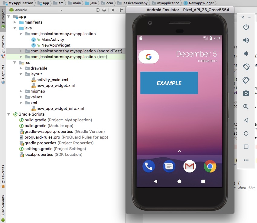
Android Studio will now generate all the files and resources required to deliver a basic application widget. This widget isn’t exactly exciting (it’s basically just a blue block with the word Example written across it) but it is a functional widget that you can test on your device.
To test the widget:
- Install your project on a physical Android device or AVD (Android Virtual Device).
- Launch Android’s Widget Picker by pressing any empty space on the homescreen, and then tapping the word Widget that appears towards the bottom of the screen.
- Swipe through the Widget Picker until you spot the blue Example widget.
- Press down on this widget to drop it onto your homescreen.
- Enter resize mode by pressing the widget until a set of blue handles appear, and then drag these handles to increase or decrease the number of cells that this widget occupies.
Exploring the Application Widget Files
This widget might not do all that much, but it includes all the classes and resources that we’ll be working on throughout the rest of this series, so let’s take a look at these files and the role they play in delivering an application widget.
NewAppWidget.java
The widget provider is a convenience class containing the methods used to programmatically interface with a widget via broadcast events. Under the hood, a widget is essentially just a BroadcastReceiver that can respond to various actions, such as the user placing a new widget instance on their homescreen.
Most notably, the app widget provider is where you’ll define your widget’s lifecycle methods, which either get called for every instance of the widget or for specific instances only.
Although we tend to think of a widget as a single entity that the user places on their homescreen once, there’s nothing to prevent them from creating multiple instances of the same widget. Maybe your widget is customisable, to the point where different instances can have significantly different functionality, or maybe the user just loves your widget so much that they want to plaster it all over their homescreen!
Let’s take a look at the different lifecycle methods that you can implement in the widget provider class:
The onReceive Event
Android calls the onReceive() method on the registered BroadcastReceiver whenever the specified event occurs.
You typically won’t need to implement this method manually, as the AppWidgetProvider class automatically filters all widget broadcasts and delegates operations to the appropriate methods.
The onEnabled Event
The onEnabled() lifecycle method is called in response to ACTION_APPWIDGET_ENABLED, which is broadcast when the user adds the first instance of your widget to their homescreen. If the user creates two instances of your widget, then onEnabled() is called for the first instance, but not for the second.
This lifecycle method is where you perform any setup that only needs to occur once for all widget instances, such as creating a database or setting up a service.
Note that if the user deletes all instances of your widget from their device and then creates a new instance, then this is classed as the first instance, and consequently the onEnabled() method will be called once again.
The onAppWidgetOptionsChanged Event
This lifecycle method is called in response to ACTION_APPWIDGET_OPTIONS_CHANGED, which is broadcast when a widget instance is created and every time that widget is resized. You can use this method to reveal or hide content based on how the user sizes your widget, although this callback is only supported in Android 4.1 and higher.
The onUpdate Event
The onUpdate() lifecycle method is called every time:
- The update interval has elapsed.
- The user performs an action that triggers the
onUpdate()method. - The user places a new instance of the widget on their homescreen (unless your widget contains a configuration Activity, which we’ll be covering in part two).
The onUpdate() lifecycle method is also called in response to ACTION_APPWIDGET_RESTORED, which is broadcast whenever a widget is restored from backup.
For most projects, the onUpdate() method will contain the bulk of the widget provider code, especially since it’s also where you register your widget’s event handlers.
The onDeleted Event
The onDeleted() method is called every time an instance of your widget is deleted from the App Widget Host, which triggers the system’s ACTION_APPWIDGET_DELETED broadcast.
The onDisabled Event
This method is called in response to the ACTION_APPWIDGET_DISABLED broadcast, which is sent when the last instance of your widget is removed from the App Widget Host. For example, if the user created three instances of your widget, then the onDisabled() method would only be called when the user removes the third and final instance from their homescreen.
The onDisabled() lifecycle method is where you should clean up any resources you created in onEnabled(), so if you set up a database in onEnabled() then you’ll delete it in onDisabled().
The onRestored Event
The onRestored() method is called in response to ACTION_APPWIDGET_RESTORED, which is broadcast whenever an instance of an application widget is restored from backup. If you want to maintain any persistent data, then you’ll need to override this method and remap the previous AppWidgetIds to the new values, for example:
public void onRestored(Context context, int[] oldWidgetIds,
           int[] newWidgetIds) {
   }
}
If you open the NewAppWidget.java file that Android Studio generated automatically, then you’ll see that it already contains implementations for some of these widget lifecycle methods:
import android.appwidget.AppWidgetManager;
import android.appwidget.AppWidgetProvider;
import android.content.Context;
import android.widget.RemoteViews;

//All widgets extend the AppWidgetProvider class//

public class NewAppWidget extends AppWidgetProvider {

static void updateAppWidget(Context context, AppWidgetManager appWidgetManager,
                              int appWidgetId) {

      CharSequence widgetText = context.getString(R.string.appwidget_text);

    //Load the layout resource file into a RemoteViews object//

      RemoteViews views = new RemoteViews(context.getPackageName(), R.layout.new_app_widget);
      views.setTextViewText(R.id.appwidget_text, widgetText);

 //Tell the AppWidgetManager about the updated RemoteViews object//

      appWidgetManager.updateAppWidget(appWidgetId, views);
  }

//Define the onUpdate lifecycle method//

  @Override
  public void onUpdate(Context context, AppWidgetManager appWidgetManager, int[] appWidgetIds) {

//appWidgetIds is an array of IDs that identifies every instance of your widget, so this
//particular onUpdate() method will update all instances of our application widget//

      for (int appWidgetId : appWidgetIds) {
          updateAppWidget(context, appWidgetManager, appWidgetId);
      }
  }

  @Override

//Define the onEnabled lifecycle method//

  public void onEnabled(Context context) {

      //To do//
  }

  @Override

//Define the onDisabled method//

  public void onDisabled(Context context) {

//To do//

  }
}
The Widget Layout File
The res/layout/new_app_widget.xml file defines our widget’s layout, which is currently just a blue background with the word Example written across it.
The major difference between creating a layout for an Activity and creating a layout for a widget is that widget layouts must be based on RemoteViews, as this allows Android to display the layout in a process outside of your application (i.e. on the user’s homescreen).
RemoteViews don’t support every kind of layout or View, so when building a widget layout, you’re limited to the following types:
AnalogClockButtonChromometerFrameLayoutGridLayoutImageButtonImageViewLinearLayoutProgressBarRelativeLayoutTextViewViewStub
If you’re creating a collection widget, then you can also use the following types when your application is installed on Android 3.0 and higher:
AdapterViewFlipperGridViewListViewStackViewViewFlipper
Subclasses and descendants of the above Views and classes are not supported.
Clicks and Swipes
To ensure users don’t accidentally interact with a widget while they’re navigating around their homescreen, widgets respond to onClick events only.
The exception is when the user removes a widget by dragging it towards their homescreen’s Uninstall action, as in this situation your widget will respond to the vertical swipe gesture. However, since this interaction is managed by the Android system, you don’t need to worry about implementing vertical swipe support in your application.
The Widget Info File
The res/xml/new_app_widget_info.xml file (also known as the AppWidgetProviderInfo file) defines a number of widget properties, including many of the settings you selected in Android Studio’s Configure Component menu, such as your widget’s minimum dimensions and whether it can be placed on the lockscreen.
The configuration file also specifies how frequently your widget requests new information from the App Widget update service. Deciding on this frequency requires you to strike a tricky balance: longer update intervals will help conserve the device’s battery, but place your intervals too far apart and your widget may display noticeably out-of-date information.
You should also be aware that the system will wake a sleeping device in order retrieve new information, so although updating your widget once every half an hour may not sound excessive, it could result in your widget waking the device once every 30 minutes, which is going to affect battery consumption.
If you open your project’s new_app_widget_info.xml file, then you’ll see that it already defines a number of widget properties, including the update interval.
If you do give your users the option of placing your widget on the lockscreen, then bear in mind that the widget’s contents will be visible to anyone who so much as glances at the lockscreen. If your “default” layout contains any personal or potentially sensitive information, then you should provide an alternative layout for your widget to use when it’s placed on the lockscreen.
The res/values/dimens.xml File
Widgets don’t look their best when they’re pressed against one another, or when they extend to the very edge of the homescreen.
Whenever your widget is displayed on Android 4.0 or higher, the Android operating system automatically inserts some padding between the widget frame and the bounding box.

If your app winds up on a device that’s running anything earlier than Android 4.0, then your widget needs to supply this padding itself.
When you create a widget using the File > New > Widget > AppWidget menu, Android Studio generates two dimens.xml files that guarantee your widget always has the correct padding, regardless of the version of Android it’s installed on.
You’ll find both of these files in your project’s res folder:
res/values/dimens.xml
This file defines the 8dpi of padding that your widget needs to provide whenever it’s installed on API level 13 or earlier.
8dp
res/values-v14/dimens.xml
Since Android 4.0 and higher automatically applies padding to every widget, any padding that your widget provides will be in addition to this default padding.
To ensure your widget aligns with any app icons or other widgets that the user has placed on their homescreen, this dimens.xml file specifies that your widget should provide no additional margins for Android 4.0 and higher:
0dp
This default margin helps to visually balance the homescreen, so you should avoid modifying it—you don’t want your widget to be the odd one out, after all!
Your widget’s layout already references this dimension value (android:padding="@dimen/widget_margin") so be careful not to change this line while working on your widget’s layout.
Although these dimens.xml files are the easiest way of ensuring your widget always has the correct padding, if this technique isn’t suitable for your particular project, then one alternative is to create multiple nine-patch backgrounds with different margins for API level 14 and higher, and API level 13 and lower. You can create nine-patches using Android Studio’s Draw 9-patch tool, or with a dedicated graphics editing program such as Adobe Photoshop.
The Project Manifest
In your project’s AndroidManifest.xml file, you need to register your widget as a BroadcastReceiver and specify the widget provider and the AppWidgetProviderInfo file that this widget should use.
If you open the manifest, you’ll see that Android Studio has already added all this information for you.
//The widget’s AppWidgetProvider; in this instance that’s NewAppWidget.java////An intent filter for the android.appwidget.action.APPWIDGET_UPDATE action//
Widget Picker Resource
The res/drawable/example_appwidget_preview.png file is the drawable resource that represents your widget in the Widget Picker.
To encourage users to select your widget from all the available options, this drawable should show your widget, properly configured on a homescreen and displaying lots of useful content.
When you create a widget using the File > New > Widget > AppWidget menu, Android Studio generates a preview drawable automatically (example_appwidget_preview.png).
In part two, I’ll be showing you how to quickly and easily replace this stock drawable, by using Android Studio’s built-in tools to generate your own preview image.
Building Your Layout
Now we have an overview of how these files come together to create an application widget, let’s expand on this foundation and create a widget that does more than just display the word Example on a blue background!
We’ll be adding the following functionality to our widget:
- A
TextViewthat displays an Application Widget ID label. - A
TextViewthat retrieves and displays the ID for this particular widget instance. - A
TextViewthat responds toonClickevents by launching the user’s default browser and loading a URL.
While we could simply drag three TextViews from the Android Studio palette and drop them onto the canvas, if your widget looks good then users will be more likely to place it on their homescreen, so let’s create some resources that’ll give our widget extra visual appeal.
Create the Widget’s Background
I’m going to create a rectangle with rounded corners, a gradient background, and a border, which I’ll be using as the background for my widget:
- Control-click your project’s drawable folder and select New > Drawable resource file.
- Name this file widget_background and click OK.
- Enter the following code:
http://schemas.android.com/apk/res/android"
  android:shape="rectangle">
2. Create the TextView Background
Next, create a shape to use as the background for our TextViews:
- Control-click your project’s drawable folder and select New > Drawable resource file.
- Name this file tvbackground and then click OK.
- Enter the following code:
http://schemas.android.com/apk/res/android"
  android:shape="rectangle" >
3. Create Some Styles
I’m also going to use the following styles:
-
widget_text. A bold effect that I’ll apply to the widget’s text. -
widget_views. The various margins and padding that I’ll apply to myTextViews.
Open your project’s styles.xml file and add the following:
4. Build Your Layout!
Now that all our resources are in place, we can create our widget’s layout. Open the new_app_widget.xml file and add the following:
Finally, open the strings.xml file and define the string resources that we referenced in our layout:
  Widget
  App Widget IDu0020
  Tap to launch URL
Android Studio’s Design tab helps you work more efficiently, by previewing how your layout will render across a range of devices. Switching to the Design tab is far easier than running your project on an Android device every single time you make a change to your layout.
Frustratingly, Android Studio doesn’t supply a dedicated widget skin, so by default your widget’s layout is rendered just like a regular Activity, which doesn’t provide the best insight into how your widget will look on the user’s homescreen.
One potential workaround is to render your layout using the Android Wear (Square) skin, which is comparable to the size and shape of an Android application widget:
- Make sure Android Studio’s Device tab is selected.
- Open the Device dropdown.
- Select 280 x 280, hdpi (Square) from the dropdown menu.

Create the Widget Functionality
Now that our widget looks the part, it’s time to give it some functionality:
- Retrieve and display data. Every instance of a widget is assigned an ID when it’s added to the App Widget Host. This ID persists across the widget’s lifecycle and will be completely unique to that widget instance, even if the user adds multiple instances of the same widget to their homescreen.
- Add an action. We’ll create an
OnClickListenerthat launches the user’s default browser and loads a URL.
Open the widget provider file (NewAppWidget.java) and delete the line that retrieves the appwidget_text string resource:
static void updateAppWidget(Context context, AppWidgetManager appWidgetManager,
                          int appWidgetId) {

//Delete the following line//

  CharSequence widgetText = context.getString(R.string.appwidget_text);
  RemoteViews views = new RemoteViews(context.getPackageName(), R.layout.new_app_widget);
  views.setTextViewText(R.id.appwidget_text, widgetText);

  appWidgetManager.updateAppWidget(appWidgetId, views);

}
In the updateAppWidget block, we now need to update the R.id.id_value placeholder with the widget’s unique ID:
  RemoteViews views = new RemoteViews(context.getPackageName(), R.layout.new_app_widget);
      views.setTextViewText(R.id.id_value, String.valueOf(appWidgetId));
We also need to create an Intent object containing the URL that should load whenever the user interacts with this TextView.
      Intent intent = new Intent(Intent.ACTION_VIEW, Uri.parse("https://code.tutsplus.com/"));
      PendingIntent pendingIntent = PendingIntent.getActivity(context, 0, intent, 0);

//Attach an OnClickListener to our “launch_url” button, using setOnClickPendingIntent//

      views.setOnClickPendingIntent(R.id.launch_url, pendingIntent);
Here’s the complete widget provider file:
import android.appwidget.AppWidgetManager;
import android.appwidget.AppWidgetProvider;
import android.content.Context;
import android.widget.RemoteViews;
import android.app.PendingIntent;
import android.content.Intent;
import android.net.Uri;

public class NewAppWidget extends AppWidgetProvider {

  static void updateAppWidget(Context context,

                              AppWidgetManager appWidgetManager,

                              int appWidgetId) {

//Instantiate the RemoteViews object//

      RemoteViews views = new RemoteViews(context.getPackageName(), R.layout.new_app_widget);

//Update your app’s text, using the setTextViewText method of the RemoteViews class//

      views.setTextViewText(R.id.id_value, String.valueOf(appWidgetId));

//Register the OnClickListener//

      Intent intent = new Intent(Intent.ACTION_VIEW, Uri.parse("https://code.tutsplus.com/"));
      PendingIntent pendingIntent = PendingIntent.getActivity(context, 0, intent, 0);
      views.setOnClickPendingIntent(R.id.launch_url, pendingIntent);
      appWidgetManager.updateAppWidget(appWidgetId, views);

  }

  @Override
  public void onUpdate(Context context, AppWidgetManager appWidgetManager, int[] appWidgetIds) {

      //Update all instances of this widget//

      for (int appWidgetId : appWidgetIds) {
          updateAppWidget(context, appWidgetManager, appWidgetId);
      }
  }
}
Testing the Widget
It’s time to put this widget to the test!
- Install the updated project on your Android device.
- To ensure you’re seeing the latest version of this widget, remove any existing widget instances from your homescreen.
- Press any empty section of the homescreen, and then select your widget from the Widget Picker.
- Reposition and resize the widget as desired.

-
Check that the widget responds to user input events, by selecting the Tap to launch URL
TextView. The application widget should respond by launching your default browser and loading a URL.
If you’ve been following along with this tutorial, then at this point you have a fully functioning widget that demonstrates many of the core concepts of Android application widgets. You can also download the finished project from our GitHub repo.
Conclusion
In this post we examined all the files required to deliver an Android application widget, before building a widget that retrieves and displays some unique data and responds to user input events.
Currently, there’s one major piece of functionality still missing from our widget: it never displays any new information! In the next post, we’ll give this widget the ability to retrieve and display new data automatically, based on a set schedule, and in direct response to user input events.
In the meantime, check out some of our other great posts about Android app development here on Envato Tuts+!
 Android SDKWhat Are Android Instant Apps?
 Android SDKCreating Accessible Android Apps
 Android SDKCreate a Material Design Tabbed Interface in an Android App
 Android SDKQuick Tip: Create a Custom Quick Settings Tile for Android
Powered by WPeMatico


