Honeypot Field: Effective Spam Prevention Techniques
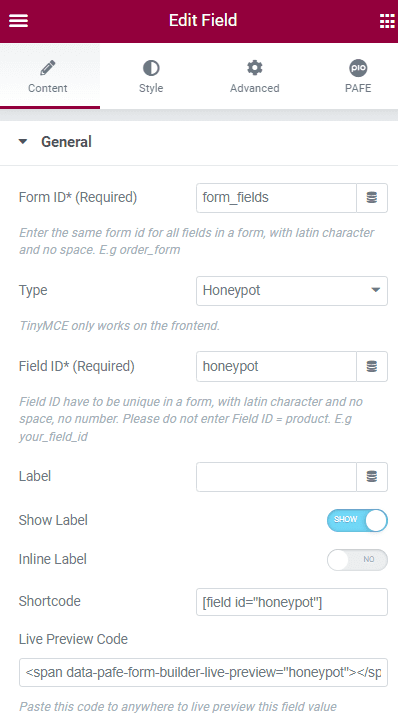
A honeypot field is an essential tool for developers aiming to enhance spam prevention in web forms, effectively keeping unwanted submissions at bay without relying on disruptive methods like reCAPTCHA.In today’s digital world, where bots are increasingly adept at avoiding detection, correctly implementing a honeypot field can significantly bolster form security.
Honeypot Field: Effective Spam Prevention Techniques Read More »