Typography in web design is more than just arranging letters on a screen; it’s a powerful tool that shapes user experience and enhances brand identity. By utilizing effective web typography tips, designers can create an immersive atmosphere, where font choices contribute significantly to a site’s aesthetic and functional appeal. The importance of typography cannot be understated—it guides users through content, ensures readability, and sets the overall tone of the website. With a few best practices in mind, such as choosing appropriate font sizes and ensuring good contrast, you can dramatically improve web design, making it not only beautiful but also user-friendly. In this guide, we will explore the art of typography to help you unlock the full potential of your online presence.
In the realm of digital design, the visual articulation of text, known broadly as type design, serves as a cornerstone for creating effective websites. Engaging with the nuances of typeface selection and the strategic implementation of textual styles can significantly influence user engagement and retention. Understanding the critical elements that dictate the effectiveness of your design layout is fundamental to establishing a coherent narrative throughout your web pages. Delving into the realm of letterform aesthetics and spacing techniques can enrich your web content, creating a symphony of visual communication that resonates deeply with your audience. By embracing the principles of typographical harmony, you can craft designs that not only speak to users but also embody the essence of your digital brand.

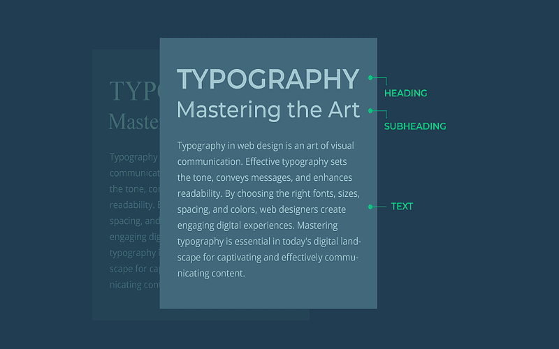
The Basics of Typography in Web Design
Typography is more than just choosing a font; it’s the delicate interplay of letters, spaces, and forms that come together to weave a narrative in the digital realm. Understanding the fundamentals can transform a mundane web page into a captivating story. Each letter holds value, each space between them signifies a pause that allows readers to breathe as they journey through your textual landscape.
In web design, typography shapes the way we interact with content. From the sleek lines of a sans-serif font to the nostalgic curves of a script font, every choice tells a part of your story. The careful selection of typefaces isn’t just about aesthetics but influences user engagement and accessibility, ensuring that every voice is heard loud and clear.
The Nuances of Font Selection
When diving into the world of fonts, one must consider the tone and personality that each face conveys. A light and airy type might suit a cheerful blog, whereas a bold serif font could anchor the gravitas of a financial website. The emotional cadence of typography invites users to linger or encourages them to move swiftly through your content.
But oh, the peril of too many choices! Flooding your layout with fonts can resemble nothing less than a cacophony of voices, each vying for attention while none truly find it. Aim for harmony with a duet of font families: a lyrical serif for headers and a smooth sans-serif for your body text. The rhythm of color and style should create a seamless journey, guiding readers with ease from one section to the next.
Testing and Refining Your Typography
Testing typography is like tuning a finely crafted instrument; the right adjustments bring an orchestra of readability to life. Gather insights from users—are they dancing over the text or stumbling through? Feedback is a composer’s notes, guiding your adjustments to ensure that every phrase sings.
A/B testing different type styles can illuminate which fonts resonate more deeply with your audience. Like an artist stepping back to view the canvas, it’s crucial to analyze the overall impact of your typographical choices. With each iteration, refine your design until it sings a clear and captivating melody, inviting every visitor to stay and read on.

In summary, effective typography is essential for creating compelling web designs that not only attract users but also facilitate their interaction with the content. By prioritizing the following key points, you can harness the true potential of typography in your web projects:
- Establish Visual Hierarchy: Differentiate headers, subheaders, and body text to guide users through your content effortlessly.
- Enhance Readability: Ensure text is legible and easy to read by choosing appropriate font sizes, line heights, and contrasts.
- Align with Brand Personality: Select typefaces that reflect your brand’s tone, whether playful or professional, to create a cohesive visual identity.
- Optimize Typeface Selection: Limit the use of different fonts, focusing on compatibility and web optimization for a seamless experience.
- Implement Best Practices: Pay attention to line length, spacing, and responsive design to enhance user comfort and engagement.
- Utilize Typography Tools: Leverage resources like Google Fonts and Type Scale to create effective and beautiful typographic compositions.
- Test and Adapt: Collect user feedback and conduct A/B testing to refine your typographic choices and maximize readability.
Embrace these principles as pivotal components of your web design strategy, and you will not only enrich user experiences but also cultivate lasting connections with your audience.


