Responsive web design (RWD) is not merely a trend; it is a powerful strategy essential for success in today’s digitally driven marketplace. With an ever-growing number of consumers using smartphones, tablets, and other devices to browse the web, ensuring that your website adjusts seamlessly to any screen size becomes a cornerstone of effective online presence. This adaptability not only enhances the user experience, allowing visitors to navigate effortlessly, but also significantly boosts your site’s visibility in search rankings. Embracing responsive web design means investing in a future-ready platform that can evolve with technological advancements, reinforcing your brand’s commitment to accessibility and user satisfaction. Let’s delve into the myriad of reasons why integrating RWD is critical for your business to thrive in this digital age.
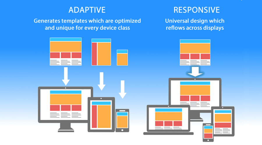
Adaptive design or fluid web layouts, commonly referred to as responsive web design, provide a captivating way to create visually appealing and functional online interfaces. As the digital landscape continues to shift, the necessity for websites to cater to various screen sizes and resolutions is more crucial than ever. This innovative design philosophy ensures that every visitor, whether accessing through a smartphone, tablet, or desktop, enjoys a uniform and engaging experience. By leveraging techniques like flexible grids and fluid images, businesses can not only elevate user satisfaction but also enhance their SEO performance and overall online visibility. Thus, incorporating this dynamic approach to design is a vital step toward ensuring a holistic digital strategy that resonates with today’s diverse audience.

The Essence of Responsive Web Design
Responsive web design is like a masterful musician, playing a symphony that adapts to the audience’s ears. It is the graceful ballet of technology, where each movement harmonizes with the devices in hand; smartphones, tablets, and desktops all have a part to play. As people shift between these devices, a responsive design creates a smooth performance, ensuring that users experience your website as intended, regardless of their screen size.
In a world where users are constantly on the move, the essence of flexibility becomes key. Responsive designs incorporate fluid grids and images that stretch and shrink, unlike rigid structures that confine creativity. That elegance in adaptability speaks volumes about a brand’s commitment to user satisfaction and technological fluency.
Statistics: The Language of Impact
The numbers are not just digits; they are voices that echo the reality of user behavior in the digital realm. Over 54% of global website traffic now flows from mobile devices, a trend set to escalate as new technologies emerge. This statistic isn’t just a wake-up call; it’s a resounding anthem for businesses to embrace responsive design. Ignoring this means risking being outpaced by competitors who are already ahead on the digital stage.
And what of Google? Their algorithms don’t whisper but shout the importance of mobile-friendliness as a cornerstone of search engine success. A site that lacks responsiveness is like a ship anchored in a storm; it fails to sail and does not reach its destination. Thus, the statistics should inspire change, urging businesses to swiftly adopt responsive practices or risk being lost in the turbulent digital waters.
The User’s Journey: Experience Redefined
Users are explorers on the vast web, and their journeys must be nothing short of exhilarating. A responsive web design crafts an enticing path that beckons visitors to linger, to interact, and to convert. Imagine a traveler stumbling upon a website where content sprawls chaotically across their screen—frustration leads them to quickly depart. Conversely, a well-structured, responsive design guides their exploration with ease, showcasing offerings like a charming guide on an adventure.
Moreover, statistics tell tales of engagement: a study from Adobe indicates that 38% of visitors will abandon a site if its layout fails to captivate. This reality emphasizes the need for businesses to prioritize user experience. In this journey of clicks and scrolls, each well-placed element, every optimized touch, serves to enhance this experience, making it more enjoyable and rewarding for the user.

In summary, adopting responsive web design is essential for businesses aiming to succeed in the fast-evolving digital climate. It enhances not only user experience but also SEO, and ultimately drives higher conversion rates. By ensuring that your website adapts smoothly across devices, you can elevate customer satisfaction, streamline your online presence, and remain competitive in an ever-changing market. To recap, consider the following key points:
– **User Experience**: A responsive design significantly improves navigation and interaction on all devices, reducing bounce rates.
– **SEO Advantages**: Simplifies indexing for search engines by consolidating content under a single URL, boosting visibility.
– **Cost-Effectiveness**: Eliminates the need for multiple sites, saving resources on maintenance and updates.
– **Future-Proofing**: Keeps your website relevant as technology evolves, ensuring compatibility with future devices.
Moreover, the importance of responsive web design cannot be overlooked as it fundamentally shapes how brands connect with their audience. By incorporating a responsive framework, businesses can provide a seamless experience that not only attracts but retains customers. As we wrap up, remember the advantages you can harness by embracing this modern trend:
– **Faster Loading Times**: Enhances overall performance and boosts conversion as users are less likely to abandon slow-loading sites.
– **Higher Conversion Rates**: User-friendly layouts lead to more completed transactions and engagements.
– **Enhanced Analytics**: Streamlined data collection fosters informed decision-making to further optimize the user experience.
Investing in responsive web design is not merely a trend but a strategic move towards long-term success. Make this a cornerstone of your digital strategy and unlock the vast potential of your online presence.


