When it comes to creating engaging web applications, understanding the differences between the Popover API and Dialog API is crucial. While both APIs may seem to serve similar purposes, they offer distinct functionalities that can significantly impact user experience and web accessibility. The Popover API is designed for simpler pop-up elements that can be associated with various triggers, such as buttons or links, whereas the Dialog API is tailored specifically for modal dialogs that demand user interaction before they can return to the main content. Consequently, developers must carefully evaluate when to use Popover API or Dialog API based on the context, design intentions, and accessibility requirements. This exploration of “Popover API vs Dialog API” will shed light on their unique benefits, especially in regard to JavaScript modal implementation and overall user engagement.
In the realm of web UI design, choosing the right interface element can elevate the user experience to new heights. The terms ‘popover’ and ‘dialog’ often create confusion among developers, yet they both play vital roles in interactive applications. Comparing the functionalities provided by these APIs reveals that popovers are more lightweight and can be implemented easily, whereas modals ensure focused engagement, compelling users to interact with content before proceeding. By examining the nuances of popover versus dialog usage, developers can harness the full potential of web accessibility and create interfaces that are both effective and user-friendly. Hence, diving deeper into the intricacies of Popover API versus Dialog API will equip you with the knowledge to implement these tools proficiently.

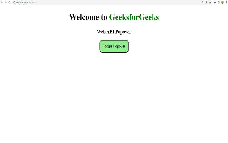
Popover API: Overview and Advantages
When it comes to choosing between the Popover API and the Dialog API, understanding their overarching functionality can greatly influence your project’s direction. The Popover API shines with its simplicity and flexibility, making it a favorite among developers. Its strength lies in its design; a popover appears non-intrusively, providing contextual information without disrupting the flow of the user experience. In fact, this allows users to continue engaging with the content behind the popover. Clearly, this offers a dynamic way to deliver information, taking usability to the next level.
Moreover, the accessibility benefits of the Popover API cannot be underestimated. Out of the box, it handles focus management automatically, which is critical for screen readers and aids users who rely on keyboard navigation. This ensures that users are never left adrift when interacting with popovers. Keep in mind, the Dialog API lacks such features inherently, requiring additional coding for equivalent accessibility. Thus, if you want a robust and user-friendly solution that prioritizes accessibility, the Popover API is undoubtedly the way to go.
Dialog API: Challenges and Workarounds
In stark contrast to the Popover API, the Dialog API comes with its unique set of challenges. While it includes advanced features like modal functionality through the `showModal` method, it lacks the native accessibility enhancements that make popovers so user-friendly. Developers need to explicitly manage focus, ARIA attributes, and user dismiss options — which can lead to complex and bulky code. Hence, many might ask: is it worth the hassle?
Despite these hurdles, the Dialog API does offer a chic and familiar user experience that can be favored in certain contexts. When a modal dialog is required, using the Dialog API can be ideal; it halts interaction with the main content, ensuring users focus solely on the modal. However, getting this right isn’t as simple as it sounds. Developers must ensure that focus doesn’t wander back into the main content until the modal is fully dismissed. This can be achieved, but not without careful implementation and consideration.
Future Insights: Evolving APIs and Best Practices
Looking forward, the landscape of modal and popover creation is evolving with ongoing proposals aimed at enhancing the Dialog API’s ease-of-use. A significant change could stem from the introduction of invoker commands, which would better incorporate the advantages of the Popover API into the Dialog API. This would bolster the workflow of creating modals, potentially lifting the accessibility burdens currently associated with it. Imagine a world where implementing modals is as seamless as deploying popovers — that’s the goal.
In preparation for this shift, developers should continuously refine their understanding of both APIs. The need for robust, clean code that considers accessibility is paramount, not only for current standards but for welcoming future advancements. Ultimately, while you might find yourself reaching for the Popover API today, tomorrow’s enhancements to the Dialog API could make it a competitive player. Staying informed and adaptable will be key as these technologies evolve.

In conclusion, choosing between the Popover API and the Dialog API ultimately boils down to the specific requirements of your project and the accessibility features you need to incorporate. By understanding the distinctions between these two APIs, you can make informed decisions that enhance user interactions with your applications. Key takeaways include:
– Utilize the Popover API for most interface elements requiring supplementary information without blocking the main flow,
– Reserve the Dialog API for cases where modal functionality is necessary, providing users with a focused context that temporarily halts interactions with the rest of the application.
Ultimately, selecting the right API not only improves user experience but also ensures compliance with accessibility standards, making your applications more inclusive for all users.
As we move forward in implementing these APIs, it’s essential to be mindful of the differences in accessibility features they provide. While the Popover API excels in automatic management of user interactions and native accessibility enhancements, the Dialog API’s specific function for modal dialogs can serve its own unique purpose when used correctly. To summarize:
– Popovers are ideal for conveying temporary information without necessitating full disruption of user flow,
– Modals require careful handling of focus, visibility, and user accessibility, thus making the Dialog API suited for these specific use cases.
By keeping these guidelines in mind, developers can create effective, accessible, and user-friendly interfaces that simplify interactions while understanding when to leverage these powerful tools.


