Highlight pseudo-elements play a pivotal role in web design, enhancing both aesthetics and functionality. Specifically, the `::search-text` pseudo-element stands out by allowing developers to customize how highlighted search results appear, significantly improving user experience. By optimizing CSS highlight pseudo-elements, we can tailor highlight colors to match overall site design while ensuring accessibility in CSS highlights. This is essential not just for aesthetic appeal but also for making sure that highlighted content is easily distinguishable, even for users with visual impairments. Furthermore, effective text highlighting techniques can greatly aid users in navigating and finding information quickly, bolstering site usability.
When discussing web design elements that improve user interaction, one cannot overlook the importance of text highlighting pseudo-elements. These features, including the `::search-text` selector, enable developers to emphasize specific segments of text based on user actions, such as search queries. By exploring customization options for highlight colors, designers can craft an inclusive user experience that caters to accessibility needs. Special attention must be given to the contrast between highlighted text and surrounding elements to ensure readability. These practices not only elevate usability but also align with modern standards for effective web design.
Understanding `::search-text` and Its Role
The `::search-text` pseudo-element is one of the latest additions to our CSS toolkit, specifically designed to enhance the user experience by highlighting search-matched text within a webpage. This feature springs to life when users invoke the find function using `Ctrl`/`Command` + `F`, allowing quick navigation through content without losing sight of context. The highlight is a stark yellow by default, instantly drawing attention to selected parts of the text.
In addition to `::search-text`, which emphasizes the current search results, we have `::search-text:current` that further refines this by changing the highlight color to orange for the active match. This visual differentiation helps users immediately identify where their search term appears, which is crucial in lengthy documents. The customization of these colors not only allows for personal styling preferences but also ensures compliance with accessibility standards, making information retrieval easier for users with visual impairments.
Exploring Other Highlight Pseudo-Elements
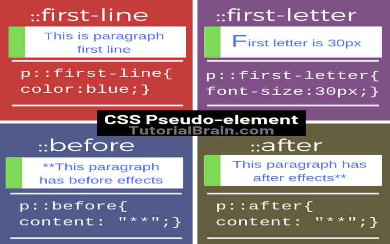
Apart from `::search-text`, CSS provides several other pseudo-elements aimed at enhancing text visibility. For instance, `::selection` highlights text when selected by the pointer, while `::target-text` targets fragments of text included in URL parameters. It’s fascinating how these pseudo-elements serve different yet complementary purposes—allowing users to navigate and interact with texts efficiently. Additionally, this customization can bridge gaps in usability by providing visual cues that guide users across various browsing scenarios.
The introduction of `::highlight()`, powered by the Custom Highlight API, brings yet another layer of interactivity, allowing developers to implement their specific highlighting logic dynamically. However, both `::spelling-error` and `::grammar-error` stand apart, typically using red and green underlines respectively for identifiable errors in editable content. Each pseudo-element has a role that, while distinct, contributes to making web pages more engaging and accessible.
Customization for Accessibility and Usability
The need to customize highlight pseudo-elements like `::search-text` arises from the demand for both accessibility and usability. Default highlighting may not always provide adequate contrast against the text they emphasize, leading to potential reading difficulties, especially for users with visual impairments. Therefore, leveraging CSS properties, we can adjust colors accordingly—ensuring that apart from being aesthetically pleasing, they serve the functional purpose of enhancing readability.
For instance, utilizing relative color syntax offers a method to create a balanced contrast based on the containing background. This insight not only addresses practical user needs but also showcases the flexibility of CSS in crafting an inclusive web environment. Ultimately, designers and developers need to continuously explore these customization options to create engaging, effective, and accessible digital experiences.
Visual Distinction Among Highlight Elements
In the world of web design, clarity is paramount. Various highlight pseudo-elements, including `mark`, `::selection`, `::target-text`, and `::search-text`, must be visually distinct to avoid confusion, particularly when overlaps occur due to simultaneous usages. Such clarity becomes crucial, especially in contexts where multiple results or errors may demand immediate user attention.
For instance, consider the situation where you have text highlighted for spell-checking, alongside a search match. Ensuring that these elements don’t blend into one another—both visually and functionally—is vital for usability. Applying different background styles and color transparency levels can create not only a distinct visual hierarchy but also foster a user interface that is as intuitive as it is visually appealing.
Implementing Effective Highlighting Techniques
When considering how to implement effective highlighting techniques in CSS, it’s essential to analyze the contrast and visibility of each element. Using properties like `background-clip` and `backdrop-filter` can enhance the visual presentation of highlights, ensuring they stand out without compromising accessibility. However, caution must be exercised, given that certain properties might not be compatible with highlights. Therefore, rigorous testing and exploration of compatibility across various browsers is crucial.
Moreover, selectively inverting colors using RGB values not only optimizes the visual appeal but also guarantees that each highlighted section maintains its legibility against varying backgrounds. The innovative use of opacity in background colors adds an elegant touch, merging highlights with the overall design without overwhelming the user.
Challenges in Highlight Customization
While customizing highlight pseudo-elements provides opportunities for enriched user experiences, it isn’t without challenges. The most prominent issue lies in ensuring accessibility across diverse user scenarios and preferences. Striking a balance between aesthetic appeal and functionality can often require extensive testing, especially in designs that transition between light and dark modes.
Additionally, determining universally accessible colors that align with design themes can be an arduous task. Highlight colors should not only stand out but also remain functional across myriad designs, creating an experience where none feel jarring or out of place. The ongoing evolution of tools and guidelines addressing these points is crucial for future enhancements.
The Future of Highlight Pseudo-Elements
As web technologies continue to evolve, the potential for enhancing highlight pseudo-elements grows enormously. With improvements in CSS and the advent of new user interaction APIs, we can anticipate an expanded toolkit to create engaging, fully customized highlight functionalities that cater to user preferences.
In the future, we may witness even more sophisticated ways to manage text visibility and interactions on webpages, ensuring that every page interaction serves a purpose. By continuously refining how highlights work and exploring new personalization options, developers can enrich the user’s browsing experience significantly.
Addressing User Feedback and Iterations
Developers must remain adaptable and receptive to user feedback, particularly concerning usability and accessibility. Highlight pseudo-elements represent an area ripe for user-driven innovation, inviting insights that can directly inform styling choices and functionality. Engaging with users through feedback loops can illuminate areas needing improvement, guiding developers toward implementing necessary changes.
For instance, a user might suggest alternative highlight colors or styles based on their experiences. Such collaborative engagements can spur thoughtful iterations that not only enhance aesthetics but also reinforce usability. Thus, fostering a community around feedback can be instrumental in advancing how we implement and customize highlight pseudo-elements.
Conclusion: The Importance of Highlights in Web Design
In summary, highlight pseudo-elements serve a critical function in web design, making content accessible while enhancing user interaction. As developers, acknowledging and implementing effective highlighting techniques is essential in creating a seamless browsing environment. The ability to adapt these elements for usability and accessibility will ultimately define the quality of user experience.
Continuous exploration and innovation in this domain promise to reveal new techniques and practices, ensuring that our digital landscapes are engaging, functional, and inclusive for all users.

In conclusion, understanding and utilizing highlight pseudo-elements like `::search-text` is crucial for enhancing both the visual appeal and accessibility of web content. These elements provide a framework for customizing text appearances during searches and other instances of highlighting, which can greatly improve user experience. Here are the key takeaways regarding highlight pseudo-elements:
– `::search-text` allows customization and controls the visual representation of highlighted text in find-in-page scenarios.
– A variety of highlight pseudo-elements exist, each serving different functions, which can lead to confusions, hence proper identification and usage are essential.
– Customizing colors using relative color syntax or specific conditional CSS enhances visibility and accessibility, addressing color contrast issues effectively.
Moreover, the visual distinctiveness of highlight pseudo-elements ensures that they serve their intended purpose without interfering with usability. As developers continue to enhance the user experience through creative design choices, it remains critical to balance aesthetic preferences with accessibility standards. The important points include:
– Highlight pseudo-elements should exhibit unique color schemes to prevent overlaps and maintain clarity when multiple highlights occur.
– Ensuring highlights stand out from the background and are distinguishable from each other aids in overcoming potential accessibility barriers.
– Continuous testing and feedback will be essential as new CSS features, like `contrast-color()`, emerge to further improve accessibility in web design.