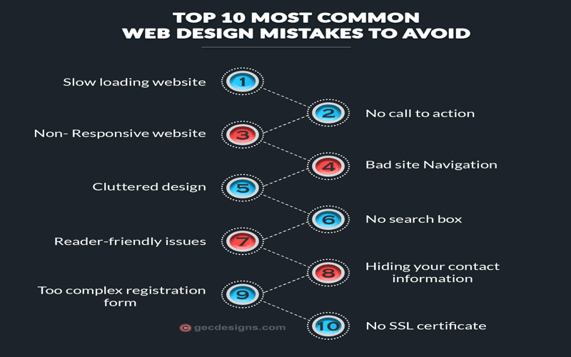
When delving into the world of digital creation, it’s essential to avoid common web design mistakes that can jeopardize your site’s success. These design blunders not only detract from the user experience but can also reduce your site’s visibility and conversion rates. From neglecting mobile responsive design to complicating navigation best practices, many pitfalls lurk in the process of website development. Emphasizing website load speed and accessible web design can significantly enhance how users interact with your platform. Ultimately, by mastering content hierarchy and making effective use of white space in design, you can elevate your website’s performance and appeal.
Exploring the landscape of online site creation unveils a vast array of crucial design considerations. Avoiding errors in web layout and structure is paramount to ensuring users have a seamless experience. Critical elements include ensuring compatibility across devices, simplifying user navigation, and enhancing site loading efficiency. Moreover, accessible web frameworks and strategic placement of call-to-action buttons play vital roles in guiding user engagement. By prioritizing these aspects, you can foster a web environment that encourages exploration and fulfillment of user needs.

Mobile Responsiveness: A Non-Negotiable Element
In today’s fast-paced digital arena, mobile responsiveness is no longer an option but a necessity. Picture a vast landscape where more than half your visitors are accessing your site from a tiny device. If your website fails to adapt, it is like presenting a grand movie on a cracked screen—uninviting and frustrating. A harmonious design that embraces all screen sizes fosters an inviting atmosphere, ensuring every element is at the user’s fingertips, regardless of how they choose to engage.
Employing frameworks like Bootstrap can be a beacon of hope when navigating the seas of mobile optimization. This tool acts as a safety net, harmonizing your layout and providing a seamless experience that captivates users wherever they may roam. Remember, in the world of web design, neglecting mobile users is akin to ignoring a significant part of your audience—don’t let your message be lost in translation.
Navigating the Maze of User Experience
Imagine walking into a library where the books are scattered haphazardly, and finding the one you need feels like searching for a needle in a haystack. This is what a convoluted navigation system akin to is online. Users need clarity and simplicity—traits that lend themselves to a serene browsing experience. Streamlined navigation is akin to a well-chartered map. Aim for a clear path, linking critical content with ease, ensuring that your visitors wander freely without feeling lost.
Keep your navigation menu tight—five to seven items should be the guiding stars in your navigation sky. Use drop-down menus judiciously, so as not to overwhelm. This refined approach enhances user satisfaction, promoting prolonged visits and, eventually, conversions, as users find their way home effortlessly.
Furthermore, intuitive navigation acts like a courteous guide, gently shepherding visitors to their desired content. When the path is well-laid, users are more likely to stay, explore, and engage, ultimately enhancing the life of your website.
The Crucial Role of Load Speed and Content Hierarchy
In the digital rush, mere seconds can spell the difference between engagement and abandonment. Users crave speed, and a slow-loading site is akin to a lumbering giant—unappealing and often forgotten. In fact, studies suggest that a mere delay of a few seconds can send visitors packing, casting your hard work aside like yesterday’s news. Thus, optimizing load speed is non-negotiable. Compress images, streamline code, and leverage caching techniques to create a lightning-fast experience.
Complementing load speed is the importance of structuring your content for optimal interaction. Users often skim rather than read, and presenting them with a clear hierarchy is essential. This can be achieved by employing H1, H2, and H3 tags effectively, guiding their eyes through your narrative like a well-organized storybook. Pair efficient loading with a logical content layout, and your site transforms into a welcoming oasis rather than an overwhelming desert.
It’s essential to remember that clean, accessible designs bloom when nurtured with both speed and organization. As you improve these elements, visitors will linger, delve deeper, and discover the treasures hidden within your digital abode.

In conclusion, avoiding common web design pitfalls is essential to not just capture your audience’s attention, but also to maintain their interest and guide them towards meaningful engagement. By implementing the following strategies, you can significantly boost the user experience on your website:
– **Prioritize Mobile Responsiveness:** Ensure that your site looks and functions well on a variety of devices.
– **Simplify Navigation:** Create intuitive navigation to help users find information quickly and efficiently.
– **Boost Load Speed:** Optimize site elements to minimize delays, which can frustrate users and negatively impact SEO.
– **Choose Readable Fonts:** Select clear and legible typefaces that enhance readability without being distracting.
– **Ensure Accessibility:** Make your site usable for everyone, including those with disabilities, by implementing helpful features.
As you refine your web design approach, remember that user experience should always be at the forefront of your strategy. Regularly testing and iterating on design choices allows you to stay aligned with the needs of your audience. Here are some key takeaways to ensure your website meets these high standards:
– **Create Clear Calls-to-Action:** Guide users on next steps with unambiguous and engaging CTAs.
– **Limit Pop-ups:** Use pop-ups sparingly to avoid overwhelming visitors and risking high bounce rates.
– **Organize Content Logically:** Arrange information in a manner that is easy to navigate and digest.
– **Utilize White Space Wisely:** Balance your layout with adequate white space to create a welcoming and clean interface.
– **Embrace Continuous Improvement:** Regularly gather and act on user feedback to enhance design elements and functionality.


