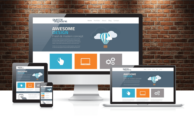
Responsive web design is the cornerstone of modern web development, ensuring that your site provides a seamless experience across all devices. With the rise of mobile browsing, a mobile-friendly design is not just a trend—it’s a necessity. By employing a responsive layout, you can create an engaging interface that adapts fluidly to various screen sizes, from smartphones to tablets and large monitors. In this comprehensive guide, we’ll unveil essential web design tips and best practices for implementing an adaptive design that enhances user experience (UX design). Embrace fluid grid systems and discover how a well-crafted responsive strategy can elevate your online presence.
Exploring the realm of adaptable web solutions, we encounter the transformative concept of fluid design tailored for diverse device interfaces. This approach prioritizes creating versatile layouts that respond intuitively to user interactions, ensuring accessibility whether on a smartphone, tablet, or desktop. Delving into responsive development means understanding the synergy of performance and aesthetics, delivering a polished web experience enriched by smart UX design principles. By focusing on key strategies like flexible media and media queries, you can embody the spirit of forward-thinking web design that resonates with users across all platforms. Engage with these principles, and unlock the potential of your digital space, crafted to navigate the future of connectivity.

Understanding Fluid Grids
Fluid grids serve as the backbone of responsive web design, transforming rigid layouts into adaptable structures that breathe with the screen’s proportions. Imagine a world where web components elegantly resize in a dance with their environment; percentages replace pixels, allowing each element to flow and fill the available space naturally. This principle of fluidity is not merely a trend; it’s a necessity in today’s mobile-first landscape. As screens grow and shrink, the grid accommodates, ensuring content never feels cramped or shunned.
A fluid grid isn’t just about aesthetics; it represents a fundamental shift in how we approach web design. By employing flexible units, web designers liberate themselves from the constraints of fixed sizes, resulting in layouts that can morph and adapt. This adaptability ensures that whether a user is examining your content on a tiny smartphone or a grand desktop display, the experience remains consistent and engaging—an undulating wave of design that caters to every audience.
Optimizing Media for Any Screen
In an era defined by rapid digital interaction, optimizing media isn’t just advisable; it’s critical. The essence of a captivating visual experience lies in the ability of images to scale and respond to their surroundings. Think of images as chameleons, seamlessly acclimating to various container sizes without losing quality or clarity. The CSS rule `max-width: 100%;` is your ally here, ensuring that images gracefully fit without overflowing, thus maintaining harmony within the layout.
Additionally, embracing advancements in media formats can transform load times and performance. Light as a feather, formats like WebP step into the limelight, offering crisp visuals without the heavy baggage. Furthermore, the technique of lazy loading—loading images only when they enter the viewport—ensures that users aren’t impacted by long waits or clunky displays. Imagine a symphony where each note arrives precisely when it should, creating a flawless auditory experience; this is the goal of optimizing media in responsive design.
Testing and Refining for Responsiveness
The journey toward a responsive website culminates in the pivotal phase of testing. Picture this: the meticulous examination of your design across an array of devices, each one revealing insights and potential hiccups you may not have foreseen. Tools like Google’s Mobile-Friendly Test act as your guides, illuminating any dark corners of incompatibility—helping you polish your creation until it shines brightly, regardless of the device being used.
Testing isn’t just a one-time ritual; it is an ongoing commitment to excellence. As new devices emerge and web standards evolve, continuous refinement is essential. It’s like crafting a fine piece of art—every stroke of feedback, every click through different screens, contributes to the masterpiece. The end goal? A website that not only looks exquisite but functions flawlessly—a user-centric experience for every visitor, delivered with grace and precision.

In conclusion, embracing responsive web design is an essential step toward ensuring your website stands out in a crowded digital marketplace. With users engaging from an array of devices, a responsive approach not only accommodates varied screen sizes but also cultivates a seamless browsing experience. Here are the key takeaways to remember:
– **Responsive Design is Essential**: A responsive site adapts to various devices, enhancing user satisfaction and engagement.
– **Improved SEO Strategy**: Google rewards responsive sites, as they simplify the user experience and reduce duplicate content issues.
– **Cost-Effective Solution**: One comprehensive site means easier management and fewer resources spent on maintaining multiple versions.
To wrap up, implementing responsive web design reflects a commitment to quality, accessibility, and user-centric practices. By adopting techniques such as fluid grids, flexible images, and rigorous testing, your website can thrive across platforms. Let’s recap some best practices to ensure your design is effective and efficient:
– **Prioritize Mobile-First**: Start by designing for mobile to focus on critical content and functions.
– **Utilize Fluid Layouts**: Create adaptable layouts that can adjust seamlessly with varying content dimensions.
– **Optimize Images**: Implement responsive images and lazy loading to enhance performance without compromising quality.


