Running an ecommerce site is all about making sales. That means driving as much traffic and converting them into as many customers as you can.
Aside from your product pages, you have to consider creating landing pages that showcase your collection or promote your current promos.
Ecommerce landing pages are not much different from B2B landing pages. But you need to be aware of the nuances in online shopping to help you design a page that will compel people into signing up or buying your products.
Below are ecommerce landing page examples to inspire you to create one for your online shop so you can increase your sales.
Savile Row Company

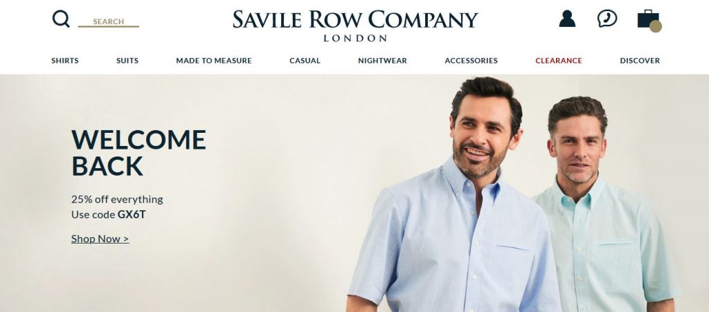
London-based online retailer Savile Row Company caters to men with a distinct taste for formal wear. A quick look at their site immediately shows you the snappy collection of garments available on their store.
Their page also features random Trustpilot reviews from their customers, most of which are positive. Just below it or the brand’s most popular products on sales.
The placement of both sections are strategic – the reviews help the brand gain confidence from visitors, who will then be more comfortable in making a purchase of one of its bestsellers.
Finally, there’s a short explanation from the brand about what makes their apparel great. Sometimes, you have to spell things out to people to convince them to buy from you, which is what the Savile Row Company did.
Xpand No-Tie Shoelaces

Nobody likes to tie their shoes in the middle of walking or during a workout session. That’s why Xpand No-Tie Shoelaces exists.
The unique product should sell itself given the lack of general competition in the market. However, the brand won’t rest on its laurels as it pulls out all the stops on their landing page.
The background video puts the shoelaces to the test by having people engage in different physical activities with it. This shows viewers that Xpand indeed doesn’t untie itself.
In fact, the entire focus of the page is to put the spotlight on the shoelaces, how it works, and how you can get your hands on them.
This is a refreshing change of pace for ecommerce sites since most of them want to cram as many products as they can on a page, thus confusing visitors as to which CTA to take.
Marley Spoon

If you’re a person on the go and don’t have time to prepare delicious and healthy meals for you, then Marley Spoon is a meal prep service you need.
Aside from the mouth-watering images used in the landing page, what stands out the most is the use of solid colors across the different sections of the page. The brand also uses white space wisely to help put the emphasis on the CTAs of each section.
The page is a perfect example of a restaurant landing page done right. It’s easy to get lost in featuring different dishes and menus on the page. But Marley Spoon focused on featuring the most important points on the landing page to help viewers decide which route to take from there.
Vanity Planet

Health brand Vanity Planet fully understands the value of putting their best foot forward on their landing page. Just below above the fold that features the slider section are collections of products organized according to type. This helps users find the product they need and are looking for.
Next, you will see the bestsellers that the brand and its customers swear by. This could save you a ton of time from browsing through its collection if you want to buy something quick.
What’s great about the landing page is it also promotes its membership program where you can sign up and get exclusive deals and discounts for their products. This is a great way to collect their emails and send them the deals to increase their conversions.
LIV Watches

LIV Watches is a US-based microbrand that crafts Swiss-made, limited edition watches at affordable prices. And it communicates this message rather well on their homepage.
The background video shows the watch in high detail to show visitors the quality and skill put into assembling the watch.
Scrolling down the page, you will see even more high-resolution and big images of the other watches for sale.
What LIV Watches got right is the social proof. The landing page features what the big publications and customers have to say about the brand, all of which are glowing reviews. Getting other people to share their satisfaction with one’s product is arguably the best way to convince people to buy.
Conclusion
Now that you have a couple of ideas from the ecommerce landing page examples above, it’s time to create one for your site.
The key is finding the best landing page builder for you. For the non-designers out there, Landingi is one of the best in the market. You can choose from its pre-built templates and customize them according to your branding.
They also have a selection of ecommerce landing page templates that are especially made for online stores. This way, you don’t have to worry about creating a page from scratch.
Finally, you need to analyze and measure the results of the page. From here, you will see how many are filling out the form or clicking the button on the page. Use the information here to improve your page and generate more conversions along the way.
Related posts:
What Will An Ecommerce Website Need To Stand Out In 2020?
4 Ecommerce Challenges For Luxury Brands
The post 5 Beautiful Ecommerce Landing Page Examples For Your Online Store appeared first on SpyreStudios.


