
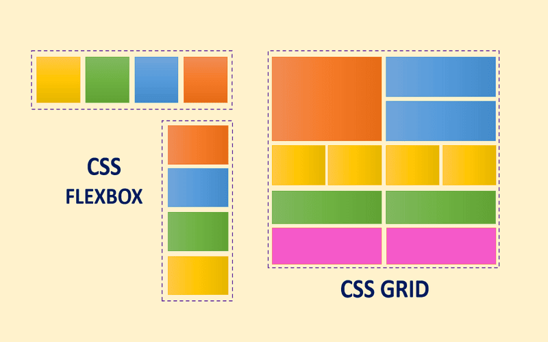
Imagine crafting a seamless web layout where your items appear not just spaced, but tastefully decorated at the gaps, enhancing user experience without the clunky workarounds of the past. With the introduction of CSS gap decorations, specifically designed to bring elegance to grid and flexbox layouts, web developers can finally breathe easy—no more juggling border hacks to create visually appealing web design gaps. The new properties extend the functionality of existing CSS layout techniques, giving designers greater control over how elements interact without compromising the aesthetics of their designs.
The support for gap decorations in major browsers like Chrome and Edge marks a significant leap forward, allowing for nuanced styling that caters to modern web design demands. For instance, the new longhand properties let you customize the appearance of your gaps extensively, whether you want to define how rules render at intersections or control their visibility next to empty areas. If you’re keen on keeping your layouts fresh and engaging, it’s time to explore these CSS properties for layout that not only streamline your coding process but also enhance your site’s overall visual appeal.
Understanding CSS Gap Decorations
Have you ever found yourself frustrated with the limitations of CSS layout techniques like flexbox and grid when it comes to adding visual space between items? CSS gap decorations are here to ease that pain. Built on the well-known `column-rule` property, gap decorations now empower designer to effortlessly style the spaces between elements, effectively transforming layouts and enhancing visual appeal. With the introduction of properties such as `row-rule`, designers can apply aesthetic touches along both the horizontal and vertical axes, allowing for greater flexibility than ever before.
The evolution of CSS gap decorations brings with it an expanded syntax and improved control, which is critical for web developers who rely heavily on precision in design. The recent updates reflect valuable feedback from the community, resulting in clearer property names and the introduction of functionalities that permit independent adjustments of decoration placements. For instance, the new properties `row-rule-inset-cap` and `row-rule-inset-junction` enable targeted control over how decorations sit at the intersections between rows and columns — a game changer for precise web design.
Adapting Browsers to Support CSS Gap
In a time when cross-browser compatibility remains a major concern, it’s refreshing to see that gap decorations are supported on major browsers like Chrome and Edge, specifically from version 149 onwards. This reinforces a commitment to advancing web design practices across different platforms. But what happens for those who are still on older versions or different browsers? It’s wise to consider fallback strategies while embracing this powerful CSS feature.
For those keen to incorporate gap decorations without compromising functionality, a polyfill is in the works. This means that you can utilize such enhancements without alienating users in incompatible environments. The important takeaway here is: don’t be shy about experimenting with these properties in your current projects, understanding that they’re not just enhancements but vital tools that elevate the quality of modern design.
Practical Implementation of Gap Decorations
Let’s say you’re working on a personal website and want to create visually distinct sections without breaking the flow of content. Here’s where you can apply the new gap decoration features. For instance, using properties like `column-rule-inset` alongside `row-rule-inset` can stylishly separate blog posts or distinct content blocks, enhancing user experience without overwhelming the interface. Consider this CSS snippet:
“`css
.container {
display: grid;
gap: 20px;
column-rule: 2px solid white;
row-rule: 2px solid white;
}
“`
The above code not only applies a pleasing aesthetic to the gaps but also sets the stage for a clean layout.
However, before jumping into implementation, it’s essential to recognize that these gaps don’t solely serve a decorative purpose. They enhance accessibility by reducing clutter and guiding the user’s eye through the content. For example, a web page that effectively uses gap decorations can lead to a clearer delineation of information, ultimately making the content more digestible. The goal should always be to combine functionality with design, ensuring that while visuals pop, usability remains intact.

Frequently Asked Questions
What are CSS gap decorations and how do they improve layout styling?
CSS gap decorations are new CSS properties that enhance the styling of spaces between items in grid and flexbox layouts. They build upon the existing `column-rule` property and allow for more customizable gap styling, including features such as `row-rule` and greater control over decoration placement, making it easier to create aesthetically pleasing web designs without relying on outdated hacks.
Which CSS properties are related to gap decorations for grid and flexbox styling?
Gap decorations utilize several CSS properties, including `row-rule-inset` and `column-rule-inset` for creating visual rules between items. Additional properties like `row-rule-inset-cap` and `column-rule-inset-junction` provide further control over how these decorations are displayed, allowing web designers to customize the appearance of gaps in their layouts.
What is the browser support status for CSS gap decorations?
CSS gap decorations are supported in Chrome and Edge starting from version 149, as well as in other Chromium-based browsers that follow this versioning. As the feature gains popularity, more browsers are expected to adopt it, with ongoing discussions among different browser engines for full interoperability.
• Take advantage of the new gap decorations feature available in recent versions of Chrome and Edge, which simplifies the task of styling gaps in web layouts, making it significantly less cumbersome than previous border hacks.
• Revisit the concept of `column-rule` as gap decorations build upon its principles, and now extend this functionality to both grid and flexbox layouts, enriching design possibilities.
• Get familiar with the new `row-rule` property that allows for decorative styling along both axes, expanding control over layout aesthetics.
• Explore the updated syntaxes that offer finer control over decorations, such as the new longhand properties for positioning elements at outer ends and junctions of gaps, enabling precise adjustments.
• Keep an eye on the changes made to property names, like `gap-rule-paint-order` now being `rule-overlap`, which enhances clarity and usability for developers.
• Check out the new `rule-visibility-items` property to manage how decorations appear, particularly next to unused spaces in a container, adding to your design flexibility.
• If you are enthusiastic about progressive enhancement, you can start using gap decorations now without any disruption for non-supporting browsers, ensuring a smoother user experience.
• Anticipate the upcoming polyfill for browsers lacking this feature, allowing you to implement gap decorations widely across various platforms.
• Dive into the visual demonstration of gap decorations by comparing the before and after scenarios on the demo pages provided, illustrating the impactful design changes.
Feel free to check related posts for deeper insights on maximizing CSS in your web projects.













