

Imagine your beautifully crafted website, designed to engage users on every screen size—yet you’re losing visitors because a sprawling hero section overwhelms mobile users. The solution? Hide WordPress blocks based on device using the innovative block visibility feature. No longer a feature locked behind cumbersome plugins, WordPress responsive design now empowers developers and designers to tailor content for different devices effortlessly. By utilizing the new Block Editor controls, you can show or hide blocks on mobile and desktop versions, ensuring your site looks its best wherever it’s viewed.
The advent of block visibility in WordPress has transformed mobile optimization, allowing us to declutter user experiences without sacrificing design integrity. With a few clicks, you can easily create distinct layouts for your desktop and mobile audiences, optimizing each version of your content. This means you can display a striking, detailed hero image on larger screens while streamlining the mobile experience to keep users engaged, demonstrating the powerful flexibility of the WordPress Block Editor.
The Importance of Responsive Design in WordPress
Responsive design has become essential in crafting modern websites. Users now access content through various devices, from smartphones to large desktop monitors; hence, ensuring a seamless experience on every screen is critical. The WordPress Block Editor is adapting to this demand, enabling developers to provide tailored experiences for different device users.
Responsive WordPress setups enhance user engagement. For instance, adapting a site’s layout can significantly affect how content is perceived. Mobile users often prefer succinct, engaging visuals instead of the extensive text usually suited for desktops. By utilizing features like block visibility, designers can effectively cater to these differing preferences.
Getting Started with Block Visibility
Implementing block visibility isn’t just a convenience; it’s a powerful tool that empowers creators to manage content dynamically. For example, if you’re drafting a web page that should appear differently on mobile versus desktop, one might consider using the Block Visibility feature. This allows you to hide or show particular blocks based on user device.
This feature operates with intuitive simplicity. Suppose you want to ensure that a large image only appears on desktop interfaces. In the Block Editor, one could select the image block, access the Options menu, and select the appropriate visibility settings. A few clicks can dramatically alter the user experience, making the design responsive and effective.
Crafting Unique Experiences for Different Devices
Creating specialized content for mobile and desktop users significantly enhances engagement. For instance, imagine a landing page with a bold header image tailored for desktop users, which can convey business branding. However, on mobile, that image could become a distraction, diverting attention from the action you want users to take. By simply hiding the desktop image on mobile, the same message remains but with increased clarity.
Additionally, consider restructuring text blocks for mobile accessibility. Instead of a long paragraph, condense the information into bite-sized, impactful statements that deliver the same message effectively. Not only does this improve readability on smaller screens, but it also aligns with users’ expectations for quick, consumable content.
Test and Optimize Regularly
No design is complete without thorough testing. Once you’ve implemented strategies to hide WordPress blocks based on device, it’s crucial to see how these adjustments take form in real-world applications. Testing isn’t merely about aesthetics; it ensures functionality aligns with intended user experiences.
Utilizing various devices, or even browser developer tools, allows you to visualize your site just as users would. Each adjustment provides you with feedback. The goal is to iterate on your design continuously and leverage insights to refine block visibility settings, thus enhancing mobile optimization and overall site performance.

Frequently Asked Questions
How can I hide WordPress blocks on mobile devices using the Block Editor?
To hide WordPress blocks on mobile devices, open the block you want to hide, access the Options menu (⋮), and select ‘Hide Block.’ Then, choose ‘Hide on Mobile.’ This allows you to control block visibility based on device type, enhancing your site’s mobile optimization.
What is Block Visibility in WordPress and how does it improve responsive design?
Block Visibility in WordPress refers to the feature that allows users to show or hide specific blocks based on the user’s device, such as desktop or mobile. This greatly improves responsive design by enabling tailored content display, thus enhancing user experience on different devices.
Why is mobile optimization important for WordPress sites?
Mobile optimization is crucial for WordPress sites as it ensures content is displayed effectively on smaller screens, improving user engagement and satisfaction. With features like block visibility in the WordPress Block Editor, site owners can easily tailor their content for mobile users, which can also positively impact SEO.
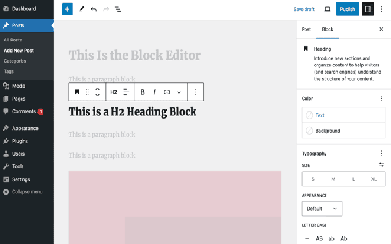
– The introduction of the Block Visibility feature in WordPress enables users to hide blocks temporarily without deleting them, revolutionizing how designers can approach responsive web design within the platform.
– Users can create tailored experiences for both mobile and desktop by easily assigning visibility parameters to specific blocks, enhancing user engagement across devices.
– Implementing responsive hero areas illustrates the feature’s effectiveness—adjusting image sizes, text density, and overall layout can dramatically improve mobile usability.
– The process of managing block visibility is straightforward, as it requires just a few clicks within the Block Editor, eliminating the need for third-party plugins or custom coding.
– Enhancements like these not only save developers time but also promise a more seamless future for block-based design in WordPress.
– The Block Visibility feature allows WordPress users to control which blocks are displayed based on the viewing device, a game-changer for responsive design.
– By creating separate hero sections for desktop and mobile with distinct layouts, web designers can significantly enhance the browsing experience for visitors on different devices.
– The procedure to hide blocks for specific devices is intuitive, making it accessible to a wide audience, including those with minimal coding experience.
– Optimizing content for user devices prevents overcrowding on mobile screens, ultimately leading to better conversion rates and improved user satisfaction.
– As WordPress continues to evolve, features like this may lead to even more robust tools for responsive design, shaping the way websites are built in the future.
– With the introduction of device-specific block visibility, designers can create more impactful and tailored web experiences.
– The ability to simplify elements for mobile users—such as condensing text and adapting images—can have a substantial effect on usability and aesthetics.
– Editing blocks based on device visibility can be accomplished through a simple menu selection, streamlining the design process compared to prior methods that involved complex coding or plugins.
– This feature signifies a pivotal shift in WordPress, granting designers greater flexibility to cater their layouts for various devices without compromising functionality.
– Exploring related articles on similar enhancements can provide additional insights into optimizing WordPress designs effectively.
– WordPress now enables responsive block settings, allowing users to hide blocks based on the device being used, significantly enhancing control over the user interface.
– Creating separate hero areas for different device types showcases how to leverage this feature for better visual clarity and functionality.
– The ease of utilizing the Block Visibility feature reflects a broader trend towards simplifying web design workflows in WordPress, matching modern web development practices.
– Ensuring blocks are tailored to their intended audience is crucial, as it impacts engagement and accessibility, especially on mobile devices.
– Readers are encouraged to delve into related content that further explores various tools and strategies within the WordPress ecosystem.
– The Block Visibility feature marks a significant advancement in WordPress’s capabilities for responsive design, allowing specific blocks to be shown or hidden based on user devices.
– This enables more agile content management; designers can finely tune what users see depending on their device, ensuring an optimal viewing experience.
– A practical example shows that optimizing a hero area for mobile can improve loading times and user engagement remarkably, by reducing unnecessary clutter.
– The simplicity of managing visibility through the Block Editor means that more WordPress users can take advantage of responsive design without needing advanced technical skills.
– For those interested in optimizing their WordPress sites, exploring additional related articles can provide valuable insights into the best practices and tools available.













