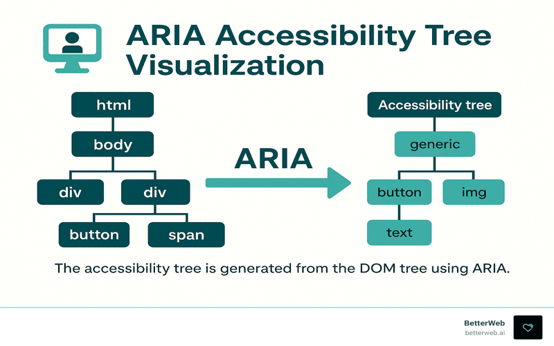
ARIA accessibility is a crucial aspect of modern web development that enhances user experience for individuals relying on assistive technologies, such as screen readers. By properly implementing ARIA roles, developers can transform standard HTML elements to provide meaningful navigation and interaction for users with disabilities. However, it is vital to understand that relying solely on ARIA is not a substitute for semantic HTML, which serves as the cornerstone of web accessibility best practices. Effective keyboard navigation, clear screen reader accessibility, and proper element roles help ensure that all users can engage with web content seamlessly. Therefore, integrating ARIA correctly not only improves accessibility but also fosters an inclusive web environment.
In the realm of digital design, the integration of ARIA features significantly enhances the usability of web applications for users who depend on assistive devices. This involves utilizing well-defined ARIA roles to clarify the purpose and function of elements within a webpage. A focus on semantic markup is equally essential as it lays the groundwork for comprehensive web accessibility strategies, ensuring that each element behaves predictably for all users. Furthermore, fostering an environment that supports keyboard navigation and screen reader technologies is key to achieving high accessibility standards. By honing these principles, developers can create web experiences that are both functional and inclusive.

Learning from Mistakes in Web Accessibility
Throughout my journey in web development, I’ve learned that mistakes are often our greatest teachers. Recently, I went through an experience that highlighted just how crucial it is to place trust in semantic HTML. I was under the impression that by implementing ARIA roles, I was enhancing accessibility for a feature I developed. It seemed foolproof: keyboard navigation was operational, ARIA roles were in line, and even automated accessibility audits flashed green without an issue. Little did I know, these assurances masked a deeper inadequacy — my component was not as accessible as I believed.
This underscores an important lesson for anyone venturing into the realm of web accessibility: layering ARIA on top of a semantically incorrect element can lead to confusion. It’s easy to assume that any addition of ARIA equates to improved accessibility; however, this misconception can obscure the functional baseline provided by native HTML elements. I learned the harsh way that while ARIA can be beneficial, it is not a catch-all solution — often, it complicates what should be straightforward. In the end, relying on the rich features of semantic HTML is the most powerful and effective way to ensure a broadly accessible experience.
The Role of Semantic HTML in Accessibility
In the discourse around web accessibility, the emphasis often drifts toward ARIA roles and attributes, yet the power of semantic HTML remains steadfast. When I initially created my accessible component, I relied on a simplistic `
I discovered that when I engaged with a basic HTML button, everything functioned as intended right out of the box. What I had overlooked was the profound role that native elements play in conveying user intent. As a developer, my responsibility is not to retouch what’s already well-designed; instead, it’s to utilize these tools wisely to uphold accessibility standards. By prioritizing concise, semantic HTML over excessive ARIA, I not only simplified my coding process but vastly improved the interaction experience for users, particularly those relying on assistive technologies.
Testing Accessibility: A Practical Approach
To truly understand the efficacy of my components, I implemented a straightforward testing protocol: I relied purely on keyboard navigation, engaged a screen reader, and closely observed the focus order. This process elucidated the natural behavior of my elements, serving as a crucial baseline. Without deviating into complex ARIA territories, I was able to identify issues early and effectively ensure user expectations were met. Such clarity arose from a methodical approach where intention was clearly articulated through proper HTML elements.
The essential takeaway from my testing phase was about clarity — establishing a predictable operation. Engaging with the raw HTML button allowed me to ensure it performed in accordance with common user behavior. Although it may feel tempting to dive into ARIA to address specific needs, I found that often those needs could be met without modifying the semantic nature of the element itself. This kind of baseline testing solidified my understanding of accessibility workflows and reinforced the need for a keen focus on the fundamental capabilities of our native elements.
Overcoming the Pitfalls of Misused ARIA
As I ventured deeper into adding ARIA roles, I found myself tangled in a web of confusion. Implementing a role attribute to make a button act like a link appeared harmless at first. Yet, this seemingly innocuous choice cascaded into a series of accessibility issues: screen readers flagged inconsistencies, keyboard activation faltered, and user expectations plummeted. This experience drove home a critical realization: ARIA should not be viewed as a replacement or stylistic modifier, but rather as a tool reserved for communicating essential state changes.
Through this misstep, I recognized a vital practice: aligning styling decisions with appropriate HTML structures is paramount. The role attribute does not redefine the fundamental behavior of native elements — instead, it introduces risks of deviation and unpredictability. My overzealous attempt to merge style with functionality inadvertently created barriers for users who rely on assistive technologies. Understanding the nuanced boundaries of when to use ARIA versus just letting HTML do its job is essential for all developers embarking on the journey of creating accessible web components.
Adopting a Well-Defined Workflow
Building a sustainable approach to accessibility has been liberating. I’ve cultivated a workflow that aims to minimize hassle and maximize user experience. It begins with leveraging semantic HTML to convey intent. Before I even consider adding ARIA, I ensure that I understand how the native elements behave in their simplest form. This baseline serves as a reference point throughout my development process. I firmly believe that true accessibility blossoms from simplicity.
Testing with a screen reader and keyboard navigation has become a non-negotiable step for me as it grounds my understanding of user interactions. Only after validating that everything functions robustly do I proceed to integrate ARIA, and even then, it’s solely to address missing states rather than redefining the roles of elements. By following this methodology, ARIA acts as a complement to HTML, never a complication, which fosters a more inclusive digital space.
When to Utilize ARIA Effectively
After my encounters with ARIA misapplications, my perception of its utility has matured significantly. There are indeed scenarios where ARIA shines, specifically when extensive custom widgets require clear state management, or when it’s critical to convey dynamic changes to users. An effective application of ARIA is to communicate the expanded or collapsed state in custom components while preserving the semantics of the native structures.
Consider building a disclosure widget: here, employing ARIA attributes aids in signaling the current state without altering the inherent characteristics of its components. This thoughtful interplay allows ARIA to amplify accessibility instead of competing against it, fostering a coherent understanding for both developers and users. Recognizing when ARIA is appropriate versus employing pure semantic HTML is an art — one that enhances the entire web experience when balanced effectively.
Trusting the Power of Native HTML
The most significant evolution in my work as an accessibility advocate was not an expansion of knowledge surrounding new ARIA attributes, but rather a return to the foundation. Trusting native HTML to do its job has yielded substantial improvements in accessibility for users of all backgrounds, particularly those with disabilities. The goal isn’t just to create accessible components; it’s to draft experiences that inherently respect users’ needs from the outset. Semantic HTML, when utilized correctly, serves as a robust baseline that supports and enhances everything that follows.
Letting the platform work for you means acknowledging the vast capabilities of browser-rendered elements and embracing their innate strengths over complex additions. My hope is to continue disseminating this crucial lesson: accessibility within web design is not an additional layer — it’s an integral path forward. Admitting mistakes enables us to grow, helping ensure we don’t repeat them, thereby shaping the direction of our inclusive evolution in web accessibility.

In conclusion, my experience serves as a powerful reminder of the importance of understanding the context and purpose of ARIA in web accessibility. Here are the key takeaways to ensure your components are truly accessible:
– Start with semantic HTML: Always use the appropriate native HTML elements as they come with built-in accessibility features.
– Testing is essential: Before making any modifications, thoroughly test your components with keyboard navigation and screen readers to establish a baseline for expected behavior.
– Use ARIA judiciously: Only apply ARIA attributes when there are specific states to communicate, rather than to redefine the inherent roles of native elements. Trust the functionality already provided by browsers to simplify your approach.
Ultimately, the goal of accessibility is to create an inclusive web experience for everyone. My mistake underscores a common pitfall when overly relying on ARIA at the expense of semantic HTML. Thus, it’s vital to:
– Recognize the capabilities of semantic elements: Understand that native HTML elements are designed to provide predictability and clarity in interactions.
– Avoid conflating styling with functionality: Design elements must not dictate their accessibility features; instead, maintain a clear distinction between the two.
– Commit to ongoing learning: Accessibility is a journey—embracing mistakes as learning opportunities can pave the way for producing more robust and user-friendly applications in the future.


