CSS contrast-color is an essential feature in web design, enabling developers to select appropriate color schemes that enhance readability and accessibility. This function facilitates the automatic selection of contrasting colors based on the background, but it often simplifies this to just two options: black or white. However, a more nuanced understanding of color contrast reveals that such binary choices may lead to discomfort for users, particularly when designing with dark themes. By exploring alternatives like the CSS light-dark function and considering color scheme optimization strategies, designers can create more appealing interfaces that align better with user preferences. Ultimately, understanding how to utilize the contrast-color function effectively contributes significantly to enhancing accessibility in web design, ensuring that all users can enjoy a visually comfortable experience.
In the realm of web design, the concept of contrast-color extends beyond mere functionality to encompass a broader understanding of visual design principles. Known as color contrast utility, this tool facilitates the implementation of harmonious color palettes that maintain legibility across varying backgrounds. By delving into alternative methods, such as advanced techniques for optimizing color schemes or employing sophisticated functions like light-dark(), designers can achieve a much more engaging visual experience. Understanding the interplay between different color values enhances the overall user experience by ensuring aesthetic uniformity while adhering to accessibility standards. Therefore, a comprehensive approach to color selection not only beautifies websites but also empowers every user to navigate these digital spaces comfortably.
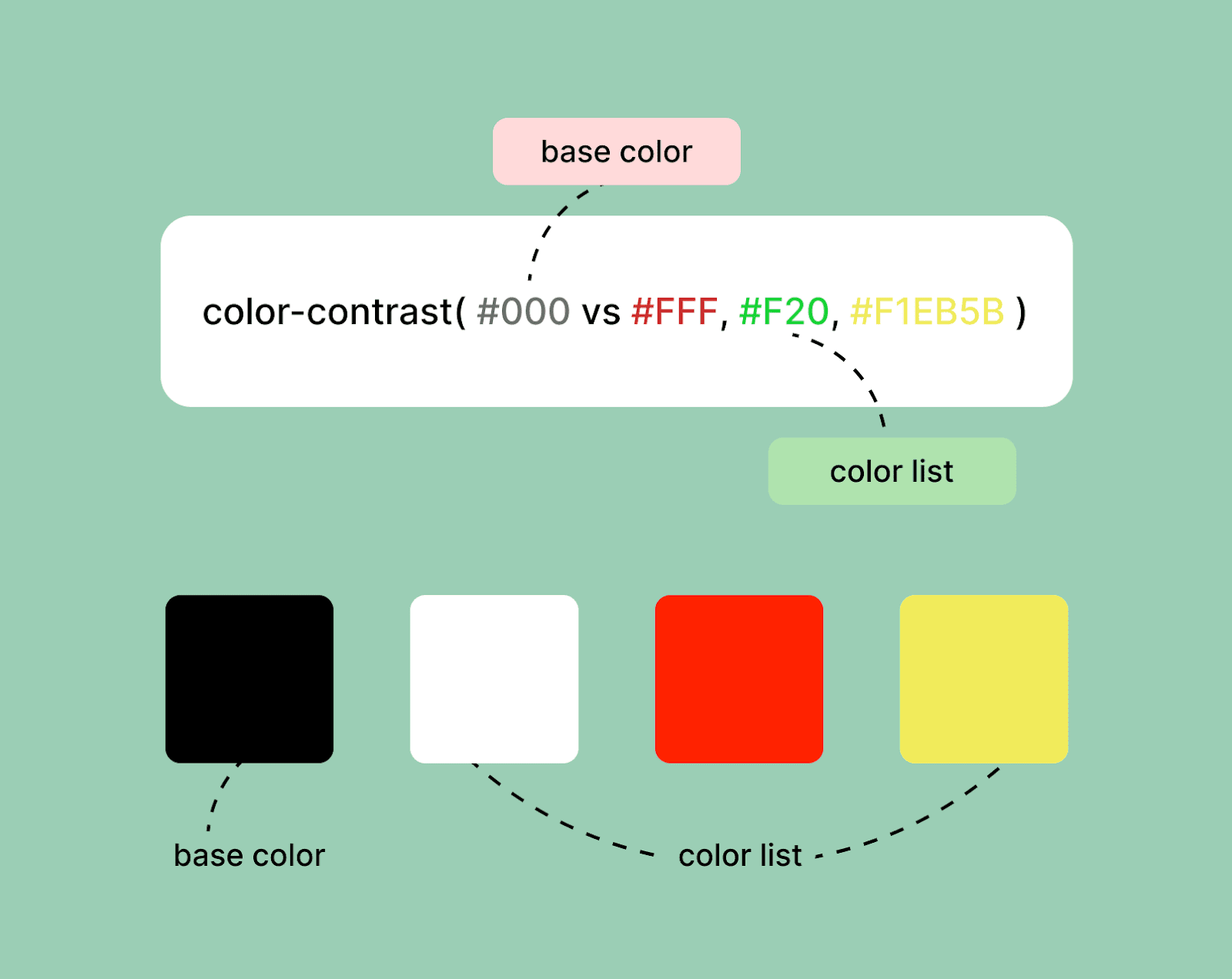
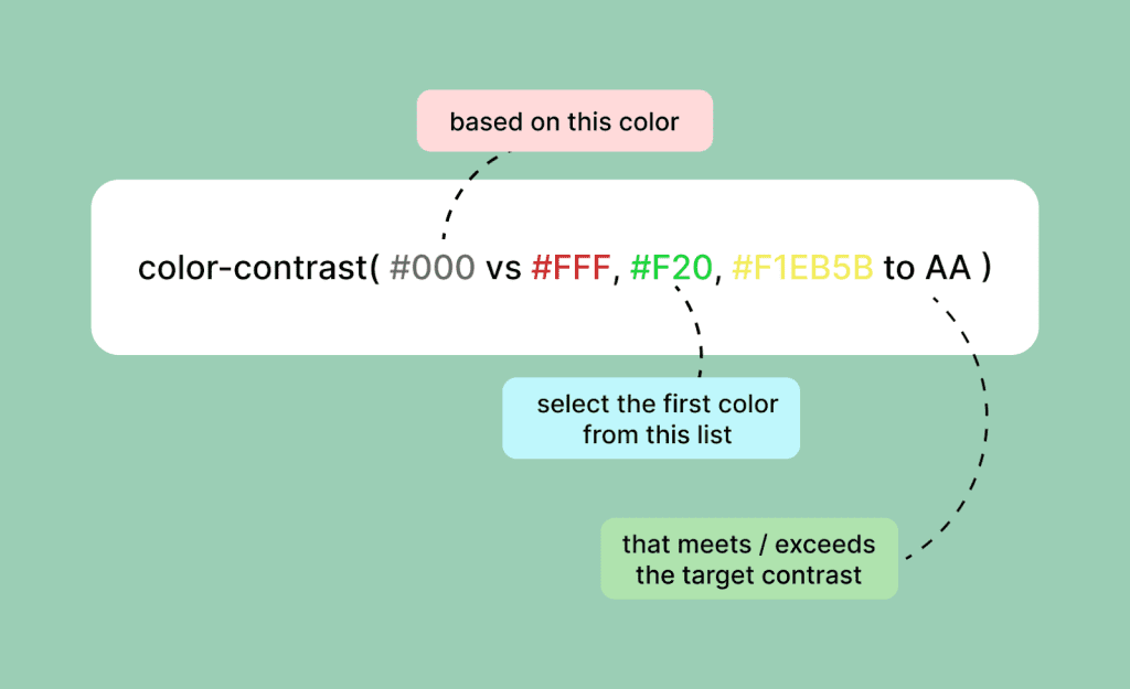
Understanding the Contrast-Color() Function
The CSS contrast-color() function, while a powerful tool in theory, has some notable limitations in practice. It essentially boils down to selecting between black and white based on the chosen color for contrast, which many designers find insufficient. For instance, in my own website design, the stark contrast created by pairing a dark blue background with solid white text resulted in a glaring readability issue. Instead of enhancing the user experience, the color pairing seemed to detract from it, making reading an uncomfortable task.
This sharp contrast can overwhelm the senses, leading to visual fatigue, especially during prolonged reading sessions. Designers like Andy Clarke point out that a more nuanced approach is required—one that takes into account not only the color itself but also its surrounding context on the page. This understanding can dictate whether softer or richer tones might be better suited to maintain both aesthetics and accessibility.
The Challenges of Achieving Optimal Contrast
While safe colors like black and white guarantee a certain level of contrast, they do not always provide the best overall experience. As I experimented with different shades, I discovered that a color like hsl(100, 100%, 100% / .8) offered a much more pleasing visual transition against my dark blue background. It struck a balance that felt more natural, but achieving this subtlety remains a challenge with the current capabilities of the contrast-color() function.
The existing limitations often result in a design that feels either too harsh or bland. It narrows down the creative freedom of designers. As a community, we must advocate for improvements to functions like contrast-color() that would enable us to easily specify our desired contrast levels without compromising on style. Ideally, this would include specifying opacity or saturation, which would enhance the overall palette while preserving readability.
Transitioning to Light-Dark() for Better Flexibility
In my pursuit of a more visually satisfying design, I eventually turned to the light-dark() function. This function opens a new realm of possibilities by blending two contrasting colors together, which allows for a smoother transition between text and background. Instead of relying solely on stark contrasts, using light-dark() enables a more tailored approach, leading to designs that are easy on the eyes and more visually appealing.
By specifying colors with this function instead of sticking to the binary of light and dark, I found that I could create text that stood out without feeling jarring. This notably enhances user experience, as the text is legible and harmonizes better with the overall design aesthetic. As future enhancements are anticipated for the contrast-color() function, I can only hope they incorporate principles that adapt to individual user preferences, enhancing the level of control designers have over color contrast.
Looking Ahead: The Future of Contrast in CSS
The evolving landscape of web design suggests an exciting future for functions like contrast-color(). Anticipated updates are expected to introduce more sophisticated algorithms that would allow designers to manipulate contrast in a way that’s more user-friendly and visually engaging. Concepts such as including customizable variables for color ratio adjustments are incredibly appealing.
As web standards evolve, this balancing act of ensuring both accessibility and aesthetics will become increasingly important. Tools that support a broader range of colors beyond just black and white will empower designers to create more intricate and engaging visuals. It’s a transition towards understanding that color is not merely a visual element; it’s an essential aspect of communication and user experience in digital spaces.
Color and Accessibility: An Ongoing Conversation
As we continue to explore the nuances of color contrast in design, the conversation around accessibility must remain central. The current guidelines, including those set forth by WCAG 3.0, highlight the importance of user preference and context in determining appropriate contrast levels. Designers must adapt not only to the technical specifications but also to the varied needs of their audience.
This dialogue emphasizes the notion that accessibility doesn’t have to mean compromise. Designers can embrace creativity while focusing on inclusivity. As we refine tools like contrast-color(), it’s crucial to gather feedback from diverse users, ensuring that improvements genuinely address the challenges faced by a wide spectrum of individuals navigating the web.
Reflecting on Personal Experiences with Color Usage
In reflecting on my own experiences using color in web design, I realize how deeply personal this aspect can be. Choices about color don’t just stem from aesthetic preferences; they’re often influenced by individual needs and experiences. The use of specific shades and contrasts becomes a subjective journey based on visual comfort and usability.
Just as Andy Clarke navigated his choices in personal web design, I’ve also embarked on a path to discover what colors resonate the most effectively for my audience. The ongoing experimentation with tools like light-dark() has been instrumental for me, cultivating a deeper understanding of how to engage users through thoughtful color application.
Harnessing the Power of CSS for Enhanced Design
Harnessing the power of CSS for enhanced design is akin to painting a vibrant picture on a canvas—each stroke intentional, each color carefully considered. As CSS evolves, so does the potential for designers to craft unique experiences that go beyond mere visual appeal. Innovations like contrast-color() and light-dark() encourage exploration and experimentation, pushing the boundaries of what’s possible.
Ultimately, the goal is to design for the user’s experience while ensuring aesthetic beauty remains intact. With each update in CSS comes new responsibilities, pushing designers to stay proactive in adapting to and advocating for improved tools that cater to both creativity and accessibility.
Practical Tips for Using Contrast-Color() Effectively
When working with the contrast-color() function, it’s important to keep in mind a few practical tips that can enhance effectiveness. One strategy is to consider your color palette thoroughly before committing to any designs. Experimenting with various pairings and observing their effects on readability in different contexts can yield valuable insights.
Additionally, embracing tools like color contrast checkers to assess the readability of your designs through the lens of contrast-color() can offer a clearer perspective on whether your chosen colors strike the right balance. This combination of strategic planning and practical tools can ultimately lead to designs that are both beautiful and functional.
Engaging with the Community on Color Design
Engaging with the design community about color usage can foster a richer understanding of current trends and user preferences. Through online forums, discussions, and collaborations, designers can share insights that elevate the conversation around color design. Collaborative feedback is a powerful tool in honing our skills and ensuring that our designs resonate with users.
By participating in this dialogue, we can collectively push for advancements in CSS that accommodate diverse needs, ultimately enriching the web design landscape as a whole. Like any progression in design, it’s about striking a balance between individual expression and communal support for the highest quality user experiences.

Conclusion
In summary, the issues surrounding the CSS contrast-color() function highlight the nuanced relationship between color and readability. While strong contrasts can enhance visibility, they may also lead to discomfort for users, particularly when the starkness of black and white is applied to a colored backdrop. Designers must not only aim for compliance with accessibility standards but also strive for aesthetic appeal, which sometimes requires breaking free from the limitations of basic contrast functions. The evolution of color functions in CSS is expected to address these challenges, offering designers greater flexibility in achieving visually pleasing and accessible web experiences.
As we look ahead, the potential expansions of the contrast-color() specification raise exciting possibilities for web design. Future updates may provide more control over color output and better cater to user preferences through more sophisticated algorithms. This adaptability can help create a more inclusive web environment. In practice, developers might consider the following points:
– Explore alternative functions like light-dark() to achieve desired color contrasts without discomfort.
– Keep an eye on the developments in CSS color functions to leverage new capabilities as they emerge.
– Balance between adhering to WCAG guidelines and ensuring a visually appealing design that caters to user comfort and preference.


