The CSS light-dark() function is an innovative tool that enables developers to create dynamic color schemes by toggling between light and dark modes based on user preferences. This function, introduced in 2024, has quickly become essential for enhancing user experience, especially as more users rely on dark mode for better visibility and reduced eye strain. With applications in various areas of web design, the light-dark() function plays a crucial role in facilitating customizable interfaces, allowing for seamless transitions between light and dark color palettes. As web accessibility becomes increasingly important, incorporating options like high contrast mode into the light-dark() function would further elevate its utility. Ultimately, understanding the potential of the light-dark() function opens up exciting possibilities for creating bespoke color schemes that enhance both aesthetics and functionality.
Often referred to as the dynamic color mode function, the CSS light-dark() function serves as a bridge between traditional light and dark modes, presenting an opportunity to improve user interface customization in web design. Known for its straightforward syntax that adjusts color values according to individual user settings, this function is key to optimizing website accessibility. The notion of integrating alternative color themes, such as high contrast and custom color schemes, aligns well with the growing trend towards personalizing user experiences. Moreover, the upcoming schemed-value() function hints at even broader capabilities for color management within CSS, extending beyond the confines of simple light and dark transitions. Exploring these advancements provides insight into the future of web aesthetics, emphasizing the need for versatile and inclusive color options.
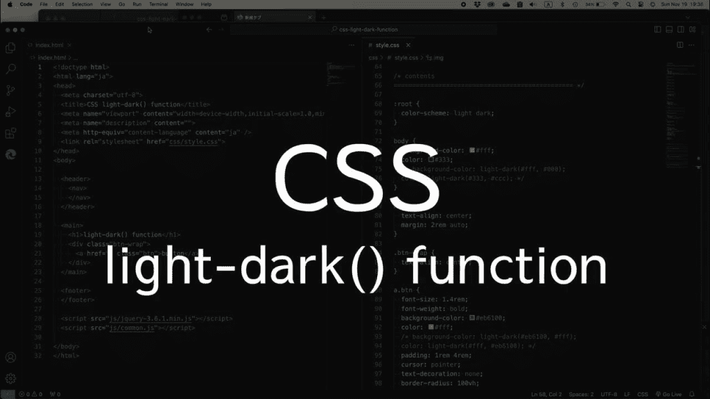
Understanding the light-dark() Function
The `light-dark()` function is a relatively new feature in CSS that allows web developers to define a color scheme based on user preferences for light or dark modes. Introduced as a solution to a long-standing need for better theme support, this function takes two color values—one for light mode and another for dark mode. As a result, it offers a simple way to adapt to users’ viewing preferences without requiring extensive conditional checks in your stylesheet.
Consider how easy it is to use in practice; with a straightforward implementation, web developers can enhance user experience significantly. The example provided shows a minimal setup, but the potential to scale and adapt is vast. We cannot underestimate the important role `light-dark()` plays in ensuring accessibility and catering to a broader range of users, particularly as more people switch between light and dark modes on their devices.
The Need for Expanded Features
Despite the utility of `light-dark()`, there remains the question of whether it should support more than just light and dark values. In my research, I was struck by how many other color themes could enhance a user’s experience—grayscale, high contrast, and low contrast modes are just a few possibilities. By limiting developers to only these two modes, we risk neglecting a significant segment of users who might prefer these alternative settings.
Adding support for new modes could not only improve accessibility but also enrich the overall design language of web applications. The discussions around this function suggest that there’s a growing understanding in the CSS community about the necessity for more versatile color management strategies. If `light-dark()` was expanded to include other schemes, it could become a more powerful tool in our arsenal as developers, allowing for creative freedom and a more inclusive web.
The Debate on High-Contrast Modes
The inclusion of high-contrast modes within the `light-dark()` function remains a hotly debated topic. Some advocates believe that high-contrast options should be integrated into `light-dark()` because they directly support users with visual impairments, offering a necessary change that would enhance readability and accessibility. Others argue that introducing such a feature could complicate the function, diluting its primary purpose.
It’s a delicate balance between maintaining simplicity and addressing the needs of users with diverse preferences. I find Bramus’s perspective particularly compelling; he suggests that `light-dark()` is merely an intermediary towards something greater—a more comprehensive `schemed-value()` function that would provide more flexibility than we currently have. This approach could help clarify roles and responsibilities between functions while leading to more robust theming capabilities.
The Concept of Custom Color Schemes
Custom color schemes are where the exciting potential of CSS is starting to emerge. With the proposed idea of registering a `color-scheme` using an at-rule, such as `@color-scheme`, we can define precisely how different color values interact with one another, tailoring experiences even further. Users could benefit significantly from this, as it allows for the creation of personalized themes that cater to their specific visual preferences.
Imagine being able to define schemes not just for light and dark modes but for a variety of other contexts based on your target audience. Allowing developers more autonomy in this area would undoubtedly spark creativity and results in richer web designs. Moreover, this leads to a more inclusive approach to web design where everyone’s preferences and needs can be catered to, making a positive impact on accessibility.
Reflections on Future Developments
The overarching question remains: should we push for the `light-dark()` function to incorporate additional modes, or rely on the anticipated `schemed-value()` function arising from it? On one hand, advocating for expansions within `light-dark()` would present immediate benefits; on the other hand, waiting for a more comprehensive solution could result in a stronger foundation for future CSS developments.
What we do know is that discussions within the CSS community are vigorous and reflect a genuine concern for enhancing user experience and accessibility. By taking the time to explore these various avenues, we prepare ourselves for future advancements in CSS—where custom functions, extended themes, and more will shape the landscape of web development in exciting ways.

The Future of CSS light-dark() Functionality
In conclusion, while the current `light-dark()` function serves as a valuable tool for toggling between light and dark themes, the discussion around its potential to support additional color modes cannot be ignored. The desire for heightened accessibility through modes like high contrast speaks to a broader need for inclusivity in web design. As developers, we must advocate for enhancements that align with user preferences and varying visual needs. The community’s input could guide the evolution of this function, ensuring it meets the demands of all users.
Moreover, the introduction of the `schemed-value()` function presents an exciting opportunity for more nuanced color handling in CSS. By enabling custom color schemes, developers could create richer and more personalized user experiences. The pathway forward seemingly lies not in patching the limitations of `light-dark()`, but rather in integrating it into a larger framework that includes flexibility and extensibility through new features. As CSS evolves, the emphasis will likely remain on creating an inclusive digital landscape that caters to diverse user preferences.


