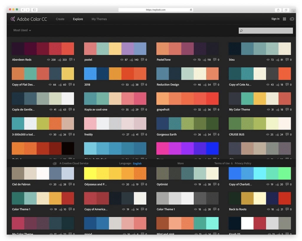
Website color schemes are a crucial element in web design that can significantly influence user experience and engagement. The right combination of colors not only enhances aesthetic appeal but also guides user behavior and decision-making. Incorporating the best color schemes for websites allows brands to communicate their values and identity effectively, setting the tone for how visitors perceive them. Understanding color psychology for websites can help designers choose palettes that evoke the desired emotional responses from their audience. As we delve into this guide on website color schemes, we’ll reveal 30 compelling examples that combine functionality and artistry, featuring trending color palettes that are sure to elevate your site’s branding and impact.
When discussing the aesthetic choices for digital platforms, the term “color arrangements for web design” often emerges as a key focal point. These arrangements encompass everything from vibrant hues to subtle tones, each serving a distinct purpose in enhancing user interaction. Exploring methods of color selection in web design can reveal significant insights into how colors influence visitor perceptions and actions. By leveraging effective web design color guides, website owners can curate experiences that are not just visually appealing but also strategically aligned with their branding objectives. In this exploration of color schemes, we will cover a broad spectrum that includes contemporary trends and timeless classics.
The Importance of Choosing the Right Color Scheme for Your Website
In the realm of web design, the significance of selecting the ideal color scheme cannot be overstated. It sets the foundation for the user experience and can dramatically influence a visitor’s perception of your brand within mere milliseconds. Studies indicate that visual cues, particularly colors, shape first impressions, often before any text is read. This immediate impact highlights why choosing the right colors matters; it can lead to improved user engagement and higher conversion rates. An effectively implemented color scheme drives visitors to interact with your content, thereby increasing time spent on your site.
Moreover, colors are not just aesthetic choices; they hold the power of color psychology, where hues can elicit feelings and emotional responses. For instance, blue tones often convey trust and security, making them ideal for finance and health-related websites. In contrast, vibrant reds can evoke excitement and urgency, perfect for e-commerce platforms aiming to boost sales. Understanding these emotional associations provides a strategic advantage in web design color guides, allowing brands to select colors that resonate with their target audience and enhance brand recognition.
Exploring the Best Color Schemes for Websites
When curating a compelling website, exploring the best color schemes is crucial. One approach is to utilize classic combinations that stand the test of time, such as monochromatic blue or black and white with red accents. These iconic palettes are versatile and can adapt to a variety of industries, making them a reliable choice for enhancing website branding colors. This enduring appeal ensures that your site remains visually appealing and effective over time, regardless of changing design trends.
Conversely, if you aim to stay ahead of the curve, consider incorporating trending color palettes for 2025, such as neo-mint paired with deep purple or coral alongside teal. These combinations not only harness contemporary aesthetics but also demonstrate your brand’s relevance in a fast-paced digital world. By striking a balance between timeless appeal and modern trends, you can create an eye-catching site that invites exploration and encourages user interaction.
How Color Psychology Influences Web Design
Understanding color psychology is essential when selecting a color scheme for your website. Each color evokes different emotions and can affect user behavior in profound ways. For example, cool colors like blue and green often induce calmness and trust, which is why they’re prevalent in healthcare and wellness websites. In contrast, warm colors like red and orange can stimulate excitement and urgency, making them suited for calls-to-action on e-commerce sites. Integrating these insights into your web design process can create a more powerful emotional connection with your audience.
Additionally, leveraging color psychology helps to reinforce your brand identity. Consistency in color use can increase brand recognition by up to 80%, creating a cohesive experience for visitors across all platforms. Use color scheme website examples to inspire your choices, keeping in mind that the same principles apply universally. By thoughtfully selecting colors based on psychological impact, you can enhance user engagement and foster brand loyalty, ultimately driving your business goals.
Tips for Selecting a Color Scheme for Website Branding
Selecting a color scheme for your website branding is a multifaceted process that requires careful consideration of your brand personality and target audience. Begin by identifying the essence of your brand—is it playful, sophisticated, or contemporary? This understanding will guide your color choices. For instance, a vibrant color palette might suit a creative agency, whereas muted tones may resonate better with a law firm. The key is to ensure that your colors reflect your brand values while appealing to your target demographic.
Incorporating research into industry-specific color schemes also enhances your decision-making process. By analyzing competitors and understanding what color combinations work within your niche, you can carve out a unique identity. Tools like Adobe Color can help visualize potential schemes and ensure they align with color theory principles, such as complementary or analogous ranges. Testing your color options with real users can provide invaluable feedback, ensuring that your chosen palette resonates well with visitors.
The Impact of Color Schemes on Conversion Rates
The strategic use of color schemes can significantly affect conversion rates on your website. Research shows that colors can boost conversion by as much as 24% when tailored for calls-to-action (CTAs). For example, using a contrasting color for a ‘Buy Now’ button can make it stand out, drawing attention and prompting user action. Therefore, when designing your site, consider how colors can navigate visitors’ emotions and guide their decisions, influencing their journey through your site.
Additionally, the context in which colors are placed matters. Ensuring high contrast between text and background colors improves readability, making content more accessible and engaging. Color schemes that prioritize user experience and accessibility not only enhance visual appeal but also promote trust and satisfaction among users. By focusing on converting visitors into customers through effective color strategy, you pave the way for better business results and an optimized user experience.
Creating Cohesive Color Palettes for Your Website
Creating cohesive color palettes involves blending various shades and tones that harmonize to create a visually appealing look. Start by selecting a base color that aligns with your branding goals, then incorporate complementary or contrasting shades to add depth and dimension. Tools like Coolors and Color Hunt can help in generating color palettes tailored to your brand identity, ensuring that each element of your website feels connected and well-designed.
Remember to limit your color choices to a select few shades, as overcomplicating the palette can leave visitors feeling overwhelmed. Typically, three to five colors can effectively serve your website’s design while allowing for visual diversity. Ensure that the main colors convey the right emotions while secondary colors you choose serve as accents without detracting from your primary messaging. A balanced palette not only enhances aesthetic appeal but also supports user navigation and overall brand coherence.
Using Color Theory to Your Advantage in Web Design
Leveraging color theory in web design is crucial for creating a balanced and appealing site. Color theory encompasses elements such as complementary, analogous, and triadic color schemes, guiding how to choose colors that work well together. Understanding the relationships between colors can lead to designs that naturally attract the viewer’s eye and enhance the overall aesthetic experience of your website.
By applying these principles, designers can create visual harmony that resonates with users. For instance, a complementary scheme, like blue and orange, can create visual tension that grabs attention, while analogous schemes, such as blue-green and teal, can provide a seamless flow that is calming and inviting. By incorporating these color theory basics into your web design, you can craft an engaging online experience that captures visitors’ interest and encourages them to explore your content.
Testing and Iterating on Your Website Color Scheme
Testing your chosen color scheme is essential before fully committing to your design. Use A/B testing methods to compare different color combinations and measure their impact on user behavior. By showing different color schemes to a sample of your audience and analyzing metrics such as click-through rates, time on site, and conversions, you can gather real data to inform your decisions.
Iterating on your color choices based on testing results allows you to refine your approach continuously. Successful color combinations emerge from understanding user preferences and behaviors, ensuring that the design resonates effectively with your audience. Utilize insights from user feedback to evolve your site’s color palette, ensuring that your web presence remains effective, engaging, and aligned with design trends that appeal to your changing visitor base.
Future Trends in Website Color Schemes
As we look towards the future, staying informed about emerging trends in website color schemes is vital for maintaining relevance. With the rise of minimalist designs, soft pastels are becoming increasingly popular, providing a clean and contemporary feel while allowing content to take center stage. Color palettes inspired by nature, featuring earth tones and muted shades, are also trending as consumers become more environmentally conscious, seeking brands that reflect their values.
Moreover, advancements in technology will continue to influence color choices, with more designers experimenting with gradients and dynamic color adjustments that adapt based on user preferences. Staying ahead of these trends helps your website remain fresh and engaging, attracting new visitors while resonating with returning users. Keeping an eye on the evolving landscape of color psychology and branding concepts will only strengthen your web design strategy in the years ahead.
Frequently Asked Questions
What are the best color schemes for websites to enhance user engagement?
The best color schemes for websites involve combinations that resonate with your target audience while enhancing user engagement. Consider using complementary colors, such as blue and orange, or classic monochromatic schemes like varying shades of blue, which create depth and maintain focus on content.
How does color psychology affect website color schemes?
Color psychology plays a crucial role in website color schemes by evoking emotional responses from users. For instance, blue often inspires trust, while red can stimulate appetite. Selecting colors based on their psychological impact can improve user experience and increase conversions.
What are trending color palettes for web design in 2025?
Trending color palettes for web design in 2025 include bold combinations like neo-mint and deep purple, or coral and teal. These palettes are visually striking and cater to contemporary aesthetics, making them ideal for modern web design.
How can I use web design color guides to choose a color scheme?
Web design color guides provide valuable insights into harmonizing colors. Utilize tools like the color wheel to find complementary or analogous colors that enhance your website’s aesthetic. Additionally, referencing color guides can help identify popular trends suitable for your brand.
What color schemes are effective for website branding?
Effective website branding often utilizes consistent color schemes that reflect the brand’s personality. Classic combinations like black and white with red accents, or earth tones for a organic feel, can significantly enhance brand recognition and convey the brand identity.
What should I consider when selecting colors for my website color scheme?
When selecting colors for your website color scheme, consider your brand personality, audience demographics, and current design trends. Research competitor color schemes and test different combinations to find what resonates best with your visitors.
How can I experiment with different website color schemes before finalizing one?
You can experiment with different website color schemes using design tools like Adobe Color, Coolors, or Canva. These platforms allow you to create and visualize various color combinations to see how they would look on your website before making a final decision.
Are there specific color schemes recommended for e-commerce websites?
Yes, specific color schemes recommended for e-commerce websites often include bright, appetite-stimulating colors like reds and yellows, or trustworthy blues combined with vibrant accents. These colors can help guide users towards making purchases and enhance overall user experience.
Can minimalist color schemes be effective for websites?
Absolutely, minimalist color schemes can be very effective for websites as they prioritize readability and content. Using a simple palette of grays with one strong accent color can create an elegant design that focuses on user engagement.
How can I ensure my website color scheme is accessible?
To ensure your website color scheme is accessible, check the color contrast ratios to make sure text is readable against backgrounds. Tools like WebAIM’s contrast checker can help you evaluate accessibility and make necessary adjustments for all users.
| Color Scheme | Description | Color Codes |
|---|---|---|
| Monochromatic Blue | A sophisticated approach using varying shades of blue creates depth without distraction. | Base: #1A73E8, Light: #D2E3FC, Dark: #174EA6 |
| Black and White with Red Accents | This timeless combination provides excellent contrast and readability. | Black: #000000, White: #FFFFFF, Red: #FF3A3A |
| Earth Tones | Warm browns, greens, and soft yellows create an organic, welcoming atmosphere. | Brown: #8B4513, Green: #556B2F, Yellow: #F5DEB3 |
| Coral and Teal | Vibrant yet balanced, this combination captures attention without overwhelming. | Coral: #FF6B6B, Teal: #4ECDC4, Off-White: #F7F7F7 |
| Healthcare and Wellness | Calming blues and greens inspire trust and healing. | Soft Blue: #A8D5E2, Mint Green: #D1F5D3, Clean White: #FFFFFF |
| Gradient Purples | Multi-tonal purple gradients create depth and visual interest. | Light Purple: #D8B5FF, Medium Purple: #9747FF, Dark Purple: #5E17EB |
| Primary Colors | The classics red, blue, and yellow never fail to capture attention. | Fire Engine Red: #CE1126, Royal Blue: #4169E1, Golden Yellow: #FFD700 |
Summary
Website color schemes are crucial in determining how visitors perceive and engage with your online presence. By carefully selecting colors that align with your brand’s personality and your audience’s emotions, you can create an inviting and memorable experience. Remember to test your chosen schemes for effectiveness and consider accessibility for all users. Embrace the power of color to transform your website into a compelling digital platform.


