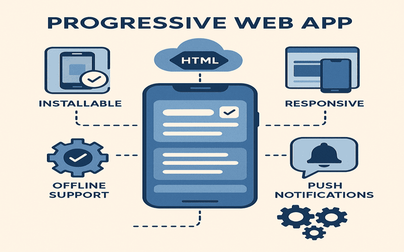
Imagine opening your favorite web app and being greeted by a stunning interface that seamlessly integrates with your operating system instead of a bland title bar. With the upcoming Window Controls Overlay feature for Progressive Web Apps (PWAs), designers can break away from the constraints of traditional rectangular interfaces and reclaim that valuable screen real estate. This is not just about aesthetics; it’s a pivotal shift in PWA design that opens up exciting possibilities. By layering UI elements over the window control area, we can create a more immersive user experience that feels cohesive, responsive, and unique—showcasing the power of CSS techniques to elevate the standard of web app user interfaces.
The introduction of Window Controls Overlay is a game changer for web app developers aiming for an integrated look that truly feels at home on a desktop. It pushes us to rethink responsive design, encouraging the use of CSS environment variables that allow for fluid interactions with varying device features. As we explore these new design horizons, the challenge lies in not just adopting the technology but in creatively utilizing it to enhance user experience while ensuring functionality isn’t lost. How can we leverage this feature to craft applications that don’t just fit the screen but also resonate with the user? Let’s unpack these ideas and experiment with what’s possible.
The Evolution of Web App Interfaces
Web applications have fundamentally transformed how we interact with digital content. As developers, we often design for familiar rectangular frameworks shaped by decades of UI standards. However, innovations such as the Window Controls Overlay push us to reconsider not just how we build interfaces but how they can look and feel within those constraints. These overlay controls allow us to extend our designs into previously restricted areas, thus crafting richer interactions.
Reflecting on the interface evolution, it’s intriguing how old paradigms maintain their grip on our design thinking. PWAs (Progressive Web Apps) are at the forefront of this debate, merging the robust features of traditional apps with the accessibility of web technology. We’re no longer confined to simplistic buttons and ribbons; instead, we can integrate real-time dynamic elements into our designs, enhancing responsiveness for users on every platform.
To make sense of this, consider a music streaming service interface. Imagine if we utilize the area above the conventional title bar to display album art or animating controls—this is where the Window Controls Overlay becomes a game-changer. Not only does it liberate design elements from a static top bar, but it also allows for a more immersive experience that resonates well with users.
Harnessing Window Controls Overlay in PWA Design
So how do we practically implement the Window Controls Overlay in our projects? First, it’s essential to realize that using this feature entails some changes to our web app manifest file. By default, setting the display override to include the ‘window-controls-overlay’ modifies how we can present our app. A sample snippet could look like this:
```json

{

  "name": "My PWA App",

  "theme_color": "#ffffff",

  "display_override": ["window-controls-overlay"]

}

```
Once this is set, we get to work on the layout with new CSS techniques. For instance, we can use the newly introduced CSS environment variables to ensure our content doesn’t overlap with control buttons. Defining a header with respect to these variables keeps our design clean and functional.
Utilizing CSS like this helps in maintaining a user-friendly interface, regardless of the operating system. For example, with environment variables such as `titlebar-area-height`, we can ensure the header aligns perfectly, enhancing the overall user interface of our PWA across different browsers.
Design Considerations for Responsive PWAs
Ensuring our apps look good on any device isn’t just about responsiveness; it’s also about adaptability. The introduction of the Window Controls Overlay necessitates a rethink of how we treat app space. Have you ever considered how much effective design hinges on the smallest visual spaces? Even a 30-pixel advantage can dramatically elevate user experience. This extra space, albeit small, allows us to enhance functionality while also making it visually appealing.
When working with CSS, consider integrating `@media` queries alongside leveraging the Window Controls Overlay to maintain user experience as screen sizes change. For example, based on the size of the window, we can dynamically alter the positioning of elements like our header, keeping interface elements both functional and aesthetically pleasing.
```css

@media (max-width: 800px) {

  header {

    top: env(titlebar-area-height);

    padding: 10px;

    display: flex;

    justify-content: space-between;

  }

}

```
The goal is to blend the design seamlessly with the environment, allowing for fluid transitions while appropriately using available space. This not only makes better use of the window but also aligns with user expectations, creating a cohesive multi-platform experience.

Frequently Asked Questions
What is the Window Controls Overlay feature in PWAs?
The Window Controls Overlay is a feature that allows Progressive Web Apps (PWAs) to utilize the entire window space, including the area typically occupied by the title bar and window controls. This enables designers to create more integrated and visually appealing web app user interfaces by providing additional room for content and enhancing the overall PWA design.
How can CSS techniques be used with the Window Controls Overlay?
CSS techniques, such as using environment variables like titlebar-area-x, can help position content correctly when utilizing the Window Controls Overlay. This ensures that app elements do not overlap with the window controls and that the layout adapts responsively to various screen sizes and operating systems.
What are the benefits of using PWAs and the Window Controls Overlay for responsive design?
PWAs, combined with the Window Controls Overlay, allow for an enhanced user experience by blurring the lines between web apps and native applications. This combination facilitates adaptive layouts that respond to different device postures and screen sizes, making it easier for developers to design responsive web applications that feel native to their operating systems.
– The web is fundamentally constructed from boxes, and recent innovations in technology compel designers to rethink these traditional layouts, enhancing creativity and functionality. In particular, the **Window Controls Overlay** feature encourages developers to maximize the use of visual real estate within PWAs, removing the constraints of the title bar and built-in window controls.
– Imagine the possibilities when designing Progressive Web Apps (PWAs)! With the **Window Controls Overlay**, designers can integrate their app content seamlessly with the operating system’s interface, challenging the historic perceptions of application aesthetics.

– Developers should consider how they can utilize the **Window Controls Overlay** effectively. By adjusting the manifest file with display overrides, it’s possible to create immersive experiences that make PWAs feel more like native applications rather than just web pages.
– A practical step in leveraging the **Window Controls Overlay** is adjusting CSS to prevent window control overlap. New CSS environment variables such as `titlebar-area-x` and `titlebar-area-height` can help maintain a clean layout, enhancing usability.
– To further enrich the user experience, remember to adapt background colors dynamically through JavaScript and CSS properties. Setting a cohesive theme with the **Window Controls Overlay** adds flair to your PWA and makes it visually appealing while providing functional navigation through window controls.
– Accessibility should be a focus when adopting new features. With the **Window Controls Overlay**, ensure users can still drag the application window intuitively by expanding draggable areas, combining traditional expectations with new design paradigms.
– Finally, monitor responsiveness to window size changes. The **Window Controls Overlay** JavaScript API offers tools to react to geometry changes, allowing designs to adjust fluidly, thus improving user experience on diverse screen sizes.
Exploring how to break boundaries in web design leads to new opportunities; check out more insights related to this evolving design landscape.