

Imagine a user struggling to read a crucial button on your application because the text is too small, leading to frustration and potential abandonment. This scenario underscores the importance of font size accessibility in digital design, where every piece of text serves as a vital communication tool. By integrating **Figma font scaling** into your design workflow, you can simplify the testing of font size adjustments to meet the diverse needs of users relying on **assistive technology**. It’s not merely a question of aesthetic preference but ensuring compliance with **accessibility best practices**, allowing users to customize their reading experience effortlessly.
In Figma, testing font size adjustments becomes part of the routine, enabling designers to visualize how changes impact the user experience before implementation. Consider this: about 26% of mobile users routinely increase their font size for better readability. By employing systematic **font size testing** within your design processes, you create an environment where accessibility is not an afterthought but an integral part of the development life cycle. This approach not only enhances the user interface but aligns your projects with inclusivity standards, fundamentally changing how accessibility is perceived within the team.
Understanding Font Size Accessibility
Font size accessibility is more than a trend; it’s a pressing need that affects user interaction with digital products. When text is too small, essential information becomes obscured, frustrating users and potentially leading them to abandon an application. Accessibility does not merely help those with visual impairments; it enhances the experience for everyone, as many users prefer larger text for comfort while reading. By integrating font size variability directly into your design process, you ensure that users can choose their preferred text size without inconvenience.
Moreover, as designers, it’s our responsibility to anticipate how users interact with web interfaces. Statistics indicate that a significant portion of mobile users adjust their font settings for a better experience—this behavior underlines the importance of designing with adaptability in mind. As we work on digital products, recognizing the need for increasing font sizes becomes essential. This foundational understanding drives the importance of using tools like Figma, which allows for seamless integrations of adjustable text sizes without requiring complete overhauls of designs.
The Role of Assistive Technology in Enhancing Accessibility
Assistive technology plays a crucial role in bridging gaps in digital design accessibility. For instance, think about how screen readers interpret text for visually impaired users or how dynamic text resizing affects various interaction elements. Users leverage a myriad of assistive tools, such as voice recognition software or screen magnifiers, to navigate digital landscapes that can be overwhelming without such support.
An exemplary instance includes enabling browser settings for text enlargement. For those unfamiliar, standard browsers like Chrome offer built-in features to increase font sizes, allowing users a significant degree of control over their reading experience. By supporting such technologies in our designs, and by including markers that notify users about scale adjustments, we not only comply with accessibility standards but also enrich the user experience for a broader audience.
Creating a Workflow for Font Size Testing in Figma
Integrating font size testing into your design workflow can feel daunting, but it doesn’t have to be. A simple approach is to create a Figma file with preset variables for different text sizes—100%, 120%, 140%, and so on. This allows you to visualize changes in real-time, ensuring each layout adapts harmoniously. To start, define a base text style in Figma and apply variables for font size that follow a consistent scale—this creates an efficient system where size adjustments reflect throughout the design.
As you set up these styles, ensure to utilize auto layouts. This will facilitate the dynamic resizing of elements within your design as text scales. Neglecting this step may lead to a chaotic design where elements misalign or overflow. By preemptively implementing responsive measures, you will streamline the typography assessment process and enable a smoother iteration cycle when testing font sizes across various devices.
Design Standards and Compliance: Why They Matter
Adhering to design standards, particularly those outlined in the Web Content Accessibility Guidelines (WCAG), should be mandatory for any project. Section 1.4.4 states that text can be resized up to 200% without loss of content or functionality—an essential aspect that underscores the need for mindful design practices. Failure to comply not only denies a portion of the user base an inclusive experience but also exposes businesses to legal ramifications.
Additionally, when developing interfaces, think about how elements may need to adapt as users increase font sizes. The goal isn’t just to meet compliance but to create a genuinely usable interface for everyone, including users who rely heavily on adaptive technologies. Crafting designs that maintain clarity and usability, even with significant text enlargement, speaks volumes about a company’s commitment to accessibility.
Iterative Testing: The Path to Improvement in Designs
Testing should be an iterative process, not a one-off task. After applying different font sizes in your mockups, gather feedback from real users, especially those who rely on assistive technologies. This helps inform which aspects of your design work well and which need adjustment. User testing on accessibility can reveal unexpected issues; for instance, while a particular font size might seem adequate to designers, users may experience discomfort or difficulty that goes unnoticed during standard design review processes.
Following these tests, document the findings thoroughly. If certain designs fail to meet accessibility expectations, discuss them with your team and strategize on solutions. Whether it requires adjusting font weight to improve legibility or tweaking layout features to accommodate larger text, the iterative cycle of feedback and revision is essential for enhancing accessibility. Remember, it’s not just about achieving compliance—it’s about fostering an inclusive digital experience for all users.

Frequently Asked Questions
What are the best practices for ensuring font size accessibility in digital design?
To ensure font size accessibility in digital design, it’s crucial to implement accessibility best practices such as designing with scalable text that can be resized up to 200% without loss of functionality. Additionally, using assistive technology that facilitates font size adjustments is essential. Tools like Figma support font scaling, allowing designers to create adaptive designs that maintain readability and usability at various sizes.
How can Figma be used for testing font size increases in accessibility design?
Figma offers robust features such as variables and auto layouts that allow designers to test font size increases easily. By creating a set of variables for different font sizes, designers can rapidly iterate and assess the impact on the design’s readability and overall accessibility. This approach aligns with digital design accessibility practices by ensuring that the text accommodates users who require larger fonts.
Why is it important to incorporate assistive technology considerations in font size testing?
Incorporating assistive technology considerations in font size testing is vital as it ensures that digital products are usable by individuals with diverse accessibility needs. Users often rely on tools that adapt font sizes for their comfort, and designers must account for these adjustments. By testing fonts across various sizes in Figma, designers can better understand the implications of their choices and make informed decisions that enhance overall accessibility.
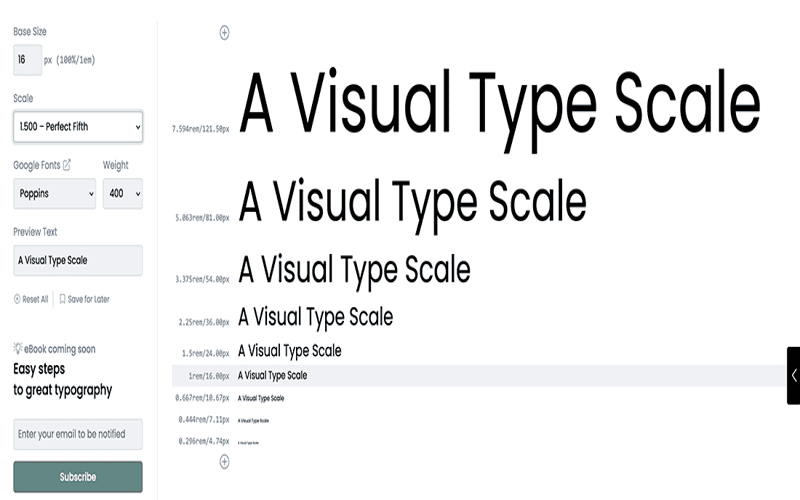
– Implementing accessibility considerations in design workflows doesn’t require a complete overhaul, but rather integrating it naturally into existing processes, especially when it comes to handling font sizes, making them a standard aspect of design tasks.
– Establishing a culture of accessibility in teams means moving beyond clichés; it’s about finding practical steps to ensure font readability for all users without overburdening already strained resources.
– It’s essential to acknowledge that accessibility is not just another checklist item but a critical component of digital design, particularly when considering how font sizes can affect user experience across multiple devices and contexts.
– Prioritizing readability through adjustable font sizes should be part of the designing phase, considering how many users rely on features like resizing text on their devices to engage effectively with content.
– Design elements must be adaptive to user preferences, ensuring that increased font sizes do not create layout problems, which could deter users from interacting with essential content.
– Not all text elements should increase when font size adjustments are made; some may already be adequately sized, so care must be taken to assess readability without disrupting the design’s integrity.
– When conducting tests in design tools like Figma, utilizing variables to manage text styles allows for efficient scaling of font sizes while maintaining visual hierarchy and ensuring that the design remains functional and accessible.
– The necessity of automation through features like auto layout in Figma emphasizes the importance of structured design systems in accommodating diverse user needs for font size adjustments without hassle.
– A well-organized design system lays the groundwork for simplifying processes, which supports consistent accessibility practices, such as testing font size variables, integrated effortlessly into routine design workflows.