
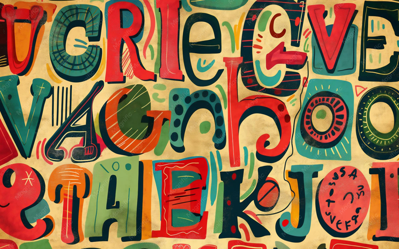
CSS Letter-Spacing Effects offer a fascinating way to transform your web typography, enhancing readability and visual appeal. By adjusting the letter-spacing property, designers can create stunning CSS text effects that captivate users’ attention and improve user engagement. Implementing letter-spacing animations allows for a dynamic reveal of characters, making text more interactive and engaging. These innovative CSS design techniques not only emphasize important information but also provide a playful interaction for users, inviting them to explore the content further. Embracing CSS character reveal can take your designs to the next level, highlighting your creative approach to web aesthetics.
When it comes to enhancing typographic design, playing with the spacing between letters can yield impressive results. Interactive CSS effects like letter-spacing not only add flair to your text but can also craft unique animations that draw attention. Techniques such as CSS text transformations and character reveals create memorable user experiences that stand out in a crowded digital landscape. By leveraging these methods, web designers can reinforce their message visually, transforming plain text into captivating and interactive elements. By exploring these creative avenues, you can elevate the artistry of your digital content.
Exploring Letter-Spacing in CSS Effectively
When discussing text manipulation in CSS, letter-spacing instantly comes to mind. This property serves as a powerful tool to help us adjust the space between each character smoothly. With a simple positive value, you can add visual breathing space between letters. Conversely, by applying negative values, you can pull characters closer together. Think of it like crafting a fine piece of art—adjusting each letter’s position to either spread out or overlap, defining how the text breathes within its design.
Imagine, for example, using CSS to create a unique showcase of text as part of your website’s interactive features. By utilizing the `letter-spacing` property alongside animations, you can produce stunning visual results. Consider a label that when clicked gradually reveals itself—with letters first squished together, hidden under transparent color, and then spreading apart into legibility, each step elegant and intentional. This approach not only enhances aesthetics but engages users by providing a delightful visual treat.
Creating Interactive Text Effects
Let’s dive deeper into how the interactive effects can be designed using CSS. The example shared demonstrates how a checkbox can work wonders in a playful display of text. By targeting specific labels through `:checked` states, we create an engaging experience where text appears and transforms simply with a user’s interactions. It’s all about shooting for that sweet spot between user engagement and visual polish—keeping things fun and dynamic!
To build this interactivity effectively, consider the efficiency of transitions when the checkbox state changes. For instance, letters that were once invisibly stacked can elegantly spread out into a remarkable reveal. By animating the `letter-spacing` and the `color` properties simultaneously, you ensure that the user’s eye follows the transformations, adding a layer of excitement to the navigation of your web application.
Reimagining Text Through Design
The beauty of CSS does not stop at simple text effects. It offers creative flexibility to transform mundane letters into dynamic visuals. Think about integrating letter-spacing with images or other visual elements to create a unique narrative for each piece of content on your webpage. One exciting example is using an acronym where, on hover, the full meaning unfolds, showcasing how thoughtful design can tell a story beyond just text.
By leveraging features like `::first-letter`, you can create standout designs where the initial character commands attention, while the rest of the text builds anticipation. Text styling is more than functionality; it’s about crafting experiences. With just letter-spacing adjustments and strategic hover effects, you can provide users with an engaging interface that sparks curiosity and encourages more profound interaction. What creative scenarios can you envision for your next project?
In conclusion, the `letter-spacing` property in CSS offers a creative way to manipulate text visibility through spacing adjustments. Here’s a quick overview of the main points discussed:
- Letter-Spacing Manipulation: Positive and negative values can control the spacing between characters, allowing for overlapping or separation effects.
- Animation Capability: The `letter-spacing` property is animatable, enabling smooth transitions from hidden to visible text.
- Interactive UI Elements: By utilizing checkboxes and transitions, we can create engaging experiences, revealing or concealing text effectively.
- Utilization of Existing Features: Other CSS properties like `::first-letter` and `::hover` complement `letter-spacing` to enhance the text reveal effects.
- Potential for Creativity: While a `::nth-letter` selector would expand our capabilities, the existing tools inspire innovative text effects within current limitations.
Utilizing these CSS techniques can significantly elevate the user experience and visual appeal of web content.


