When it comes to modern web design, **grid-lanes** are set to revolutionize how developers approach layout strategies. This innovative CSS feature offers a powerful alternative to traditional techniques, enabling seamless integration of masonry layouts into your website. By leveraging CSS grid properties efficiently, grid-lanes allow designers to create a flexible and responsive layout that accommodates varying item heights. Gone are the days of clunky hacks and inconsistent shifting of elements; with **grid-lanes**, you can achieve a tidy and coherent design effortlessly. As the CSS landscape evolves, embracing advanced layout techniques like grid-lanes is essential for staying ahead in a competitive digital space.
The concept of **grid-lanes** represents an exciting advancement in CSS layout techniques, offering a more intuitive way to handle dynamic content arrangements. Often described as a masonry layout solution, grid-lanes facilitates an attractive and organized presentation of elements that can adapt to various screen sizes and resolutions. As developers increasingly seek efficiency and clarity, adopting these contemporary display grid options becomes crucial for enhancing user experience. By utilizing grid-lanes, designers can achieve an aesthetically pleasing structure that not only looks great but also performs well across multiple devices. This shift towards more versatile grid properties underscores the importance of modern solutions in web design.

Introduction to Masonry Layout
The concept of masonry layout has been a major topic within the web development community, particularly in discussions focusing on CSS and layout strategies. Since its inception, it has sparked numerous debates about optimizing layouts that resemble the traditional masonry style where items of varying heights are arranged effectively. Now, with the introduction of `grid-lanes`, there’s renewed excitement as this CSS feature promises to unify various layout strategies into a new, efficient form.
Historically, attempts to mimic masonry layouts using CSS have often fallen short, particularly with existing properties that were not designed for such a use case. The discourse began as early as 2017, where CSS users explored various methods, including workarounds utilizing `multi-col` and flexbox. However, these solutions still lacked the true flexibility and control that a dedicated masonry layout could provide.
Transitioning to `grid-lanes`
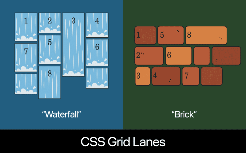
The transition from traditional layout methods to `grid-lanes` signifies a breakthrough in how web developers can create responsive and visually appealing designs. The ability to implement masonry-style layouts through a simple CSS property means less complexity and more focus on creativity. Developers can expect to use syntax like `display: grid-lanes`, which will allow elements to flow naturally in a grid-like manner.
Moreover, the journey to this point was not without its obstacles. Various proposals were on the table before the final decision was made, including `collapsed-grid` and `grid-masonry`. Each of these options brought its own set of pros and cons, but ultimately, `grid-lanes` emerged as the most sensible choice, harnessing the robust capabilities of CSS Grids.
The Practical Application of Masonry
When implementing masonry layout, the key advantage of `grid-lanes` lies in its simplicity and effectiveness. Using just a few lines of CSS, developers can enable a layout that intelligently arranges elements to fit together, regardless of their height. This is particularly useful for content-heavy sites, such as image galleries or blog posts, where visual aesthetics can enhance user engagement.
This practical application demonstrates how far we’ve come since the early discussions about masonry layouts. With the addition of properties like `item-flow` and `item-wrap`, managing how items are displayed not only becomes easier but also allows for more sophisticated designs. The capability to control item arrangement dynamically will ultimately empower designers to create unique and fluid layouts.
Looking Ahead with `grid-lanes`
As the CSS community gears up for the full implementation of `grid-lanes`, developers and designers alike are filled with anticipation. The synergy between `grid-lanes` and existing grid properties shows great promise for the future of web design. With browsers slowly adopting this new standard, the timeline for widespread usage becomes a topic of eager speculation.
The next steps will involve monitoring browser updates to see when `grid-lanes` officially goes live. Until then, developers can experiment with the emerging capabilities through polyfills or alternative methods, ensuring they’re ready when the feature is fully available. It’s a thrilling time to be part of the web design universe as we stand on the brink of a major evolution in how we create layouts.
Conclusion: A New Era in CSS Layouts
In conclusion, the introduction of `grid-lanes` marks a significant turning point for CSS layouts, especially for the highly debated masonry style. With this new approach, designers can finally achieve the desired results without clunky hacks or convoluted workarounds. The pathway to this moment has been long and intricate, yet the reward is a more intuitive and practical layout design.
This is not just a minor update in CSS specifications; it represents a shift towards a more flexible and user-friendly approach in web development. As `grid-lanes` continues to evolve and as browsers begin to roll it out, the community must remain engaged and adaptive to fully harness the power of this feature when it arrives.

In conclusion, the long-anticipated feature of masonry layouts in CSS is on the verge of becoming a reality with the introduction of the `grid-lanes` display property. The journey to reach this point was riddled with complexity and debate, but the final resolution suggests promising advancements for developers. Key takeaways include:
– The `grid-lanes` property allows for a simplified and effective way to implement masonry layouts without requiring excessive CSS hacks.
– Concepts such as `item-flow` and `item-direction` will enhance control over item placement and alignment, providing developers with more flexibility.
– Although major browsers have already experimented with masonry layouts, the transition to `grid-lanes` is underway, promising a smoother implementation in the near future.
As we look forward to the official support of `grid-lanes`, it’s essential to remember that this feature is not just an evolvement of CSS but a culmination of years of discussions and explorations surrounding layout techniques. The anticipated benefits of this new property will significantly affect the web development landscape. Key points to consider going forward include:
– Embracing `grid-lanes` will likely promote more accessible and visually appealing layouts, improving user experience.
– The transition period requires patience as browser implementations finalize, but the community’s eagerness for this feature showcases the need for robust layout tools in CSS.
– Monitoring discussions and updates from browser development teams will be crucial for developers looking to leverage `grid-lanes` as soon as it becomes available.


