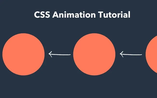
CSS sequential animation is a powerful technique that brings a new level of dynamism to web design. By leveraging the capabilities of CSS, designers can create stunning animations that play one after another, enhancing user engagement and visual appeal. With CSS sequential animations, multiple elements can be animated in a specified order, ensuring a smooth transition that captivates the audience. Utilizing advanced CSS animations along with the CSS linear function not only simplifies the process but also eliminates the complexity typically associated with timing and delays. In this article, we will explore how to implement this innovative approach to animation with CSS, allowing your projects to stand out.
Creating dynamic visual effects through CSS-based animations has transformed the way web content is presented. Sequential animations in CSS enable elements to perform movements in a timed sequence, invoking a sense of flow and activity on the page. Instead of animating all elements simultaneously, sequential CSS animations allow for staggered movements, creating an engaging user experience. Using the linear function in CSS, designers can finely control the timing and delays of these animations, enhancing the sophistication of their visual storytelling. Join us as we dive deeper into the world of CSS animations and discover how to effectively animate multiple elements with precision and flair.

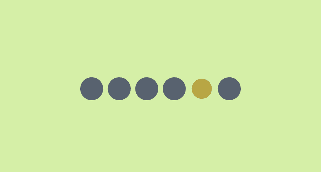
Understanding N Elements in Sequential Animations
When it comes to animating a series of N elements sequentially, the challenge lies in orchestrating each animation to occur one after the other without overlap. The first element initiates its animation, followed by the second, then the third, and so on until the final element has completed its animation before looping back to the start. This systematic approach creates a visually appealing flow, yet the implementation can be tricky. The key is to efficiently calculate the timing and delays for every single item to ensure seamless transitions.
In the realm of web animations, keeping track of multiple elements while managing the timing of their animations can quickly become complex. Traditionally, this required a tedious setup of keyframes and precise timing functions. However, utilizing the latest advancements in CSS can simplify this process immensely. With just a few lines of code, you can define a straightforward animation that scales and alters the background color of each element, offering not just a visual transformation but also a logical organization of the animation flow.
The Power of Modern CSS
In today’s web development landscape, CSS has evolved to fulfill dynamic animation requirements with ease and flexibility. You can define animations that adapt to an arbitrary number of elements—this is a game changer for developers. With a specific demo that showcases its effectiveness—albeit limited in browser support for now—this method of using the sibling-index() and sibling-count() functions empowers us to create robust animations that seem almost effortless.
The beauty of this contemporary approach is its ability to abstract complex calculations into simple variables and functions. As you customize animations for different elements, the CSS becomes a canvas where you are allowed to express movement, timing, and style without being bogged down by excessive code or convoluted logic. This innovation in CSS serves to streamline web animations, enticing both developers and users with visually rich experiences.
Breaking Down the CSS linear() Function
Let’s delve deeper into the CSS linear() function—arguably one of the strongest weapons in a developer’s toolbox when it comes to animation. Unlike traditional easing functions that merely facilitate a straightforward transition from one state to another, the linear() function allows for an extensive range of control points. Each control point effectively acts as a checkpoint in an animation sequence, enabling developers to specify exact timing and visual effects at multiple entry points.
Moreover, you can specify not only beginning and end states but also intermediate transitions, creating a layered and intricate animation path. While it may seem intimidating at first glance, mastering the linear() function unlocks a myriad of possibilities, turning what may appear simple into something intricately beautiful. This further extends the capabilities of typical animations, sliding in advanced functionalities that elevate the standard web experience.
Creating Sequential Delays
As we shift our focus to creating pauses within animations—essentially delays—the strategy becomes even more nuanced. The goal is to implement a sequential animation where each element not only animates but also pauses after completing its motion, allowing others to catch up. This means understanding how to effectively utilize the keyframes while integrating the concept of waiting times, which can become quite complex without the right tools.
Instead of board-stating delays within keyframes, we can express them via linear() by maintaining the same output progress for two control points within the animation’s time span. This ingenious method bypasses the need for extensive keyframe adjustments, leading to animations that feel responsive and coordinated. With this setup, animations can begin to overlap or operate independently, ultimately crafting a more dynamic and fluid experience.
Implementing the Full Animation Sequence
To bring everything together and fully embody the sequential animation technique, we can begin with a pair of elements to demonstrate how they can interact within this framework. Initially, both elements may appear to pulse in harmony; however, adjustments to their respective linear() values—tailored with unique timing—create an alternating rhythm between them.
By tweaking the linear() parameters, we create a pattern where the first element animates while the second pauses, emphasizing the distinct staggered movements. This exhibits a basic but profound principle: managing CSS animations programmatically offers the flexibility to adaptively showcase designer intent without cumbersome code management. Each additional element can follow the same principle, leading to a clean and elegant visual sequence.
Advanced Configurations and Variations
Once the core concept of sequential animation is established, the fun begins with experimenting and crafting variations. Instead of having a strict start and stop to each animation segment, you might want to explore configurations where elements can animate in tandem or allow for overlapping segments. This opens up a treasure trove of creativity when designing user interactivity, making animations not just aesthetic but functional.
Consider scenarios where animations have dual ranges—this will involve configuring the timing parameters to allow for a sophisticated dance between elements, enhancing engagement. The approach transforms from a simple sequential outfit into a lively ensemble, where each animation can enhance the overall narrative element of the web experience. Through these adjustments, you learn not only to animate but to animate cleverly.
Conclusion: Unleashing the Potential of linear()
As we conclude our exploration of the CSS linear() function and its capabilities, it becomes evident that the future of animations in web design is bright and full of potential. The improvements and capabilities that have emerged pave the way for more complex and beautiful user experiences. No longer are we bound by the constraints of traditional keyframe animations; CSS gives us the tools to implement dynamic and fluid visual narratives.
In your next project, remember that with a firm grasp of linear() and the sequential animation methods, you have the power to create mesmerizing animations that captivate and maintain user interest. The journey of understanding and applying these concepts is just the beginning, and there are countless variations waiting to be explored!
Summary of Key Concepts
In summary, the introduction of the linear() function has radically simplified the process of creating sequential animations in CSS. By employing the sibling-index() and sibling-count() functions, developers can animate multiple elements in an efficient and streamlined way, easing away from traditional methods requiring complex keyframes. The examples shared in this article showcase how to seamlessly transition between states, allowing for a smooth animation that can be controlled easily with minimal code.
Moreover, the potential of the linear() function extends beyond just sequential animations. It opens doors to creating dynamic movement patterns without the burden of extensive keyframe definitions, encouraging creativity in animation design. With browser support gradually increasing, particularly in Chrome and Edge, the future of CSS animations looks brighter as developers can harness these powerful tools to engage users through captivating visual experiences.
Future Directions for CSS Animation
Looking forward, the enhancements in CSS animation capabilities, especially with advancements like the linear() function, are exciting. They provide an excellent foundation for animators to explore even more intricate animations with less effort. As familiarity with these new tools grows, we can expect developers to push the boundaries of creativity, experimenting with various combinations to produce engaging experiences across a range of platforms.
As the CSS community continues to innovate, it’s essential to remain updated on new features and browser compatibilities. Keeping an eye on ongoing support tickets and discussions regarding the sibling functions will ensure developers can adapt their projects accordingly. Overall, the continuous evolution of CSS animation will undoubtedly lead to increasingly sophisticated designs that enhance user interaction and visual storytelling.


