
Color psychology is the silent architect behind the digital experiences that capture and hold our attention. It influences not just the aesthetic appeal of web design, but also shapes emotional responses, allowing brands to communicate their identity effectively through carefully selected color schemes. By understanding how colors evoke feelings and behavior, designers can create immersive user experiences that resonate powerfully with their audience. For example, a soothing blue might instill trust, while a vibrant red can spark urgency, guiding users toward desired actions. In this exploration, we’ll delve into the profound impact of color psychology on web design, revealing its role in enhancing brand identity and fostering deeper connections.
Exploring the intricate realm of hue influence, the notion of chromatic perception emerges as a pivotal aspect of digital interaction. This phenomenon, underlying user behavior and engagement, reflects how distinct shades can evoke unique emotional reactions and forge strong connections between brands and users. Hence, the thoughtful application of color in web aesthetics doesn’t merely enhance visual appeal, it plays a crucial role in defining brand identity and optimizing user experience. The careful orchestration of these vibrant elements crafts color palettes that resonate deeply, allowing designers to conjure feelings that guide interactions and responses. In this discussion, we’ll unravel the significant implications of chromatic choice in creating effective digital landscapes.

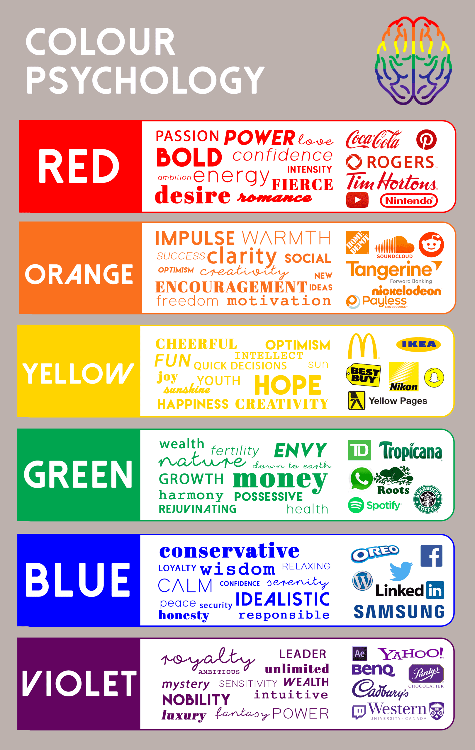
The Psychological Power of Color
Colors weave a tapestry of emotions, captivating users and guiding them through the digital landscape. Whether it’s the calming embrace of blue or the energetic call of red, every shade can dictate the rhythm of user interactions. The moment a visitor lands on a website, these colors whisper messages that resonate deep within their subconscious, often influencing their behavior before they even realize it. This invisible dance illustrates how web designers must become connoisseurs of color, understanding its profound impact on user experiences.
Consider a vibrant red sale banner looming on a page; its urgency surges, prompting users to act swiftly. In contrast, a serene green invites them to pause and explore, creating a sense of peace harmonized with the content. Thus, designers become storytellers, using color as their prose, crafting narratives that captivate the visitor’s attention and guide them through an unforgettable journey.
From the moment a user enters a website, the subtlety of color can mold perceptions, deepen engagement, and ultimately drive action. This profound influence of colors not only shapes user experiences but also lays the foundation for a brand’s identity, making it an essential study for all web creators.
Brand Identity through Harmonious Hues
In a world saturated with endless options, color becomes the hero of brand recall. Statistically, it reigns supreme, with a staggering 90% of snap judgments based on hues alone. Imagine Coca-Cola, its bold crimson instantly evoking memories of refreshment and joy, each sip colored in nostalgia. Such associations forge a bond between consumers and brands, a connection strengthened by consistent color themes, which act as a visual anchor in a sea of choices.
Through unified color schemes, brands cultivate loyalty, transforming casual visitors into devoted patrons. It’s not just a palette; it’s an emblem of recognition and emotional reassurance. Each user interaction with color influences brand identity, ensuring that every click resonates with familiarity and trust.
Thus, in the intricate web of design, colors serve as the brushstrokes that paint the larger picture of a brand’s ethos, creating a compelling narrative that users can identify and connect with.
The Essence of Accessibility in Color Use
Beyond aesthetic appeal, the choice of colors in web design takes on a mantle of responsibility, invoking the need for accessibility. Colors should not only captivate but also invite, ensuring every user, regardless of ability, can engage deeply with the content. Following the Web Content Accessibility Guidelines (WCAG), web designers are tasked with bridging gaps, allowing for a spectrum of users to partake in the digital experience.
Imagine a world where vibrant designs grace screens, yet those colors hinder accessibility. High-contrast combinations emerge as heroes in this narrative, serving as guides through the labyrinth of content, offering clarity to those who may struggle with visual impairments. By prioritizing accessibility, designs evolve from mere aesthetics to inclusive platforms, fostering a warm embrace that welcomes all visitors.
Through intentional color choices, designers do not merely enhance usability; they champion a movement towards inclusivity, allowing every user the opportunity to explore, engage, and connect with the narratives presented in digital spaces. In this evolving paradigm, the essence of color shifts from a mere design consideration to an ethical imperative, urging creators to design with empathy.
Final Thoughts on Color’s Influence
As we wrap up our exploration of color psychology in web design, the dynamic interplay between color and user experience becomes vividly clear. Colors are not mere backdrops; they are active participants in the narrative we weave online, shaping emotions and guiding decisions with every click. A thoughtful application of color can transform visitor interactions into memorable experiences, effectively bridging the gap between brands and consumers.
To amplify this impact, consider these points:
– Colors evoke emotions that can enhance user engagement.
– Strategic color choices reinforce brand identity and recognition.
– Accessibility in color selection ensures inclusivity, broadening your audience.
In this vibrant spectrum of design, the potential of color to elevate online interactions is not only rich but also boundless.
Embracing Color for a Better Digital Experience
In the ever-evolving world of web design, the ability to harness the power of color psychology can be the linchpin to creating sites that resonate deeply with users. By recognizing that colors are not just visual elements but are carriers of meaning and emotion, designers can craft websites that not only look appealing but also feel intuitive and inviting. The psychological resonance of color offers a toolkit for designers, enriching aesthetics while guarding user experience.
Key takeaways for designers seeking to leverage color psychology include:
– Regular updates on color trends can keep your designs fresh and relevant.
– Understanding cultural meanings behind colors ensures global accessibility.
– Priority on usability and readability through color contrast can reduce bounce rates and enhance engagement.
As we paint our digital canvases, let us wield our brushes with intention and insight, creating spaces that truly inspire connection and celebration among users.


