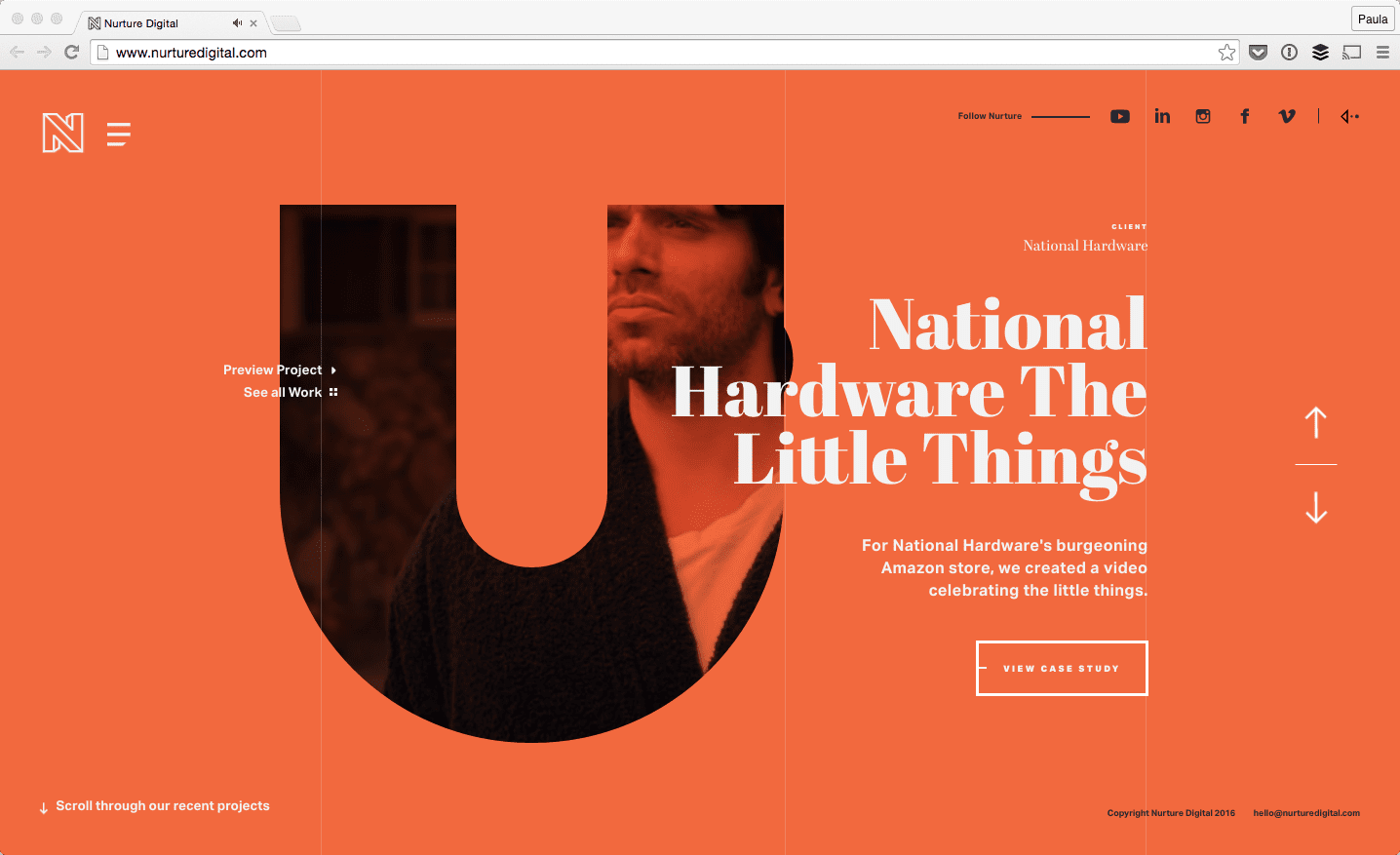
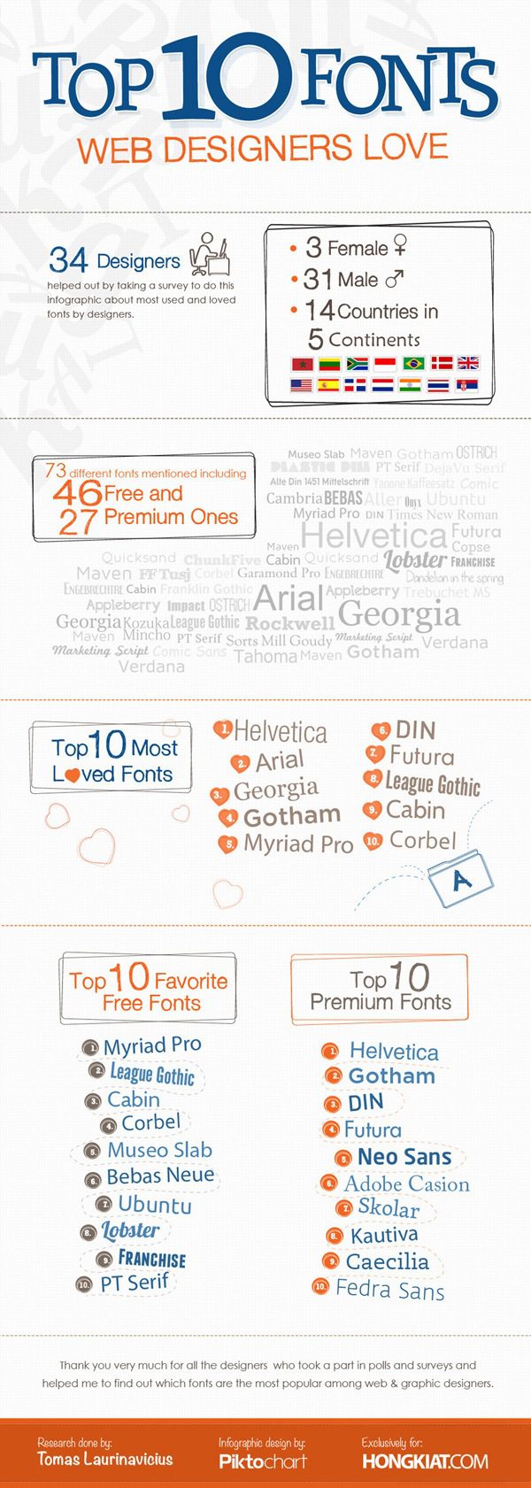
Typography in web design stands as a vital pillar, shaping the visual language that communicates ideas and brand identities across the internet. Effective web typography enhances the overall user experience, making the content not just readable but also engaging and accessible. As we delve into 2023, the latest typographic trends, such as responsive typography and innovative font choices, are redefining how designers craft digital spaces. Emphasizing accessibility in typography ensures that design is inclusive, inviting users of all abilities to interact with the content. In this exploration, we’ll uncover how thoughtful font selection and the latest trends can transform web design into an impactful storytelling medium.
In the realm of digital creativity, the choice of typefaces is more than mere decoration; it is a crucial aspect of web aesthetics and user interaction. As we navigate the intricate world of letterforms, understanding the nuances of font selection and layout brings forth an array of design possibilities. The latest developments in typographic styles and approaches, particularly in responsive design, echo the ever-changing digital landscape of 2023. Moreover, considering the importance of inclusive design principles ensures that every visitor can engage with the content seamlessly. Join us as we unravel the significance of these elements and their impact on crafting compelling online experiences.

The Evolution of Typography in Web Design
Typography, the artistry of arranging type, has woven itself into the very fabric of web design. In a world where every pixel counts, the evolution of fonts and typefaces mirrors our ever-changing communication trends. From the days of simple, static text to dynamic, responsive typography, we witness a journey rich in innovation and creativity. Today, designers harness the power of typography to create immersive experiences that resonate with users on a profound level.
As we navigate this visual revolution, it becomes apparent that typography is not merely decorative; it acts as a bridge, connecting the content of a website to its audience. Designers now employ an arsenal of fonts, each with its unique character and personality, shaping the narrative and tone of the brand. The shift from traditional typography practices to embracing new technologies like variable fonts highlights the breath-taking adaptability of design in the digital realm.
Psychology Behind Font Choices
Diving deeper into the psychological implications of typography reveals a world where fonts speak louder than words. Each curve and line of a typeface carries with it an emotional weight, capable of sparking joy, comfort, or even tension. For instance, a playful sans-serif may evoke a sense of harmony and approachability, while a bold serif might communicate formality and trust. These subtle cues influence our perceptions and reactions, driving the designer’s hand when creating user-friendly interfaces.
Studies show that typographic choices can impact user behavior and engagement significantly. When brands take the time to select the right fonts, they’re not just choosing a style but crafting a visual story. This careful selection transforms the user’s journey, enhancing not just readability but connection, relationship, and trust. The psychological foundation laid by font choices becomes an integral part of the user’s experience, often unnoticed yet profoundly felt.
Mobile Typography Trends Shaping The Future
In our increasingly mobile-centric world, the trends in typography are adapting to meet the needs of the on-the-go user. Mobile typography requires an overlap of aesthetics and functionality. Designers are now exploring how typography can morph beautifully across various screen sizes, creating a cohesive experience that retains both style and substance. Responsive typography is no longer a luxury but a necessity in the evolution of web design.
With the rise of mobile browsing, the conversation shifts to clarity and user engagement on smaller screens. Designers are embracing minimalist approaches, opting for legible fonts that lend themselves to quick comprehension. Spacing, line height, and font size become paramount considerations. As mobile tech continues to evolve, so too will the innovations in typography, ensuring that accessibility and usability remain in lockstep with design trends.

Final Thoughts on Typography’s Impact
As we draw the curtains on our exploration of typography in web design, it becomes ever clearer that this art is much more than mere letters and spaces. Typography serves as the invisible thread that weaves together visual ambiance, user engagement, and brand storytelling. With each font choice and typographic layout, designers wield the power to create immersive experiences that resonate with users on an emotional level. Hence, typography stands as both an aesthetic anchor and a functional tool, carving out pathways to accessibility and inclusivity in the digital landscape.
The importance of typography in modern web design can be summarized by key points:
– **Readability and Accessibility**: Fonts must be chosen to ensure comfortable reading for all users, including those with visual impairments.
– **Trends and Innovation**: Staying updated with trends like variable fonts allows for creative flexibility and enhanced performance.
– **Brand Identity**: Typography shapes perceptions of brands, making unique and thoughtful type choices essential.
– **Emotional Engagement**: The emotional weight of typefaces can significantly influence user experience and conversions.
– **Mobile Optimization**: With mobile browsing on the rise, responsive typography is key to maintaining usability and clarity across devices.


