The contrast color function is a powerful tool in CSS that plays a crucial role in ensuring web accessibility by optimizing color visibility on web pages. By adhering to standards such as the Web Content Accessibility Guidelines (WCAG), designers and developers can create accessible designs that effectively communicate information through text and visuals. The contrast color function simplifies the process of checking color contrast, which is vital for those who are colorblind or have low vision. As the demand for web accessibility grows, so does the need for effective tools—like the contrast color function and color contrast checkers—to meet these standards. With this function, users can ensure that their designs will not just meet aesthetic goals but also provide an inclusive experience for all website visitors.
Also known as the color contrast function, this feature facilitates a visual balance in digital design by determining the most effective contrast between colors. It operates within the framework of accessible web design, a fundamental aspect of creating content that is usable by individuals with varying degrees of visual abilities. Alternative terms such as contrast-checking functions or color optimization methods echo the importance of adhering to WCAG compliance mandates. Effective implementation of this feature can significantly improve user experience by ensuring that essential information is easily discernible. By enhancing the readability of text against background colors, designers can embrace accessible design principles without compromising visual appeal.
Understanding Web Accessibility as a Right
In many countries, web accessibility is viewed not just as a technical necessity but as a fundamental human right. This perspective has led to the enforcement of laws ensuring that all web content, including text and icons, is accessible to individuals with disabilities. Stringent penalties can be imposed for non-compliance, which underscores the importance of adhering to the Web Content Accessibility Guidelines (WCAG). These standards dictate optimal color contrast ratios that must be met to ensure readability for all users.
The impact of such regulations extends beyond legal compliance; they also drive innovation and improvements in web design. By adhering to these guidelines, businesses not only fulfill their legal obligations but also enhance user experience and accessibility. Ensuring proper color contrast is a key part of this process, as it can significantly influence the legibility of web content, thereby ensuring all users, regardless of their abilities, can engage with digital information effectively.
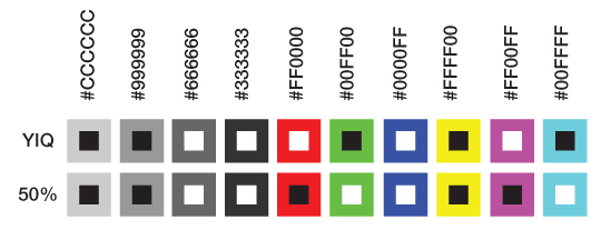
Exploring the contrast-color() Function
The advent of the contrast-color() function marks a significant development in CSS, but it’s essential to approach it with a clear understanding. Unlike traditional color contrast checkers, which can accurately assess the distinction between two colors based on established criteria, contrast-color() simplifies this process. It resolves the color choice to either black or white, depending on which provides a sharper contrast with the specified color. This function is relatively easy to implement but comes with limitations regarding browser compatibility, currently restricted to Safari Technology Preview.
An example of using this function can be seen in typical button styles. When applying a darkblue background, the color property can be set to contrast-color(var(–background-color)), which will automatically choose white for better visibility. This straightforward approach, however, does not enhance the flexibility of color choices, which means designers may find themselves constrained under the binary options that the function offers.
Limitations and Future Improvements
Despite its promise, the contrast-color() function has notable limitations that cannot be ignored. Its inability to provide colors beyond black or white poses a significant challenge for designers who aim for greater flexibility in color schemes. Furthermore, there are situations where neither of these options may achieve the desired visual accessibility, thus leaving some color choices effectively unusable. This gap signals that while the function is a step forward, it requires further refinement before it can fully meet the dynamic needs of web design.
Additionally, as web technologies evolve, the need for more robust and versatile solutions like contrast-color() becomes apparent. Future iterations of this function could indeed incorporate a wider spectrum of colors, thus allowing designers to maintain aesthetic appeal alongside accessibility. The vision for this enhancement could potentially align itself more closely with accessibility standards such as the WCAG, benefiting both users and developers.
The Role of Font Size in Color Contrast
Font size plays a critical role in determining how color contrast is perceived, yet the current implementation of contrast-color() does not account for this vital factor. Understanding the interplay between font size and color contrast is fundamental for creating a truly accessible design. As digital interfaces continue to evolve, there’s an expectation that future updates to this function will consider these variables, offering a more intelligent selection mechanism that reflects real-world reading scenarios.
Moreover, incorporating font size considerations will significantly enhance how users perceive visual contrast, especially in varying contexts and lighting conditions. This adaptability is essential for delivering a user-friendly experience that aligns with a diverse range of users’ needs, ensuring that accessibility is not merely an afterthought but an integral component of design.
Innovations in Color Contrast Algorithms
The introduction of the Accessible Perceptual Contrast Algorithm (APCA) marks a pioneering advance in measuring color contrast more accurately than previous methods. Research has revealed considerable discrepancies in how existing standards classify accessibility, suggesting that many sites deemed compliant are still problematic for certain users. The APCA criterion goes beyond simple contrast ratios, taking into account a broader range of visual factors, including font sizes and weights, thus providing a more nuanced measurement of accessibility.
While the contrast-color() function does not yet leverage the capabilities of APCA, the potential for integration could significantly transform its functionality. The concept of choosing between different algorithms reflects a progressive approach in web development that values inclusivity and usability, aligning with legal requirements and user preferences. Developing a better contrast solution could empower designers to create aesthetically pleasing interfaces that do not compromise on accessibility.
Implementing contrast-color() in Design
Utilizing contrast-color() in practical design scenarios is straightforward, as exemplified by using CSS variables effectively. A simple button can have its background color defined in a variable, allowing the text color to be dynamically set based on that background using the contrast-color() function. This can easily enhance user engagement and guarantee optimal visibility, providing that the background colors chosen allow for a clear, contrasting text color.
As web interactions grow more complex, the application of contrast-color() could be adapted to various states and elements beyond buttons. For instance, using gradients or dynamic colors on hover can lead to visually appealing and accessible designs by ensuring that contrast is always monitored. This adaptability highlights the versatility of contrast-color() while showcasing the ongoing need to consider compliance with emerging standards and user expectations.
Final Considerations on color contrast
While contrast-color() is a step in the right direction, its current limitations underscore a need for more sophisticated solutions that can adjust color contrast dynamically based on a broader spectrum of hues. It’s essential for browsers and designers alike to consider not only the immediate implications of color choice but also the long-term accessibility for users. The prospect of enhanced functionalities may help designers ensure color contrast is not only consistent but also customizable to meet various aesthetic and accessibility standards.
The conversation on color accessibility will also benefit from clear guidelines that prioritize user agency when it comes to choosing their own visual preferences. Ultimately, by encouraging flexibility and user empowerment in color contrast options, the design community can create more inclusive environments that respect individual choices while adhering to necessary accessibility standards. Is contrast-color() the ideal solution, or should we embrace a more comprehensive approach to color accessibility?

Conclusion on Accessibility and Color Contrast
In conclusion, ensuring web accessibility through optimal color contrast is not merely a technical requirement but a fundamental human right upheld by law in many regions. As we confront increasing demands for compliance with standards like the Web Content Accessibility Guidelines (WCAG), web developers and designers must prioritize color contrast to enhance user experience for everyone, particularly those with disabilities. The introduction of the contrast-color() function is an important step in the right direction, albeit with limitations that need addressing.
Despite its potential, the current limitations of contrast-color()—resolving only to black or white and lacking broader color support—underscore the need for further development in web standards. Future enhancements could significantly improve usability and accessibility, aligning with evolving legal requirements and user expectations. Developers are encouraged to experiment with existing tools and keep abreast of advancements in CSS that can contribute to creating more accessible web environments. Ultimately, as technology evolves, so must our approaches to web design and accessibility.


