
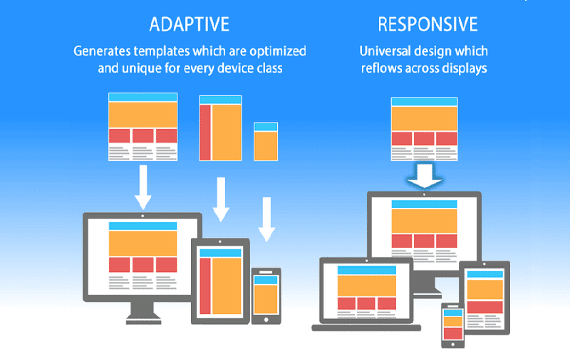
Imagine visiting a website and seamlessly transitioning from a large desktop monitor to a petite mobile screen without any loss in functionality or design integrity. This is the magic of Responsive Web Design—an approach that transforms how we experience the web by ensuring that every pixel is optimized for the device in hand. As the digital realm continues to evolve, the necessity for fluid layouts and adaptable images has become paramount, demanding designers to rethink their strategies and techniques.
The statistics are compelling: over half of the global web traffic now originates from mobile devices, a trend that cannot be ignored if you want your online presence to thrive. Responsive Web Design is not just a trendy term but a fundamental skill that enhances accessibility, boosts SEO rankings, and creates a cohesive user experience across varying platforms. So, how do you turn this essential concept into a reality for your projects? Let’s unravel the elements and best practices of responsive design that will empower you to craft websites that truly resonate with all users.
Understanding the Fundamentals of Responsive Web Design
Responsive Web Design is about crafting your site to ensure it looks excellent regardless of the device used. Imagine a site that breathes, expanding and contracting as it finds its place on a smartphone or an expansive desktop. The core principle is flexibility, built upon grid systems that allow elements to resize fluidly. Rather than adhering to fixed pixels, you can set dimensions in percentage, adjusting dynamically as screens vary.
Implementing responsive design begins with understanding how users interact. Take for instance the difference between displaying a multi-column layout on a desktop and a stacked version on mobile. A fluid grid allows for this transition: one moment, three columns flow side by side; with a screen resize, they stack vertically. This magical transformation ensures users have a consistent experience, whether they’re scrolling on the couch or commuting on the subway.
The Impact of Responsive Design on User Engagement
Consider the user journey: when a website fits seamlessly into the user’s screen, it encourages deeper exploration. A clean, responsive design reduces frustration that typically leads to high bounce rates. On the flip side, when users encounter sites that require endless zooming or scrolling, they’re likely to abandon ship quickly. The goal should always be to create frictionless navigation that invites users to linger longer.
Let’s not forget the SEO implications either. Search engines prioritize sites that respond beautifully across screens. With a single set of URLs and an optimized experience, your site not only climbs the ranks, but it captures a broader audience. I’ve witnessed firsthand how a simple responsive tweak led to a significant uptick in organic traffic and user retention. A win-win, wouldn’t you agree?
Practical Steps for Implementing Responsive Web Design
Transitioning into responsive web design doesn’t have to be daunting. Start by laying a strong foundation—choose a reliable text editor and set your grid system based on percentages. This method feels liberating as you’re crafting a layout that reshapes itself based on the viewer’s needs. Imagine telling your site, ‘You can be whatever you want to be, just fit the screen.’ It’s liberating.
Next, flexible images play a pivotal role in this strategy. By applying the rule of `max-width: 100%;` to your images, they harmonize with the layout instead of spilling awkwardly out of their containers. This simple CSS trick helps maintain your design’s integrity. Moreover, don’t shy away from media queries. They are your toolkit for tailoring styles according to device specifications. For example:
“`css
@media (min-width: 768px) {
.content { display: flex; }
}
“`
This snippet shifts your layout from stacked to flexible, illustrating how a few lines of code can vastly improve user experience.

Frequently Asked Questions
What are the benefits of using Responsive Web Design for my website?
Responsive Web Design enhances user experience by ensuring content is accessible and visually appealing across devices. It also improves SEO rankings with a single URL for content, reduces maintenance costs by eliminating the need for multiple sites, and caters to the growing trend of mobile device usage.
How do media queries work in Responsive Web Design?
Media queries are a vital tool in Responsive Web Design, enabling you to apply different CSS styles based on the characteristics of the device, particularly screen width. This ensures your design adapts seamlessly, providing optimal viewing on various devices by defining distinct styles for different screen sizes.
What tools can I use to get started with Responsive Web Design?
To embark on your journey into Responsive Web Design, consider using text editors like Visual Studio Code or Sublime Text for coding. Frameworks such as Bootstrap and Foundation can streamline the design process, providing pre-built responsive features. Additionally, testing tools like Google’s Mobile-Friendly Test can help ensure your site looks great on all devices.

– The essence of responsive web design lies in crafting web pages that adapt fluidly to a variety of device screens, ensuring a cohesive visual experience whether users are on a smartphone or desktop.
– Elevating user experience stands as a critical reason for adopting responsive design, enhancing engagement and keeping visitors browsing for longer periods through tailored interactions.
– With search engines favoring responsive sites for their ability to streamline indexing, embracing this design approach not only delights users but can also bolster your site’s visibility in search rankings.
– As mobile traffic continues to dominate internet usage, responsive web design transcends being a mere trend; it’s a fundamental requirement for effective audience outreach.
– Fluid grids serve as the backbone of responsiveness, allowing elements to resize and realign seamlessly according to screen proportions, creating a visually pleasing arrangement across different devices.
– The practice of utilizing flexible images guarantees that visual content doesn’t disrupt a site’s layout, ensuring aesthetics remain intact regardless of the viewing context.
– Media queries play a pivotal role in responsive design, applying custom styles that cater to the specific characteristics of devices, making stylistic adjustments a breeze across various screen widths.
– Beginners can significantly benefit from frameworks like Bootstrap, which afford a robust foundation with integrated responsive features, simplifying the design process considerably.
– Setting up a suitable development environment is your first step into the world of responsive web design, with coding practices in HTML and CSS forming the essential toolkit you’ll rely on.
– Starting with a fluid grid layout paves the way for an adaptable design approach, encouraging layouts that naturally transition to fit any screen during user engagement.
– Incorporating responsive images into your design is crucial, as it removes the risk of content overflow, yielding a polished aesthetic across all devices.
– Engaging with media queries allows you to craft unique styles for different device widths, ensuring clarity and usability during user interactions, an important aspect of modern web design.
– Testing the end result through various tools ensures that your responsive design meets expectations across platforms, revealing areas of improvement for an optimal viewing experience.
– Best practices urge you to prioritize essential content, steering clear of fixed positioning that stifles adaptability while keeping navigation straightforward for effortless exploration.
– Striking a balance between aesthetics and functionality aims to enhance the user’s journey through your site, encouraging repeated visits and deeper engagement on varied devices.













