
User-Centric Web Design is the cornerstone of creating engaging and effective online experiences. In a digital world overflowing with information and options, making a website that resonates with its audience can dramatically uplift user satisfaction and conversions. By placing an emphasis on user experience design, you can curate a journey that feels both intuitive and rewarding. From responsive web design to enhance accessibility, to optimizing website usability, the focus lies in serving the end-users above all else. Here, we will explore indispensable web design tips that can elevate your site’s performance by keeping the users’ voice at the heart of your design decisions.
At its essence, a user-first approach to crafting web spaces is about prioritizing the needs and desires of those who navigate them. This principle, often termed as empathic design, encapsulates the ambition to create interfaces that are not just visually appealing, but also align seamlessly with user expectations. By integrating inclusive design practices and ensuring a responsive layout, designers can forge connections that deepen user engagement. Such an approach is paramount in an era where every click counts, and where accessible web design not only enhances experience but can also catalyze loyalty and returns. Let’s delve into key strategies that can transform your website into a truly user-centered digital haven.

The Essence of User-Centric Design
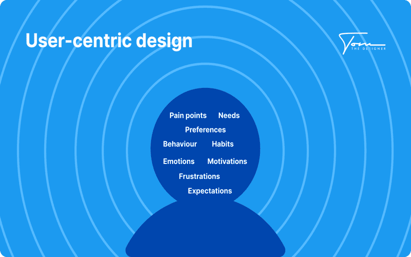
User-centric design revolves around the principle that the end-user should always be at the forefront of your design process. Rather than imposing your vision, you must prioritize their needs, expectations, and behaviors. This involves an exploration not just into aesthetics, but into functionality and usability. A well-designed website aligns its features with user needs, creating pathways for easier navigation and interaction.
Think about the last time you visited a site that frustrated you with its labyrinthine layout or unclear calls to action. How quickly did you leave? These moments highlight the importance of user-centric principles. When designing, consider insights from user research to inform decisions, leading to a web experience that both attracts and retains users.
Crafting Intuitive Navigation Experiences
Can you recall a time you found what you were looking for on a website without breaking a sweat? That’s the goal of intuitive navigation. It’s a craft that requires attention to the user’s journey, which should feel seamless rather than arduous. Begin with a logical structure; categorize your navigation items clearly and keep the hierarchy transparent. This means your main features should be visible and accessible, without requiring users to search for them.
For instance, consider using a sticky header that remains visible as users scroll, ensuring that menus are always accessible. Additionally, breadcrumbs provide a reassuring context, allowing users to track their progress and backtrack easily if needed. Here’s a simple CSS snippet for a sticky header:
.sticky-header {

    position: -webkit-sticky;

    position: sticky;

    top: 0;

    z-index: 100;

    background: #fff;

}
This helps keep navigation in sight, reinforcing clarity as users engage with content.
The Necessity of Responsive and Accessible Design
Is it enough for a website to simply look good on desktop screens? Absolutely not. With a variety of screen sizes in use today, adopting a responsive design approach is essential. This means your website should adapt seamlessly across devices, maintaining usability and aesthetics no matter how or where users access your content. Fluid grid layouts and flexible images are your allies in making this happen; they allow your design to dynamically adjust, ensuring a pleasant browsing experience on mobile, tablet, and desktop environments.
However, creating a responsive web design extends beyond mere adaptability. An accessible website is one that considers all users, including those with disabilities. Integrating thoughtful features such as keyboard navigation and screen reader compatibility enhances usability for everyone. Implementing high color contrast for text can significantly aid visibility, inviting a broader audience to your site. A great tip is to utilize tools like Color Contrast Checker to ensure compliance with accessibility standards.
  /* Responsive navigation menu */

  .nav {

    display: flex;

    flex-wrap: wrap;

  }

  .nav a {

    flex: 1;

    padding: 10px;

    text-align: center;

    background-color: #007bff;

    color: white;

    text-decoration: none;

  }

  .nav a:hover {

    background-color: #0056b3;

  }

Frequently Asked Questions
What are effective web design tips for enhancing user experience?
Effective web design tips for enhancing user experience include focusing on intuitive navigation, ensuring responsive web design, prioritizing website usability, and creating accessible web design. Start by conducting user research to understand their needs, then implement a clear structure and fast loading speeds. Utilize engaging content and strong Call to Actions (CTAs) to guide users smoothly through their journey.
How does responsive web design contribute to user-centric design?
Responsive web design is a cornerstone of user-centric design as it ensures your website adapts seamlessly to various devices and screen sizes. This flexibility not only improves website usability but also enhances user satisfaction by providing a consistent experience whether on a desktop, tablet, or smartphone.
Why is accessible web design important in creating a user-centric website?
Accessible web design is crucial in creating a user-centric website because it ensures that all users, including those with disabilities, can navigate and interact with your site effectively. By incorporating features like alt text for images and keyboard navigation, you enhance inclusivity, ultimately leading to better user experience and broader engagement.
- Understanding the essence of user-centric design invites a focus on the core needs, desires, and limitations of the website’s audience, transforming aesthetics into functional elegance.
- A user-friendly journey enhances satisfaction, boosting retention by creating an intuitive environment where users feel at ease.
- Conversion rates blossom when visitors encounter a seamless navigation experience; guiding them effortlessly towards desired actions becomes paramount.
- By fostering brand loyalty through delightful experiences, returning visitors are nurtured into advocates for your offerings.
- Engaging in user research unlocks invaluable insights, revealing the true expectations of your audience; methods such as surveys, interviews, and usability tests weave a tapestry of understanding.
- Intuitive navigation emerges as the backbone of design, allowing users to discover what they seek with minimal effort, as a clear structure and consistency create familiarity.
- Responsive design ensures that your digital presence thrives across devices, adapting fluidly to screens of all sizes while offering touch-friendly interaction.
- Speed optimization serves as a lifeline for maintaining user engagement—every second counts as you compress images and streamline elements to keep loading times brisk.
- Prioritizing accessibility transforms your design into an inclusive realm; through descriptive alt text, keyboard navigation, and high-contrast visuals, every user finds their place within your site.
- Content reigns supreme; crafting engaging and informative prose ensures that messages resonate deeply while visuals and typography elevate the reading experience.
- Regular testing and iteration enrich the design process, as A/B testing and user feedback cultivate an evolving website that remains attuned to user needs.
Dive into more insights on crafting exceptional digital experiences in our related posts.













