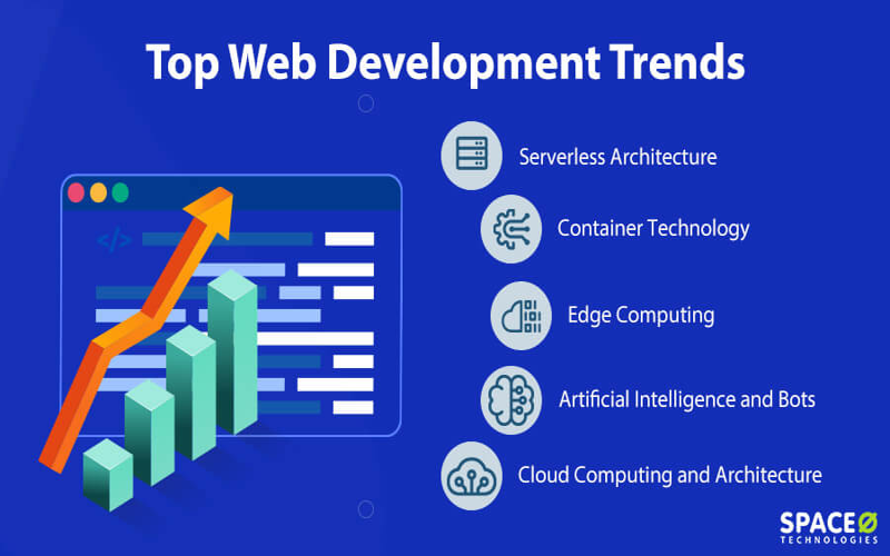
Web development trends are continuously evolving, shaping the way we create and interact with websites. As technology advances, new methods such as video state maintenance and enhanced CSS layouts are becoming essential components in building modern web applications. Innovations like media queries and improved browser functionality allow developers to create more responsive and adaptive designs. Additionally, features such as text scaling support are gaining traction, ensuring accessibility for users with diverse needs. Staying informed about these trends is crucial for developers seeking to create dynamic, user-friendly web experiences.
The latest in online creation practices encompasses various emerging patterns and methodologies that are redefining the digital landscape. With a focus on multimedia integration, site adaptability, and user-centric design, developers are finding opportunities to implement innovative solutions for enhancing user engagement. The introduction of customizable CSS structures, along with robust video handling techniques, exemplifies how the web is becoming more interactive and responsive. As tools evolve to facilitate better browser interactions, understanding these shifts becomes vital in optimizing web applications for diverse audiences. This exploration of web development methodologies highlights the ongoing transition towards a more dynamic digital experience.

Maintaining Video State Across Different Pages
Chris Coyier showcases an innovative approach using the `pageswap` event to preserve the state of videos while navigating between pages. By storing this information in `sessionStorage` as a JSON string, developers can effortlessly restore the video state during a `pagereveal`. While there may be a minor audio stutter—due to the nature of faking the state—this method remains a game-changer for user experience.
In his explanation, Coyier emphasizes the versatility of this technique, stating that it works not just for videos, but also for audio and iframes. To further the excitement, CodePen, a platform dear to many developers, recently celebrated its growth and features founded by Chris himself. This creates a perfect opportunity for developers to adopt these practices into their workflows.
How to ‘Name’ Media Queries
In this section, Kevin Powell educates readers on the effective use of `@custom-media`. This powerful feature allows developers to establish their own custom media query names, making the styling process more semantic and understandable. Adam Argyle previously touched on the topic of container style queries, urging developers to explore these newer CSS capabilities closely.
For those eager to stay ahead, Powell suggests leveraging CSS cascade layers. By embracing this advanced feature, coders can maintain cleaner and more manageable code while enhancing their media query strategies—leading to more responsive designs and a smoother user experience.
Valuable CSS Reset Practices
CSS resets tend to be a favorite topic among developers, and for good reason. They help ensure consistency across browsers by removing default styling. The recent exploration of Vale’s CSS reset includes invaluable tips and methodologies that can enhance anyone’s own reset preferences. For example, Vale’s inclusion of `svg:not([fill]) { fill: currentColor; }` proves to be a noteworthy insight.
This discovery resonates with the philosophy of continuous learning in web development. As developers adapt and customize CSS resets, they contribute to more robust frameworks that work seamlessly across various environments. Engaging with and understanding these resets equips developers with the tools needed to build more resilient and cross-device compliant web experiences.
The Inner Workings of Browsers
Ever been curious about the backstage workings of web browsers? Understanding how browsers resolve IP addresses, initiate HTTP requests, parse HTML, build DOM trees, and ultimately render layouts can significantly impact a developer’s approach to coding. The recent publications shed light on these processes, making them more transparent for developers eager to deepen their understanding.
As browsers evolve, so do their functionalities. This ongoing education enables developers to harness browser capabilities more effectively, optimizing performance, and enhancing accessibility for web applications. Keeping abreast of these insights fosters a more proficient environment for developers, ensuring they can navigate the changing landscape with confidence.
Diving into CSS Layouts
Polypane provides an engaging analysis of CSS layout techniques, diving into the intricacies that make modern web design compelling. With emerging tools and concepts, such as CSS Grid and Flexbox, developers are equipped to tackle complex layouts effortlessly. This not only enhances the aesthetic appeal of websites but also their functionality.
Layouts will continue to evolve, and staying updated with these developments is crucial. As web standards advance, exploring new CSS layout strategies can lead developers to create more dynamic and responsive experiences, ensuring that users engage with beautifully crafted web content.
CSS Masonry: A Glimpse into the Future
Jen Simmons brings attention to the discussions surrounding CSS masonry layouts, which are being experimented with at various levels. While this technique has yet to become mainstream, it offers exciting possibilities for designers looking to create asymmetrical layouts that catch the eye. By clarifying the trials happening in this area, Simmons paves the way for understanding potential future implementations.
Additionally, for those eager to take the plunge into masonry layouts today, Simmons recommends leveraging polyfills that can mimic the desired results until native support becomes widespread. By preparing now, developers can stay ahead of the curve in creating visually stunning web experiences.
Theming Animations with Relative Color Syntax
If you have a penchant for design systems, you’ll likely appreciate Andy Clarke’s discourse on theming animations using relative color syntax. This approach allows for greater flexibility and consistency in animation design, as it enables developers to maintain color harmony throughout their projects. Clarke’s insights challenge the traditional perceptions of animation, transforming how designers and developers collaborate.
Considering the dynamic nature of web design, understanding these methodologies conserves valuable time while maintaining high standards. As developers adopt these practices, they can produce visually appealing experiences, fostering more engaged user interactions.
Understanding Modals vs. Pages
Ryan Neufeld clarifies the various types of overlays available in web design—modals, lightboxes, dialogs, tooltips, and more. Each serves its unique purpose yet often leads to confusion regarding when and how to implement them. With the proliferation of new CSS features, including popovers and interest invokers, discerning their appropriate use has never been more critical.
By demystifying these concepts, Neufeld equips developers with the understanding needed to choose the right overlay tool for their specific scenarios. This knowledge ultimately aids in creating intuitive user interfaces that enhance overall user experience and streamline interactions.
Text Scaling Support Trials in Chrome Canary
In an interesting lead, Josh Tumath discusses the ongoing trials of text scaling support in Chrome Canary. While this feature primarily targets OS-level scaling adjustments, its implications for web developers are significant. Understanding how this interacts with web applications can empower developers to design more precise and accessible interfaces.
Though some may view this feature as purely technical, Tumath thoroughly emphasizes its potential implications. By familiarizing themselves with text scaling dynamics, developers can proactively craft solutions that anticipate user needs, bridging the gap between design and technology.

In conclusion, the recent discussions surrounding new web development techniques and features highlight the continuous evolution of the industry. From innovative methods of maintaining multimedia state across page transitions, to the nuanced understanding of CSS and layout mechanisms, there is an abundance of insightful resources for developers to explore. Key takeaways include:
– Chris Coyier’s `pageswap` event for saving video state enriches user experience while navigating.
– Kevin Powell’s introduction of `@custom-media` along with CSS cascade layers empowers developers in responsive design.
– Ongoing advancements in CSS layouts, particularly with the potential of masonry through grid-lanes, signal exciting updates on the horizon.
– Comprehensive guides on browser mechanics deepen our understanding of how the web operates, allowing for more effective development.
Additionally, the growing emphasis on user experience and interface design cannot be overlooked. As developers, it is crucial to be aware of the tools and techniques at our disposal, particularly for managing overlays and modals, which can significantly impact website usability. The notable points to consider include:
– Ryan Neufeld’s breakdown of modals and overlays provides clarity amidst a confusing array of options, ensuring the right elements are used appropriately.
– Andy Clarke’s insights on theming animations through relative color syntax enhance design consistency within applications.
– Emerging features like text scaling trialed in Chrome Canary suggest a promising direction for accessibility improvements, reminding us of the importance of inclusive design.
These insights, among others, serve as valuable resources for web developers keen to stay updated in a fast-paced environment.


