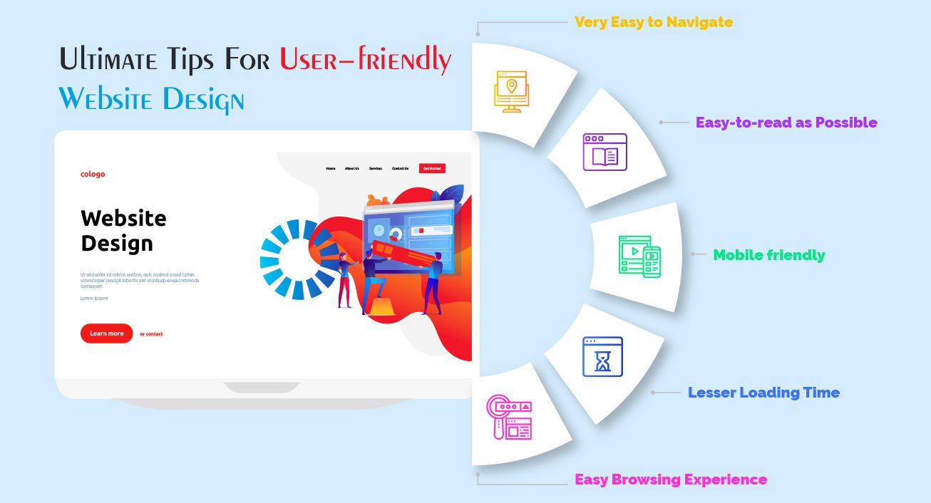
User-friendly web design is the cornerstone of a successful online presence, where every click takes your visitors closer to their desired outcomes. In an era where first impressions can make or break a business, prioritizing website usability is essential for enhancing user experience and increasing website conversion. A well-crafted design not only appeals visually but also guides users effortlessly through their journey, transforming casual visitors into dedicated customers. To achieve this, integrating responsive design, clear calls to action, and engaging content are fundamental web design tips. By optimizing these elements, you pave the way for better website performance and accessibility for all users.
Crafting an intuitive online interface is more than just aesthetics; it’s about creating a seamless experience that resonates with users. This involves designing a platform that is navigable and engaging, ensuring that potential customers can effortlessly find what they seek. The implementation of responsive layouts and smart navigation systems can significantly enhance the overall user experience, making websites approachable for a wider audience. This, in turn, cultivates trust and encourages conversions, as users are more likely to engage with a site that operates smoothly and intuitively. Emphasizing elements like effective calls to action and accessible design will fortify your online strategy, leading to fruitful interactions.

Understanding User Experience (UX)
In the realm of web design, crafting an exceptional user experience (UX) is non-negotiable—it’s the lifeblood that fuels a site’s success. Think of it as a warm welcome mat, beckoning visitors in with open arms. To forge this connection, it’s imperative to immerse ourselves in the world of our users. Every click, every scroll, every sigh of frustration tells a story and it’s up to us to decode that narrative. The goal is clear: we must create a seamless journey from the moment they arrive to the instant they are ready to convert.
User research stands as the cornerstone of this vibrant landscape. Dive deep into the psyche of your audience through surveys and interviews that unearth their desires, fears, and preferences. This treasure trove of insights allows us to sculpt user personas, archetypal representations of our audience that inform every design decision. When a site echoes the voice of its users, it transforms from mere pixels on a screen to an engaging experience that resonates.
Responsive Design and Mobile Optimization
Responsive design is not just a trend; it’s a necessity in our mobile-driven age. Picture this: a user navigating on a smartphone should feel as comfortable as someone perusing the same site on a desktop. The art of responsive design lies in its fluid adaptability—like water fitting every glass it’s poured into. By leveraging CSS media queries, we can craft layouts that morph gracefully, ensuring users enjoy a consistent experience regardless of their device.
But why stop there? Mobile optimization extends beyond mere appearance. It’s an invitation for engagement, enticing users to linger longer on our pages. The challenge is to make every element, from buttons to images, responsive and inviting. And as we fine-tune our designs to cater to both mobile and desktop users, we’re not only enhancing their experiences but also ensuring our sites are favored by search engines—after all, accessibility and usability pave the way to higher rankings and better conversions.
Compelling Content and Calls-to-Action (CTAs)
In the vast ocean of the internet, content reigns supreme. Yet, it’s not enough for content to merely exist; it must captivate and compel. Our words should weave a tapestry that resonates deeply with our audience, offering them value and insight. Clear and concise language, coupled with a pinch of creativity, can transform mundane information into engaging narratives that draw users in. The key is to break down complex ideas into bite-sized pieces—letting clarity shine through the fog of ambiguity.
But what’s a good story without a call to action? CTAs are the breadcrumbs that guide users through the forest of information to their desired destination. They should be impossible to ignore—dressed in vibrant colors and persuasive language that sparks a sense of urgency. Position them thoughtfully throughout the site, making it clear what the next steps are. The right CTA not only enhances user experience but can be the catalyst that propels visitors towards meaningful actions, be it signing up for a newsletter, making a purchase, or exploring more content.

In conclusion, the journey to crafting a user-friendly web design that converts is paved with careful consideration and strategic decisions. Focusing on your audience’s needs translates into a website that not only looks good but feels good to navigate. Here are the key points to keep in mind as you embark on this creative endeavor:
– **User Experience Matters:** Prioritize understanding your audience through research and personas.
– **Mobile First:** Implement responsive design to cater to the growing mobile user base.
– **Clear Navigation:** Create simple navigation menus and incorporate a search bar for efficient user orientation.
– **Visual Impact:** Establish a strong visual hierarchy and choose an appropriate color scheme that aligns with your brand.
– **Content is King:** Develop high-quality content that engages while optimizing your calls-to-action effectively.
– **Accessibility for All:** Ensure that your site is usable and accessible for every visitor, which broadens your potential reach.
– **Iterate Based on Feedback:** Test your design regularly and be open to user feedback to maximize your website’s effectiveness.
Ultimately, a user-friendly web design is more than just an aesthetic choice; it is a strategic necessity in today’s digital landscape. A website that thoughtfully integrates the aforementioned elements will not only attract visitors but convert them into loyal customers. To encapsulate the process:
– **Empathize with Your Users:** Gather insights to tailor your design effectively.
– **Design Responsively:** Ensure a seamless experience across all devices to capture and retain interest.
– **Streamline Navigation:** Keep paths to information straightforward and intuitive.
– **Visualize with Purpose:** Use colors and layout to guide users and encourage action.
– **Engage through Content:** Deliver value with every word, reinforced by clear CTAs.
– **Accessibility is Key:** Create an inclusive space for all users to benefit from your offerings.
– **Iterative Testing is Essential:** Regularly assess and refine your design based on user experience data and feedback.


