
When exploring the world of modern web design, CSS corner-shape emerges as a revolutionary property that enhances aesthetic appeal and functionality. This innovative tool enables designers to experiment with various shapes, such as snipped corners and beveled edges, contributing to the evolving landscape of UI design corner shapes. By leveraging corner-shape CSS, developers can create unique border effects without the need for complicated image assets, streamlining their workflows and improving performance. As the demand for creative and visually striking designs increases, mastering the CSS corner effect becomes crucial for anyone looking to stay ahead in the field. With a focus on border-radius properties and imaginative layouts, corner-shape CSS is undoubtedly a game-changer in the toolkit of modern CSS styles.
CSS corner-shape, also referred to as the corner property in styling, introduces a fresh approach to create distinctive visual elements on web pages. This property allows for a multitude of corner effects that are pivotal for crafting contemporary UI designs with a unique flair. By utilizing this feature effectively, designers can ensure that their interfaces stand out while adhering to modern design trends. Whether it’s creating soft curves or sharp angles, corner-shape CSS opens up a world of possibilities in graphic web design. Understanding these principles not only enhances your aesthetic sense but also elevates the user’s experience through streamlined and engaging interfaces.

The Evolution of Web Design
The journey of web design has seen significant transformations over the years. Initially, designers faced the arduous task of creating visually appealing elements with limited tools, often relying on a series of background images to achieve simple effects like rounded corners. The introduction of the border-radius property revolutionized this process. It offered a much-needed respite, allowing designers to easily implement rounded corners without the cumbersome need for multiple images. This shift represented a major leap forward. Many praised it not only for its practicality but also for the new creative possibilities it unlocked.
Fast forward to today, the world of design has pivoted once again. While rounded corners once captured the spotlight, the sharp edges and angular aesthetics are making a notable comeback. Concepts like squircles have emerged, showcasing the versatility that modern CSS brings to the table. The corner-shape property is a testament to this evolution, allowing designers to blend creativity with functionality seamlessly.
Diving Deeper into Corner-Shape
The corner-shape property introduces a plethora of possibilities that can redefine elements on your webpage. For instance, creating snipped corners using `corner-shape: bevel` is gaining traction among UI designers who favor a more brutalist approach to aesthetics. This technique transforms simple boxes into dynamic shapes, adding depth and interest to layouts. It’s fascinating to see how such a minor change to a corner can create a significant visual impact.
In combination with the border-radius properties, corner-shape enables the creation of intricate designs that tailor to contemporary tastes. With just a snippet of CSS, a designer can weave complex visual narratives that engage users. Each property, such as emphasizing bevel or radius, allows for adapted usage, catering to specific design requirements and personal preferences.
Innovative Uses of Corner-Shape
When exploring the applications of corner-shape, one cannot overlook its role in enhancing functional elements like sale tags and tooltips. Utilizing combinations of different corner types allows for unique designs that attract attention without overwhelming viewers. For sale tags, the intricacies of the `corner-shape: round bevel` property can make deals and promotions pop out with style. It’s an intuitive way to convey urgency while maintaining a polished look.
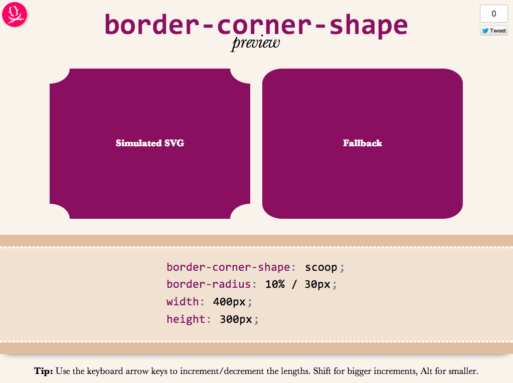
Tooltips, on the other hand, depend heavily on ensuring they guide users smoothly. The `corner-shape: scoop` property adds flair to these often-overlooked elements, elevating the user experience. Visually appealing, yet functionally sound, these snippets exemplify how corner-shape can blend aesthetic appeal with utility.
Creating Impactful Visuals with CSS
Effects like arrow crumbs or realistic highlights further demonstrate the versatility of corner-shape. By employing simple CSS rules, designers can generate rich visual cues that enhance user interaction and comprehension. The stylish approach to elements like highlights can make text more inviting, ensuring critical content stands out. It’s intriguing how such tweaks can redefine user engagement.
Highlighting elements with `corner-shape: squircle bevel`, for instance, lends them a soft yet distinct appearance. This refined touch transforms ordinary highlights into grabbing focal points on a page, stimulating interest and guiding the reader’s eye naturally. The way CSS enables such customization is an ongoing revelation, and designers are continually finding innovative ways to utilize these properties.
Corner-Shape in Functional Design
Moreover, the practical applications of corner-shape extend into background manipulation, enhancing design workflows. Using `corner-shape: notch`, for example, allows for visually interesting edge clipping that can serve specific design needs. While traditionally notched corners may lack appeal, when executed thoughtfully, they can add an extra layer of sophistication to backgrounds, seamlessly integrating them into overall layouts.
This technique gives designers the power to play with dimensional effects, creating intrigue while delivering necessary information. Strengthening the bridge between functionality and fashion, corner-shape continues to provide tools that make web design both artful and practical.
Conclusion: The Fun Factor of Corner-Shape
As we conclude our exploration of the corner-shape CSS property, it’s clear that it opens a myriad of creative avenues for designers. What may have begun as a simple method for rounding off edges has morphed into a versatile tool for crafting nuanced designs. From snipped corners to slanted sections, the possibilities are virtually endless.
Encouraging experimentation, corner-shape invites designers to venture beyond typical layouts, pushing boundaries and inventing new ways to engage with content. With each design, we are invited to find delightful applications that resonate with audiences while embodying the essence of modern web aesthetics.
Exploring the Versatility of Corner-Shape
In summary, the emergence of the corner-shape property is a true game-changer for web designers seeking to craft unique and stylish interfaces. Although we once relied heavily on rounded corners, the diverse options now available allow designers to explore creativity like never before. Whether it’s the snipped corners for brutalist aesthetics, slanted sections for dynamic visuals, or sale tags that effectively draw customers’ attention, corner-shape opens up a new world of possibilities. Here are a few highlights of what corner-shape can do:
– Create snipped corners that enhance brutalist design.
– Design slanted sections that break away from traditional box shapes.
– Combine multiple corner-shape types for tailored design elements.
Moreover, corner-shape invites a fun exploration of combinations with border-radius properties, resulting in endless creative potential. Designers can swiftly implement tooltips with a scoop effect or realistic highlights that mimic actual marker slips. Although corner-shape is currently supported in later versions of Chrome, its unique applications encourage the ongoing evolution of web designs. As we continue to push boundaries in web aesthetics, corner-shape is definitely worth incorporating into our coding arsenals. Here’s what’s undeniable:
– It pushes creative boundaries, allowing for more expressive designs.
– Promotes experimentation that can lead to innovative UI effects.
The Future of Web Design with Corner-Shape
As we look towards the future, it’s clear that technologies like corner-shape are not just trends; they are fundamental shifts in how we approach UI design. With the current trend favoring sharper aesthetics, realizing that options like round bevels and squircles can fit seamlessly into modern design is crucial. The introduction of corner-shape encourages a more versatile toolset that complements both minimalist and detailed design concepts. A few essential considerations for embracing corner-shape in your projects include:
– Understanding browser compatibility to ensure a consistent user experience.
– Experimenting with varying combinations for distinct UI effects.
– Keeping up with design trends that evolve alongside technological advancements.
The power of corner-shape lies not only in its current applications but also in how it invites designers to think outside the box—quite literally! As designers experiment more with these capabilities, we’re sure to see a ripple effect across the industry, with whole new aesthetic movements emerging from this adaptable CSS property. In conclusion, embracing corner-shape in your design workflow is not merely about creating visually appealing corners; it is about redefining what our interfaces can achieve. Keep in mind:
– It fosters innovation in web design methodologies.
– It allows designers to craft experiences that resonate with modern users.


