
In today’s ever-evolving digital realm, the concept of Mobile-First Web Design has emerged as a paramount strategy in web development. As mobile usage growth continues to dominate online interactions, businesses must recognize the significance of prioritizing mobile experiences to engage their audience effectively. This forward-thinking approach not only amplifies user experience mobile but also brings forth remarkable SEO benefits; Google’s mobile-first indexing favors sites designed with mobile users in mind. By enhancing mobile performance through quick load times and seamless navigation, companies can witness a surge in user engagement and retention. As we venture further into 2023, it becomes evident that embracing mobile-first principles is no longer optional, but rather a necessity for success in the digital landscape.
The rise of portable devices has revolutionized the way we interact with the internet, marking a seismic shift towards a mobile-centric world that calls for a fresh approach to web design. Referred to as mobile-first design, this methodology champions the needs of users accessing websites through smartphones and tablets. By cultivating a responsive web environment, businesses can ensure that their content adapts to various screen sizes, enhancing accessibility and interaction. As mobile navigation takes precedence, it is crucial to consider the intricacies of user experience that come into play, enabling users to connect with content effortlessly. Ultimately, designing with a mobile-first mindset lays the groundwork for not just improved visibility, but also the foundation for a thriving online presence.
The Rise of Mobile Dominance
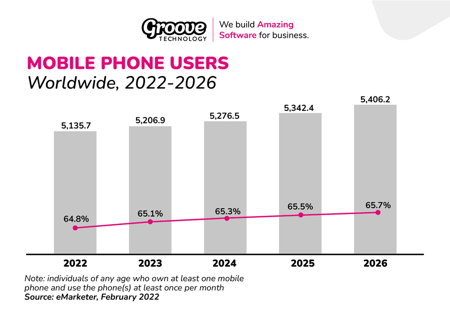
In the expansive digital realm of today, mobile devices have overshadowed traditional computing platforms. The rise of smartphones and tablets indicates a monumental shift in how users engage with the internet. January 2023 statistics reveal that these portable gadgets accounted for an impressive 54.8% of all web traffic globally. This figure paints a vivid picture of a world where accessing information on-the-go has become the norm.
As businesses navigate this mobile-centric landscape, it’s crucial to acknowledge that the preferences of users are evolving. The ability to connect instantly and seamlessly from varying locations is a demand that contemporary consumers hold dear. Ignoring this circumstance is equal parts naive and detrimental; companies willing to innovate their digital interfaces stand to gain a significant edge over their less agile competitors. Truly, the age of mobile is here, and embracing its nuances is no longer optional.
Search Engines and User Experience: A Perfect Pair
The future of search engine optimization (SEO) is undeniably intertwined with mobile-first design. With Google implementing mobile-first indexing, the implication is clear: websites optimized for mobile devices will rank better, making visibility paramount. The transformation means that businesses must focus on their mobile experiences before anything else. If they fail to adapt, they risk being buried in the digital depths, unseen by potential users.
Moreover, mobile-optimized sites promote lower bounce rates and higher engagement. When users find mobile sites that resonate well with their needs, they linger longer and delve deeper into content. This improved interaction directly influences rankings on search engines, leading to an exponential rise in both traffic and potential customer conversions—highlighting a vital synergy between user experience and SEO.
Crafting Seamless Experiences: The Responsive Design Revolution
In the age of mobile-first design, creating experiences that cater effortlessly to users revolves around the principles of responsive design. This approach is not just about resizing elements; it’s a comprehensive strategy that prioritizes user interface and experience across devices. Visualize engaging elements that adapt fluidly to screen size, offering intuitive navigation whether the viewer is on a sleek smartphone or a robust desktop.
To achieve this, designers must think meticulously about content hierarchy. What should be front and center? What enhances user accessibility? By carefully curating these decisions, businesses can ensure that essential information is easily accessible, thus cultivating a user-friendly ecosystem within their websites. The responsive revolution is not merely a preference; it’s a necessity for anyone wishing to thrive against the backdrop of mobile evolution.

Embracing Mobile-First Strategies
In a world increasingly dominated by mobile technology, businesses must pivot their strategies towards a mobile-first approach. This methodology emphasizes designing websites primarily for mobile devices before scaling up to desktop versions. The transformative impact of adopting this strategy can be illustrated through a multitude of benefits, including:
– Enhanced user engagement, as users are more likely to interact with a well-optimized mobile site.
– Improved search engine rankings due to Google’s preference for mobile-first indexing.
– Increased conversion rates, as mobile-friendly sites often lead to faster loading times and a more satisfying user experience.
As we navigate through 2023, the shift towards mobile-first design isn’t merely beneficial—it’s essential for survival in a competitive digital marketplace. Companies that neglect this imperative risk being overshadowed by more agile competitors who prioritize mobile optimization. Some key takeaways to highlight this significance are:
– The overwhelming majority of web traffic now comes from mobile devices, necessitating websites tailored to these platforms.
– A commitment to mobile-first design reflects an understanding of user needs, fostering loyalty and repeat visits.
– Businesses that invest in mobile-first strategies often enjoy sustainable growth and improved brand equity.
Navigating Towards a Seamless Future
Looking ahead, the fusion of user experience and mobile-first design continues to evolve, emphasizing speed, performance, and responsive layouts. Embracing these elements will empower businesses to meet the expectations of their users effectively. Important considerations moving forward include:
– The necessity of responsive design to ensure compatibility across diverse devices and screen sizes.
– Prioritizing core functionalities that allow easy navigation and access to essential information without excessive effort.
– Recognizing the link between enhanced performance and increased user satisfaction, as consumers demand quick, efficient interactions with their online experiences.
Ultimately, the journey towards a mobile-first digital landscape is not just about keeping pace with current trends but setting the stage for future innovations. As companies endeavor to remain relevant, they should focus on:
– Continual adaptation of design principles to accommodate the rapid advancements in mobile technology.
– Leveraging analytics to understand user behavior and preferences better, ensuring that design decisions are informed and relevant.
– Committing to a mobile-first ethos not just as a checkbox but as an integral philosophy that drives all aspects of their online presence.


