
Color theory in web design, a facet of web design color theory, is a practical compass for guiding attention, readability, and brand credibility on the web. By building color palettes that convert, you craft pathways that lead users from curiosity to conversion. Accessible color contrast remains essential, threading legibility across devices and abilities while strengthening trust. Color psychology in design helps align hues with user intent, from trust signals to urgency cues. Design tokens for color enable scalable theming and consistent accessibility across platforms.
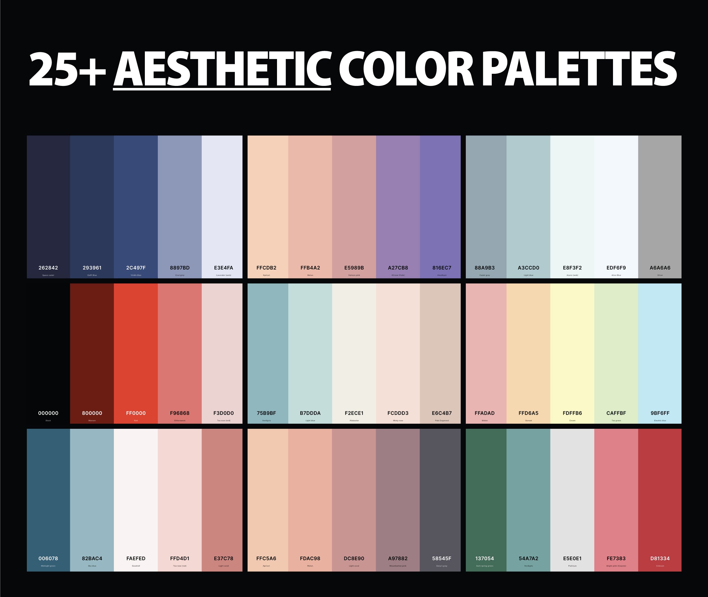
Palette structure that supports conversion
Color theory here is not mere prettiness; it is a practical compass for guiding attention, sharpening readability, reinforcing brand, and nudging conversions. When audiences sense actions clearly, trust the site, and feel confident in the brand, engagement follows—signups, purchases, conversations started. This long form guide invites you to build palettes that convert while staying accessible, inclusive, and tuned to user needs. You’ll learn to structure palettes, weave color psychology without flattening messages, and implement color tokens that scale across a design system. By the end, practical steps, checklists, and adaptable examples await your own products and campaigns.
A robust palette structure looks like a small cast: a core color for key actions, one or two accents for emphasis, a neutral range for typography and quiet surfaces. The primary anchors CTAs and headlines; secondary differentiates sections and guides flow; neutrals support readability; accents draw attention without shouting. The rule of thumb? five to seven colors for most components. A practical map might read: Primary, Secondary, Neutrals, Accent, Backgrounds. Test them in context—cards, modals, forms—and observe how they behave in hover, focus, disabled, and active states.
Structure follows roles. Primary holds action; Secondary supports the primary on secondary actions; Neutrals cradle text and backgrounds; Accent appears sparingly to touch conversions; Backgrounds ensure contrast across light and dark modes. When these roles are clear, brand remains consistent and scaling decisions across pages becomes easier. Design tokens tie the palette to the system, letting colors evolve while staying anchored to their purpose.
The real work is testing: test how colors behave in different contexts and themes, beyond just aesthetic appeal. Balance clarity with personality. You’ll develop a practical cadence—test early, test often, validate both accessibility and perception—so your palette guides users toward actions without shouting.
Accessibility and non color cues
Color is a language, but not all readers hear every syllable. Accessibility asks that meaning ride on more than hue alone. A palette should talk through contrast, labels, borders, and shapes as well as color.
Sufficient contrast: body text against background should meet at least 4.5 to 1; larger text can be slightly lower yet not below 3 to 1 for UI components. Non-color indicators: use icons, labels, borders, and shapes to convey status or errors in addition to color. Color vision considerations: beware red-green blue-yellow pairings that trouble common deficiencies; tools like color blindness simulators and automated contrast checkers help verify accessibility at scale. Prefer consistent contrast across themes: when you offer dark mode, ensure color roles stay legible with variables that recalculate contrast per theme.
These practices widen reach, build trust, and lift conversions by making clarity the shared rule instead of a color-only cue.
Color psychology, tokens, and scalable theming
Color psychology and message framing: Colors carry stories and cultural gloss; in a conversion-focused frame you want hues that reduce cognitive load and reinforce the call to action. Blue signals trust and reliability; green hints growth and success; orange feels urgent without yelling. Yet context matters: a blue CTA may suit a financial product, while a vibrant orange might win on a fashion site. The key is aligning the palette with brand personality and the user journey rather than chasing a single magic color. Pair color with clear typography, spacing, and compelling copy; validate cues with A/B testing to learn which colors best spark the desired actions for your audience.
Practical strategies for choosing and testing palettes: Start with a three-color baseline—primary, secondary, neutral—with one accent for emphasis. Define a 60-30-10 rule for layouts: 60 percent neutrals, 30 percent primary/secondary, 10 percent accents to draw attention. Build a design token system so color values travel across components; this smooths theme changes and accessibility tweaks. Test contrast early and often using automated tools; support dark mode with adaptive sets that maintain essential contrast while keeping identity. Use gradients sparingly and only where readability remains intact. And ensure branding remains cohesive across marketing, product, and support channels.
Color tokens, design systems, and scalable theming: Modern web design relies on tokens and CSS variables to keep color consistent. A design system defines tokens for surface, text, border, and action; these tokens map to themes that switch with user preferences or context. Tokens deliver benefits: consistent pages, faster theme switching, and central accessibility improvements. Document color usage in the guidelines so developers and designers stay aligned as the product evolves.
Practical examples and common pitfalls: Common mistakes include leaning on color alone to convey status, choosing palettes that fatigue the eye, or ignoring color vision needs. Strong palettes that convert tend to balance bold accents with restrained typography, spacing, and micro-interactions. A pragmatic approach pairs a mid-tone neutral surface with a dominant primary color for CTAs, a secondary color to de-emphasize competing actions, and an accent for feedback. Always include accessible icons and text labels so every user can complete the path.
Conclusion: Color theory, used well, becomes a practical instrument for guiding behavior and lifting conversions. The secret is structure, accessibility, psychology, and disciplined tokenization. Prioritize accessible contrast, align hues with brand personality, and validate with real users. When these habits travel through your design system, color becomes a trustworthy ally that clarifies actions and supports long-term goals.


