Although composition may be the framework of a great design, color is the extra little detail that makes a project feel truly complete. Color schemes can be used to evoke feelings and attitudes about a particular design or piece of content. In the past, we’ve covered the use of color in web design and how it plays a role in the final layout.
For this gallery, we’d be diving into a more distinct area of the color pool. Pastels are seen as faded colors that don’t have as much saturation. A lot of people prefer this type of color scheme, as it looks lighter and gentler on the eyes. Many times these are used in children’s websites, but they can be found all over the Internet. Take a peek at the following examples to see how you can use pastel colors in your own web design work.
Pastel Colored Website Layouts
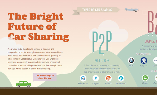
Future of Car Sharing

#Hash Contenidos

Izumi Massage

Carbonmade

Rainbow Nursery

Every Last Drop

Project Pulse

RuedaFilm

Wrist

Postable

Wonderfully Wild

Melonfree

Squilla Fund

Libenar

Mont Roucous

Sahel

ADAM

Mend Seltzer

Lobster.

Take a look at these other colorful website galleries:
40 Stunning Green-Colored Web Design Layouts
30 Distinguished Brown & Beige Website Designs
The post 19 Inspiring Pastel Colored Website Layouts appeared first on SpyreStudios.

